Pages

For People Crazy About 2D Animation!

Acme Punched! is for people crazy about 2D animation. It may be enjoyed by beginners and others, but it is aimed at animators who know already something about the process of animation and the basics of character animation. In large part, it will attempt to provide a deep look into the problem solving that goes on in my head as I work out a scene, often in step-by-step posts that I will sometimes enter in "real time", without knowing in advance what the outcome will be. Mistakes and false starts will not only be included but emphasized, so that the creative process of animation will be portrayed realistically. And, while my own bias is for 2D drawn animation, many of the effects and principles discussed here can apply to CGI 3D animation as well. I hope the blog will prove useful and instructive for all.

-Jim Bradrick

Monday, December 31, 2012

No. 23, Problem 3: The Fox On the Man's Head (Part 7)

The Finished Scene


It would have been perhaps just as appropriate to label this post Drawings Into Digital: Part 4--The Finished Scene, but for any of you who have been with me in parts 1 through 6 of The Fox On the Man's Head, I didn't want you to miss the payoff.

Here is the scene:

As I said I would, I have added a camera move-- a truck-in near the end--and an eye blink for the man, which I drew directly in Animate Pro and repeated once, to give the man's hold pose a little life.  I also put in a placeholder sound effect for the fox shaking himself out; it is not quite what I want there and I intend to switch it out when I find or record a more appropriate sound, but it will do for now.


This is my last post for 2012, and at this time I want to wish a Happy New Year to all my friends around the world.  I have been pleased this year to have hits not only in North America but from India, Ukraine, Spain, Sweden, Brazil, Australia, Israel, Germany, Macedonia and many other countries in every part of the earth.  I thank you for your interest.

For 2013 I promise you many more posts detailing my investigations into the fascinating world of 2D animation, mostly of the hand-drawn variety.  But first I will give you a look at a holiday ecard I was commissioned to do in a very short time--about two weeks--and which forced me to rely not on elaborate full animation but mostly on camerawork instead.


Next: Problem 4: Forty Seconds In Two Weeks (Part 1)  


Thursday, December 27, 2012

No. 22, Drawings into Digital: Part 4--Painting

Once you get your gaps closed (see Part 3), the painting is easy.  One thing you want to be sure to do right, though, is manage your palettes. Coloring anything that you might want to color again, without saving and labelling the color systematically, will be a mistake.

 Here is a shot of the basic Animate Pro palette:


Pretty simple, isn't it?  But this palette is just a jumping off place.  You can create hundreds or thousands of colors if needed, just by clicking on the New Color button, which is the + button at upper left.  Click  inside the color box, and you will be taken to Toon Boom's master palettes, where your choices are virtually limitless.

Here is my palette for the colors to be used in this scene:


In my case, I am still at a stage of production where I am not quite sure if the colors I am using for my characters will be the final choices.  But having labelled them Man Skin, Man Overalls, Fox Red, or whatever, I can then come back and change those colors in the palette, and everything that has been paiinted with the color of that name will change accordingly.  So not being sure of my colors turns out not to be a problem.

Here's an example of the first frame of the scene showing three layers (from the bottom: man, fox, tail) all assembled.

First frame of the scene, painted and assembled, but without the background.
Following are a couple of examples of the painted artwork of shots mentioned in earlier posts about this scene.

A shot of a fast motion double image of the fox, showing how I handled the coloring of the second "ghost" image.

A frame showing the fox's fur all bristled out, just after he shakes himself.

And finally, here is the last frame of the scene in full, anti-aliased render mode:


Next: The Whole Scene!

Sunday, November 25, 2012

No. 21, Drawings into Digital: Part 3--Closing the Gaps

As pointed out in Part 2, my use of a broken line inking style requires an extra operation using the Stroke tool to close the gaps in each paint area; otherwise, because the gaps are too large for automatic closing, the areas will not fill with color.

Here is an example of an inked fox image:
A fox image, inked but not yet ready for painting because of the large, deliberate gaps in the lines.

The large gaps shown here should be closed using the Stroke tool, which is on the toolbar in a pull-down menu with the Paint tool.  The Stroke tool is applied as you would use the pencil tool, in whatever straight or curved or even meandering style you care to employ.  It is important to understand not to use the Close Gap tool for these large gaps, because the Close Gap tool, while it will indeed close any gap, will always take the shortest and straightest path between the two points you are connecting, whereas you will find that you often may want to follow a suggested curve or other path when connecting two points.  For example, if I wanted to close the large gap at the back of the fox's head in the above illustration, I would want to follow the arc of the two lines being connected.

Here is the same image with the connecting strokes applied and made visible in blue.
A detail of the first image, with connecting strokes visible.
Note the stroke connecting the two curved lines at upper right.  This is an example of my stroke line completing the curves of the inked  lines and coming together in a soft point .

Here is an even closer view of the nose and brow area of the fox:
This shows clearly the strokes (in blue) connecting the line gaps in just the desired way.

When using the Stroke or Brush or just about any other  tool, be sure to take advantage of the instant-response Rotate View tool.  This is one of the greatest and most useful tools available in most of the Toon Boom family of products from Studio on up through Animate Pro and Harmony, allowing you to spin your drawing surface to obtain the most effective angle for your hand.  Rotate View is accessed on the Mac by pressing Alt+Command, and by a similar key combination on the PC.  The drawing disc icon that appears indicates its function; it is just like spinning the animator's  drawing disc that was set into a traditional Hollywood studio animation desk.

Sometimes the Stroke tool may be used in a more free-form or creative way than just for closing obvious gaps in lines.  Here is an example of that.
.  The gaps between each pair of border lines are connected using a line with a curve not based on the angles or curves of the inked lines.
Here the radial lines indicate the bristling fur of the fox.  I could have simply connected the lines with an arc perpendicular to the inked lines, but I wanted to finesse and soften the connections.  With the Stroke tool, this was easy to accomplish.

Next: Painting the Images


Wednesday, November 14, 2012

No. 20, Drawings Into Digital: Part 2--Inking

The scanned drawings are imported as batches into the timeline, all the drawings of each level to a new layer. The timing will be worked out later.  In my case, I have already worked out the timing in the pencil tests I did in Toki Line Test, so I will refer to the Xsheet from that when  spacing the drawings.

Here is what the timeline looks like after the  drawings are imported:

There are five layers of drawings showing here: Man, Tail_Behind, Body (the fox's body), Tail_infront, and Fur.  Above each of these layers I have created a drawing layer with the same names repeated, but in capital letters: MAN, TAIL-BEHIND, BODY, TAIL_INFRONT and FUR.  These are the layers I will be inking on, tracing from the layer below.

Note: I should mention that what I describe here is my own system.  Of the kinds of animation it is possible to do in Animate Pro, Toon Boom provides the least information and guidance about importing completed animation drawings.  No doubt this is because it is the least popular type of animation among its user base, so there is less demand for technical help, and because animators who can do all their animation on paper before entering the program usually know what they are doing.

At any rate, the drawings here are arranged in ascending number order in each layer, but the drawings of one layer do not yet have any meaningful relationship to the drawings of another layer.  For example, drawing 1 of the Body layer is meant to be held for many frames, but until it is inked and painted it will occupy only one.

I now begin the inking process, which looks like this:

The red frames on the layer BODY are the inked frames of the layer Body, directly below.

I have chosen a style using two weights of brush line, which are basically the default brush 2 and the default brush 3, although I have changed the property values of each somewhat.  Brush 2 gives a thin line without much variation, while brush 3 has a heavier line with a lot of thick and thin variation.  You will want to experiment to get the right amounts of Minimum and Maximum Size, and of Smoothness and Contour Optimization for your own purposes.  On the fox character I am using brush 2 for interior lines and anything else that is of a delicate nature, like the outlines of the lower legs.  Brush 3 is for everything else.

Also because I like the look, I am allowing the line to break, or to not always connect with other lines.  This will necessitate a lot of work with the Stroke tool, which adds invisible lines to connect these gaps.

Here is a closeup showing the inking being applied over the bitmap scanned image.  The scan was at 150dpi.  It is blurry and I was forced to refer frequently to the actual pencil drawings to be able to make out some details.

Since scanning these, I learned through an exchange on the LinkedIn group Animation Community Platform that I could be scanning my drawings vectorized rather than bitmap.  Here is an example, showing the much higher quality:
A grey mode vector scan, this time over a blue color card.
The vectorized scan also gives me alpha transparency, which the bitmap image does not.  I will be using this type of scan from now on.

Next: Closing the Gaps


Thursday, November 8, 2012

No. 19, Drawings Into Digital: Part 1--Scanning

Paper To Digital: Getting Started


Having cleaned up all drawings for this scene in black pencil, next I scanned them into the computer for "ink and paint", the old expression for getting the drawings into final line and color form on a transparent field, just as in pre computer days they were actually inked onto acetate celluloid, their colors painted in on the back of the cel.  I have actually done this, and as an independent animator I mean that I--not some employee or underling--have actually done it.  Mixing paints, doing test cels to get the right colors, doing let-downs (compensating for the gray density of each cel by lightening the paint colors incrementally, so that the parts of one character on multiple cel levels would all appear to the camera to be the same color and value), waiting for the paint to dry, repairing damaged cels where the paint turned out not to be dry, and so on.

All that is in the past, and I am glad to embrace what computer animation can do in this area.

First step is scanning, and I recommend the ScanExpress A3USB 1200 Pro Scanner by Mustek.  It costs under US$200 and scans up to 11.7" x 16.5" (29.7cm x 41.9cm).  I learned about this scanner from a comic book artist friend and was excited, because all scanners I knew about  that scanned any larger than American legal size (8 1/2" x 14") were priced in thousands of dollars.

The Mustek ScanExpress 1200
This scanner works in a wide variety of resolutions and scanning modes, and it can batch-scan 10 copies at a time. I access it through Photoshop, where the scans appear in a stack.   For mode I choose Grey.  In this way I get all the shadings of the pencil drawing, which I like to see when inking over them digitally.  But it is possible to also scan in color, at either 16, 24 or 48 bit.  Color scans of animation drawings may be useful when colored pencils have been used to code such things as match lines or  tracebacks,  or to indicate a particular inking color.

When scanning pencil animation drawings, registration is of course critical.  Unregistered drawings can be troublesome and time-consuming to correct.  And it is important to know that acme or other registration holes are not always consistent in their relationship with the edges and corners of the paper in which they are punched.  Therefore, even the most careful alignment of drawings into the corners and edges of the scanner bed will not assure registration.  The three registration holes may vary in their location from sheet to sheet by as much as 1/8" (.3cm) from the edge; moreover, they may be skewed--not level with the edge.  These variations are unacceptable and can ruin your animation or cause you much grief in their correction.

Toon Boom Animate Pro, as well as some other animation apps like Toonz, offer a peg hole detection feature, which automatically aligns your scans by their peg holes.  But to use this feature, one must scan in the Lineart mode, which produces an over-simplified rendering of the pencil drawing that I do not favor, all black or white with no values inbetween.  It also has low tolerance for any enlarged or irregular holes and can fail as often as not, in my experience.  In any case, as I prefer to see the bitmap nuances of the pencil drawings, this does not work for me.

Perhaps a better option is to equip your scanner with a pegbar.

A standard thin metal acme pegbar taped to frame of the sccanner bed, just outside the scanning field.
This will work very well for registration if 1) the specified scanning field is exactly consistent throughout the entire scene being scanned, and 2) the pegbar is taped down securely enough that it does not drift or shift its position in any way.

The Mustek scanner actually appears to have been engineered with this possibility in mind, as the inside surface of the scanner cover includes a slot all along its right side that will accomodate the acme pegs that project up from the pegbar.

Here an animation drawing has been placed face-down on the pegs of the scanner.
For this scene I scanned all the drawiings at 150dpi.  Even this rather high resolution does not show absolutely all the pencil detail once the drawings are imported into Animate Pro, so on certain critical scenes I will probably choose a resolution of 300dpi.  I would say that 72 or 96dpi would tend to be inadequate at any tiime.

Next: Inking the Drawings in Toon Boom Animate Pro.

Sunday, October 28, 2012

No. 18, Rare Animation Books: Animation in Twelve Hard Lessons

The cover of the book, its title drawn in so ornate a style that one can hardly read it.
Animation in Twelve Hard Lessons was first published in 1972 by the author's own company, Robert P. Heath Productions, of Tampa, Florida.  I think I got my copy about 1980, and in those days before the internet, it is probable that I saw an ad for it in the catalog of Cartoon Colour Company of Burbank, California, which is still in the business of selling animator's supplies to this day (including, I must mention, animation paper which is acme punched.)

Bob Heath's one claim to fame was that he animated the short cartoon "The Critic" for Pintoff Productions.  With comic narration by Mel Brooks, this cartoon won the Academy Award for Best Animated Short Subject for 1963.

Heath subsequently ran his own animation studio and developed the book during this time.  Originally it was designed as a correspondence course, which means that students would enroll by mail, receive lessons by mail, and send in their work and receive corrections and comments by mail.  Complete the whole course of work, and you get a certificate of completion.  It is the same idea as was successfully carried out by such schools as the well-known Famous Artists School and is similar in concept to the online courses available from independent schools today.  However, I don't know if it was ever actually offered to the public as a correspondence course, or only as the book that came into my hands.

It was a large format book, 11" x 14" (28cm x 35.5cm) and 142 pages long, and it offered a practical education in basic character animation in a "limited animation" character design style that was fashionable in the 1950's and 60's,  more UPA than Disney.  After some introductory material about equipment, the 12 lessons included three on inbetweening, two on assistant animation, one on general animation, and then a chapter each on animation pans, the animation camera, tricks of the trade, animation actions, working with animation, and technical animation.

Each of the 12 chapters had exercises or problems to be solved, and each had solutions to its problems provided at the back of the book, thus maintaining the lesson and answer structure of the correspondence course.  My copy of the book is somewhat mutilated because of the necessity in doing the lessons of cutting up the pages to remount the drawings in register on animation paper.  But I have kept all the material together and haved taped the pages back together so that today I have virtually the whole book.
A typical page of illustrated instruction from Animation in Twelve Hard Lessons.

Personally I never completed all the lessons because by the time I got Animation in Twelve Hard Lessons, I had already learned many of these basic lessons elsewhere.  I don't know how many animators benefitted from this book, but I believe a person who had absorbed all its information would have been qualified for at least an entry level position at any studio producing animated television commercials in its time.

In addition to the book, I purchased at the same time the animation disc offered by Heath Productions.  It was manufactured of molded particle board with a frosted glass inset panel and movable Acme peg bars of black plastic with metal pegs.  I used this disc until I replaced it with the much cooler and more expensive aluminum disc I still use today.
The Heath Productions animation disc.  The only way to lock down the sliding peg bars was to tape them down...but it worked!
Although this book is long out of print, as of this writing there are several American booksellers offering used copies online.

Next: Getting Your Paper Animation into Toon Boom Animate Pro.


Tuesday, October 23, 2012

No.17, Problem 3: The Fox On the Man's Head (Part 6)

Head To Tail: : Putting It All Together


Because I have up to four layers here in the pencil test, I took the time to clean up all the drawings in black pencil so you will get the clearest possible view.   Here is the result.

This is about how I want it.  I will add  a couple of eye blinks to the man, but I will do this on the fly, in Toon Boom Animate Pro.  I will also add a camera move at the end, trucking in on the fox as he sits down.

This scene is ready to be inked and painted, and I have decided to go ahead and do that so you can see the final result and get the full production picture of a scene from rough pencil tests through final color.

This will take me a while, so in the meantime I will do a few posts on rare animation books you may never have even heard of.


Next: Animation In Twelve Hard Lessons

Monday, October 15, 2012

No. 16, Problem 3: The Fox On the Man's Head (Part 5)

The Breakout of the Shakeout


Before we get back to the tail, I thought you might like a close look at the drawings involved in the fox shaking himself out after being matted down beneath the man's hat.  It involves drawings on both 1's and 2's, and also the use of multiple images.

Here again is a look at this portion of the sequence at full speed.  I remind you again, we are at this point ignoring the tail, which will now be on its own layer.


Now here is another  version of the same drawings, but this time with enough frames exposed for each that you can observe every drawing and its relationship to the others.


Up through drawing 61, the drawings are all exposed on 2's, with 61 itself being held for 4 to stress the anticipation.

Then 55 through 78 are on 1's, after which we return to 2's with 79 through 85.

The drawings with two heads each--66, 69, 72 and 75--are used where the fox whips his head across from one side to the other, spanning a distance where there can be no overlap of forms of the head.  In such a situation, some artifice is usually advised to help the viewer bridge the gap between the widely spaced drawings.  This might be a blur, a smear, a trail of speed lines arcing across, or, as in this case, the use of multiple positions of the moving object on one drawing.   (Note: The trailing heads on drawings 69, 72 and 75 are drawn in red only to make them stand out in the pencil drawings from the blue lines that they cover.)

Note that the head in the drawing following each of these is very closely related to the forward head of the multiple drawing; it is advanced just a little more, and the ears continue forward in a follow-through.

Mine is only one way that this might have been done.  There are many ways of convincingly  animating a quick motion like this, and therein is the joy and intrigue of animation, that although it is possible and useful to work with formulae, one may also invent something new that may be more effective than the old. 


Next: Tail and All: The Full Scene Put Together


Tuesday, October 9, 2012

No. 15, Problem 3: The Fox On the Man's Head (Part 4)

Shakin' It Out


Before doing the rest of the tail, which after all is a follow-through item, I needed to finish all necessary work on the body, lest the tail end up wagging the fox.

The two unresolved elements were: 1) how the fox sits down after shaking himself out, and 2) how his bristly fur settles down, and what kind of timing that called for.

Sitting Down

Previously I had only done key drawings.  Now I added in my inbetweens and got this:
This was good in most respects, but I thought the head turn, where he looks down, should hold longer.  (Remember, we are more-or-less ignoring the tail for now.)

I altered the timing so that he is looking down for 8 frames instead of two.  Here is how that looks:
Much better, and I am now ready to look at it together with the shakeout that comes before.  Also I now add detailed drawings showing his fur, which is all bristled out after the violent shake, settling down as he goes into his hold.

Here is all of that together:
All seems to be working.  Yet to do is the final timing, mostly on its own layer, of the tail itself, and then a test of the entire combined scene.

But first...

Next: An Analysis of the Shakeout Drawings and Timing

Friday, September 28, 2012

No. 14, Problem 3: The Fox On the Man's Head (Part 3)

[First, an apology to my readers for the long time between posts.  The fact that I was busy with other things does not mean anything when you feel that the blog you are reading has gone dead.  I intend to try to post at least twice a month, and more often if possible.]


Here I want to work on the beginning of the Fox's unwinding, slowing it down, making it more interesting, and making sure it works well with the little "take" or reaction  of the man to the tail movement.

Therefore I will only be showing the first part of the scene in this post.


Here is the first pass at improving the start of the unwind:


I feel this doesn't work as well as it might because, although I have added some drawings to the tail movement to slow it down from the original, the man's reaction still distracts from the more important movement that I want the viewer to observe (that is, the fox shaking himself out).

What else might be done here?  What else is in our animator's toolbox?   Well, it occurs to me that I could add an anticipation to the tail unwinding.  This would not only make the movement more dramatic and suspenseful, but it would also add the extra time to the movement that I am looking for.

So I erase those few drawings--they are simple ones and not hard to replace--and begin again with a snappy anticipation.

Here is how that looks:

Okay!  I am happy with this; it is exactly the effect I wanted to achieve:
-The man's reaction seems to come at a natural time, as soon as he feels something moving.
-The anticipation works well to draw your attention to the tail, and it lasts long enough that by the time the man has come to rest, the viewer is ready to focus on the main business of the fox unwinding, and he hasn't missed anything important

A note on the anticipation:

I want to draw your attention to something a bit unusual about the anticipation.  Here are the key drawings: 1, 13, 17 and 25, shown with 2 spacing guides.

Note that I use Disney-style numbering, where the drawing numbers are also frame numbers whenever possible.  Thus, if drawing numbers are all odd numbers, it means the drawings are being shot on 2's.  (This technique is best described  by Richard Williams in his book The Animator's Survival Kit.)

Drawings 1 thru 13 comprise the actual anticipation--the movement that telegraphs and often opposes the forward movement.  Nothing unusual here; as the spacing guide shows, we ease out and ease in.

But I have dwg 13 hold for 4 frames (at 24 frames per second), so that the next drawing and number is 17.  Again, there are no drawings between 13 and 17.   This gives the movement its snap.  Also, I am playing with the apparent variable volume you get with hair or fur, where it can appear to be a smaller mass when wet or otherwise compressed.  Therefore 17 shows the hair suddenly all spread out.

The remaining inbetweens that fill in between 17 and 25 are a conventional ease in as the tail fur collapses down again.

Next:  Shakin' It Out

Tuesday, August 21, 2012

No. 13, Problem 3: The Fox On the Man's Head (Part 2)

As stated, the first thing I want to do here is to change the "take" to something more subtle, and rather more amused than alarmed.  Here was my first try at the revision:

Better than before, but it still isn't quite right.  The arm movement overstates the reaction (not to mention that the framing will be a tighter closeup), and the eyes stay closed for too long.

Let's try again, letting the shoulders do the work and making the blink much shorter.  Here it is again:

Good; this is what I was looking for.  He just shows that he is aware that the fox is moving, without being too worried about it.

Next I will re-time the unwinding of the tail, slowing that down and also bringing it to a hold at the end after the body does, as it is seldom good to have everything stop all at once.

Next: The Fox Unwinds

Thursday, August 16, 2012

No. 12, Problem 3: The Fox On the Man's Head (Part 1)

First, you will need to understand the story at this point.

The Story: 
The man has arrived home to present 3 things to his wife.  He has already given her the goose and a bag of grain.  But he has concealed his third purchase as a surprise: under his hat, perched atop his head is a live fox.

In problem 2 we saw how he pulled his hat off, using the stagger effect.  Now we see the fox, his ears down and his tail tightly furled around his body, so that the man's wife is not sure what she is seeing.

The Scene:
Closeup.  The fox uncoils his tail and shakes himself out.  The man reacts in a subdued "take" at the movement of the fox.

The First Version:
In my first pass, I had the man reacting with alarm as the fox uncurled.  Here is the pencil test of that:
Pencil Test 1

In fact, the first test had the man waiting until the fox was completely uncurled before he reacted.  This was poor planning, a too literal interpretation of the rule of thumb that the movement of a secondary character can draw the viewer's attention away from the main movement of the primary character.  Often that means to have only one character moving at a time. But I realized it doesn't work well for the man to wait all that time before reacting to the movement of the fox; he should logically react right away.  Therefore as you see above, I have moved his reaction up to the beginning of the movement of the fox.  This is better, but still, it does distract.

What would be a better solution?

In watching the movement of the fox (which I am basically happy with), I realized that it would be more effective to have the tail begin to unwind much more slowly, then time the man's reaction to happen with that.  Thus the man will be at rest (and not distracting us) by the time the fox goes into his more violent movement.

There are two other things I am going to change here.  First, the shot was to be a wide view as you see in Pencil Test 1.  Since planning that, I have had more experience in Toon Boom AnimatePro, and found how easy it is to use a Camera Module.  I decided I wanted a tighter closeup, excluding the wife from the frame, more like this:


The other change is to the man's reaction itself.  Instead of being alarmed by the fox's movement, he should react only a little here, with an expression more of delight than of uncertainty.  Notice that I have the man's head moving very little, because I want the fox to remain fairly stationary.  I will stay with that constraint, mostly moving his shoulders instead of his head, and giving him that more pleased expression.

Next: Problem 3: The Fox On the Man's Head (Part 2)  We fix the man's "take".

Tuesday, August 14, 2012

No. 11, When Good Enough Isn't Good Enough: Pursuing Excellence

The fox on the man's head.
If you have read my previous posts, you will see that I have shown some examples of improving my own work.  In the animation business, as in many others, one cannot always do that.  There are many good reasons for this.  Sometimes the budget is too tight, or the screen time allowed for some bit of action is too short, often dictated by the timing of a script that is already locked down.  Very often,  a short deadline does not permit the careful planning that might make for better animation and storytelling.

Perhaps these are excuses rather than reasons.  In any event, I have spent most of my career doing work that was good enough.  It was good enough for my clients and good enough to give me a career doing animation in TV commercials, video games, and now for the internet.  I have done work where there was no time for pencil tests or for doing anything over, and it has been good enough.  And--don't get me wrong!--much of it has turned out very well.

And yet, I have done some animation I cannot bear to watch anymore and which you will never see on my demo reel.  (I think most serious creative people have work that they personally do not like to look at, even though others may admire that work.)

Also, in television commercials and other short work that I have done, there has never been time to develop character or to have very much character interaction.  There was seldom more than one character on screen at a time.  Therefore I never professionally had a chance to develop my character animation skills to their highest level.

When I began work on my current personal film The Crossing, my attitude at first was as usual:  to make it "good enough."  So I have completed the pencil animation on a good portion of it at that level.  At some point, though, I asked myself why I was doing that.  Why was I only making it good enough, when I now had the time to make it as good as it could possibly be?  I decided I wanted it to be excellent, even if that meant doing some work over again.

Thus, we have the basis for this blog:  a series of examples of "good enough" animation being improved; being made as good as I can make it.  I hope you will stay with me and perhaps benefit from the process of re-thinking all of these little scenes along with me.

Next: Problem 3: The Fox On the Man's Head


Friday, July 20, 2012

No. 10, Problem 2: A Staggering Solution (Part 3)

Now let's take a look at the scene with the Stagger in place:

You can see how shooting those drawings out of order, in this very controlled way, produces the trembling effect that I wanted here.

Here is exactly how the drawings were staggered.  There were 9 drawings to the stagger, 437 thru 453 (using odd numbers only.)  For clarity, let's give them the letters A thru I instead.  For the smooth version, shown in Part 2, they were of course shot straight through: A-B-C-D-E-F-G-H-I, and exposed on 2's. 

But staggered as you see here, and exposed on 1's, it goes like this: A-B-A-C-B-D-C-E-D-F-E-G-F-H-G-I-H.  That's 17 frames as compared to 18 frames in the smooth progression, so the screen time is almost the same.  The basic idea to this stagger is: advance two letters, then go back one; advance two letters, then go back one.  Thus you progress steadily on to the end.

In my opinion the stagger adds an extra element of effort to the action, and was well worth doing.

Saturday, July 14, 2012

No. 9, Problem 2: A Staggering Solution (Part 2)

I am now going to be doing my pencil tests in color and with as high a resolution as I can get.  I think once they are compressed for the web they will look much more clear than they have until now.

As promised, here is the test without the drawings staggered but just used in sequential order:

As you can see, the animation actually works quite well without even resorting to the stagger effect.  The strain of effort and the sudden release are all there already.  Note that for this version,  all the drawings that will be staggered I exposed on 2's, whereas when I show you the staggered version in the next post, they will be on 1's.  The screen time is almost exactly the same in each case.

Next: The Staggering Conclusion to Problem 2

Friday, July 13, 2012

No. 8, Problem 2: A Staggering Solution (Part 1)

The Stagger effect is one of those gimmicks developed in Hollywood and used at Disney, Warners, MGM, and probably other places as well. It's first real use is probably not known.   It is a way of getting a shuddering or vibrating sense  of extreme tension into an animation, or it is used to illustrate fright or some other emotion where a progressive vibration is called for.  The technique is definitely a gimmick and dependent on the use of a formula, though as in the cartoon Take, which involves an anticipation and then some extreme distortion to express surprise or fright, the possible variations are endless.

But how many animators have simply never been called upon to do a Stagger, or have never even had a scene where a Stagger was a possible solution?  Well I am in that category, and so in my film The Crossing, when I devised a scene where a character must remove his hat dramatically,  I was delighted to realize that a good Stagger was exactly the right solution to the problem.

You begin by animating one or sometimes two sets of drawings in a smooth moving hold, which is ordinarily a way of maintaining life by moving from an extreme pose to a similar but even more extreme pose.  Then--and here is the gimmicky part-- you shoot the drawings out of order, but in a calculated way, to get the stagger effect.

Let's now look at my example.
Drawing 409--first frame of the scene
The setup is that the man has concealed something under his hat which he wants to present as a surprise to his wife (a live fox).  He has already tried twice to get his hat off with a little tugging, without success.  Above, he takes hold of the hat brim for a final effort.

Drawing 421--he gets set
In 421, the anticipation, he sets himself with grim determination.

Drawing 437--first drawing of the stagger.
Drawing 437 shows him at the point where he has already expended considerable effort, but whereas in his previous attempts he stopped to regroup, now he means to continue to the end.  The Stagger begins with this drawing.  Note that although the drawing numbers 437 to 453 on the spacing chart indicate exposure on 2's (exposing 2 frames per drawing), the Stagger will actually be exposed on 1's; when I did the drawings I was experimenting to see if I could bring it off on 2's, but it wasn't effective.

Drawing 453--last drawing of the stagger.
By 453 he has stretched everything to the breaking point; something's got to give!  The hat brim will tear or his fingernails will be pulled out or he will collapse with apoplexy--I plan to add a gradual red flush to his face color as this goes on.  Note that if this were not to be exposed as a Stagger, then drawings 437 to 453 would simply be considered a moving hold.

Drawing 455--the next drawing.
Yes, drawing 455 is the very next drawing after the one above; sometimes, an extreme change like this can work very well, as Eric Goldberg demonstrates so well in his book ("Character Animation Crash Course").  As the man had hoped, it was the hat that came off.  Suddenly unrestrained, his arms shoot up, his head jerks down into his chest, his knees (unseen) bend and bring his hips down, leaving his belly to hang for an instant where it was, a follow-through item.

Drawing 475--recovery and hold.

By drawing 475, the man has recovered from the violent movement, and he holds here for 18 frames as he assesses the situation.  I will be adding a blink when I get to my digital processing in Animate Pro.

Drawing 503--last drawing of the scene.
And finally, here is the last drawing of the scene, where we cut in mid motion to a wider shot of both the man and his wife and he continues sweeping off his hat for her, revealing the tightly furled fox upon his head.


Next: For Comparison, Testing the Scene Without the Stagger Effect

Wednesday, June 27, 2012

No. 7, Problem 1: Fixing a Bad Drawing (Part 5): All the Bells and Whistles

Hello again, and I want to thank my Followers for staying with me.  Here is the long-promised version of our scene--or, rather, our female character and her goose--being thrown off balance and recovering:


As you can see, we have fixed the notorious bad drawing, with all that that entailed, and also improved the animation of the goose.  (Notice the taped-on extensions to the animation paper at the left of the screen, giving the goose room to maneuver.)  The addition of the skirt animation helps a lot, but it interestingly softens the effect of her leg kicking out because the movement brings the skirt out with it.  I tried another version where the skirt stays behind but found I was getting all involved in complex wrinkles and folds; in the end I found it simpler and more elegant to let the fabric behave as you see here.

Let's compare it with the original version for contrast:

Next:  My List of 10 Best Historical Animation Books.

Tuesday, June 5, 2012

No. 6, My 10 Favorite Animation Instruction Books

Let me first say that though I do have an extensive library of animation books in English (over 120), there are some that I don't own and have not even had a chance to examine.  But lists like this are inevitably subjective, and so these are the ones that have proven most valuable to me,  in chronological order and with a brief explanation of why each book was selected:

1.  Cartoon Animation, by Preston Blair. c1950, 1980
I recommend the 1994 edition which combines Blair's two famous large-format books into one, with additional new material.  Lushly illustrated with late 40's-style Hollywood character design and many beautiful examples of character animation often taken directly from films on which he had worked, the book is inspiring and clearly laid out. 

2.  Illusion of Life, by Frank Thomas and Ollie Johnston. 1981
This is a textbook disguised as a coffee table book, and though its arrangement is historical and quite unsystematic in terms of instruction, the lessons are in there if you watch for them, and they are pure gold.  Frank and Ollie were college chums, neighbors, partners in everything throughout their lives, and they packed this book with everything they thought might be helpful from their particular viewpoint as veterans of the Disney studio from the mid 1930's until their retirement in the 70's.

3. The Animator's Workbook, by Tony White. 1986
A veteran of Richard Williams' London studio, Tony White actually got many techniques and principles into book form years ahead of Williams, and he included other tips and tricks I have encountered nowhere else.

4. Animation from Script to Screen, by Shamus Culhane.  1988
Culhane was a talented animator and director who worked at Disney, Warner Bros, Fleischer and Lantz before becoming an independent producer, and he  tried to put everything he knew into this book, which unfortunately suffers from a small format that does not do justice to the illustrations.

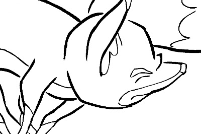
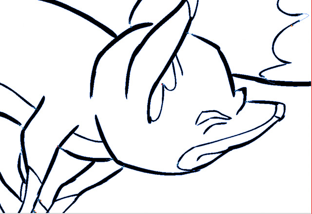
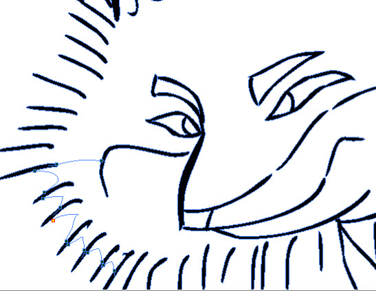
5.  The Art of Hercules,  by Stephen Rebello and Jane Healey. 1997
I have several Art of This, Art of That books, but this one I find myself going back to again and again. The process of character design that is recorded here, beginning with the bizarre yet graceful imagery of Gerald Scarfe and working toward a style that was both distinctive and workable in animation, is a fascinating journey.  Also includes a lot of animation drawings, both cleanup and rough, which are always a delight to me.

6.  The Animator's Survival Kit, by Richard Williams. 2001
Already a designer and draftsman of stature, the author became obsessed with learning animation  and hired a number of great Hollywood veteran animators to work on his films and, along the way, to teach him and his staff what they knew.  His book is an exhaustive distillation of all that lore, plus additional material from his own experience.

7. Prepare to Board, by Nancy Beiman. 2007
Just when I had concluded there was nothing more to be said, this former Disney animator showed me how wrong I was with not just one but two books full of lore, advice and lucid instruction. This one is about effective storyboarding rather than animation as such, yet the two disciplines are inextricably related, and for the independent animator, Prepare to Board is a must-have.

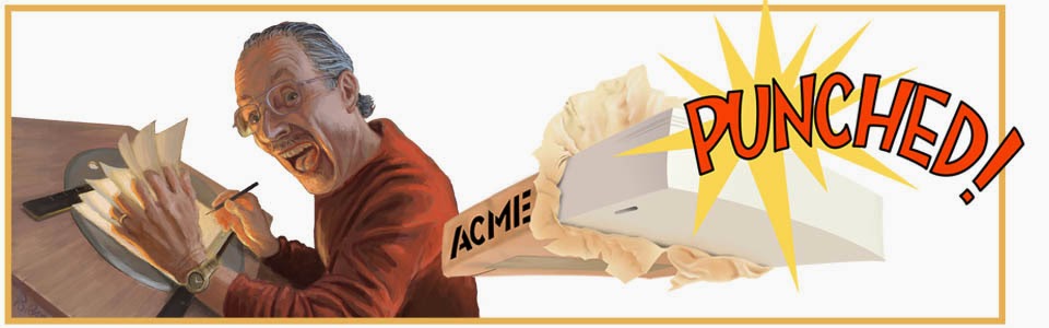
8. Character Animation Crash Course, by Eric Goldberg.  2008
By the animator of the Genie in Alladin and Phil in Hercules, this book is most notable for its demonstrations of the power of the breakdown drawing and also the "punch" that can be imparted to a movement with sudden transitions.  Includes a DVD illustrating every example in the book.

9.  Drawn to Life, vols. 1 & 2, by Walt Stanchfield, edited by Don Hahn. 2009
Compilation of illustrated lecture notes from gesture drawing classes given by Stanchfield at the Disney studio over a 20 year period.  I use these books as a kind of daily devotional, reading only one or two entries a day.

10. Animated Performance, by Nancy Beiman.  2010
Ms. Beiman's second book goes where no author has gone before in terms of laying out the planning behind great animation, and her solid teaching skills combine here with deep knowledge of feature animation to produce a volume full of insight and also some facts I have found nowhere else, such as the difference between a Scene and a Sequence. 


Wednesday, May 30, 2012

No. 5, Problem 1: Fixing a Bad Drawing (Part 4)

Now here is the redrawn anticipation, together with the recovery:
Of course, strictly speaking this is not an anticipation; it is an outside force (the weight and momentum of the goose) throwing the character out of balance.  But in many ways it is like the windup of a baseball pitcher, so it is similar to an anticipation before a major action.

Generally I think it works, so now I will move on to the addition of the detail on the goose, the movement of its wings and neck, and also add in some secondary and follow-through animation showing the woman's dress.  That post will be entitled All the Bells and Whistles.  But it will take me some time to prepare (I really am doing this stuff between postings) and I am about to start a contract job doing animation for a new video game.  Therefore my next post will be a top 10 list of books I consider essential for the 2D animator, which ought to be of interest to cgi animators as well.

Next: Top 10 Instruction Books on Hand Drawn Animation

Saturday, May 26, 2012

No.4, Problem 1: Fixing a Bad Drawing (Part 3)

-->
Although I am now a believer in serious thumbnail planning, I admit that I have always had difficulty judging the timing of an animation with only key drawings to work with in the pencil test.  Suppose you have a character throwing a ball.  You make a drawing each for the starting pose, the anticipation, the pitch, the recovery and the ending pose.  In the pencil test you expose each drawing for its own duration, plus that of all the anticipated drawings between it and the next pose.  Thus, if you have decided that drawing 1 is an 8 frame hold and then there are 8 more frames of movement until you get to drawing 2, you will expose drawing one for 16 frames.  I can imagine this in my head and time out the spacing with a stopwatch, but to string the 5 drawings together in a pencil test and try to decide from that whether it is going to work, is hard for me.  Still, in my time I have done a lot of animation where I did not give the poses enough time to "read", so I am going to work with this a while and maybe I will get it.

Here is a pencil test using the same thumbnails as shown in Part 2.


This pencil test omits the first of the seven poses,
 and you can see that it was done on the upper edges
 of the original drawings.

I think now the poses do read, and so I feel I can proceed to full-size animation drawing now and add more nuance.  Here is the first test with all inbetweens present:

There are 18 drawings here.  The recovery is fine at the end, but the leg comes down too quickly, throwing away the comic effect.  I decide to add 3 more drawings, which will also serve nicely to slow the acceleration of the goose, playing up its weight and inertia.

Here is the new test, now with 21 drawings:


Alright, this all seems to be working well.  One of the new drawings was a single exposure of the kickout, a hyper exagerrated drawing with no drawings between it and the previous extreme.  Everything else here is on 2's.  Here is that drawing in blue and the one following in orange:

Next:  The Anticipation Revisited

Wednesday, May 16, 2012

No. 3, Problem 1: Fixing a Bad Drawing (Part 2)

Fixing the Recovery


A review of the the original scene pencil test (see Part 1) shows some interesting and encouraging things, despite the reconstruction to be done.  For one, the timing is pretty good.  There are three characters, and I am lately learning how to direct the viewer attention to the place I want.  For example, the goose only flaps its wings as the woman is making her slow, slow anticipation before the kick, then stops so we will not be distracted by that.  The man steps back twice, but not at times when that will be a distraction either.

I find nothing wrong with the woman's windup or anticipation,  so I will only have to change her drawings leading into the new extreme I have drawn.  Tilting the goose so far to one side suggests some new business for it but mainly only in the neck and head.

Having to do something over is unfortunate, but as long as one is about it, examining the whole thing is a good idea in case secondary elements could also stand to be plussed.

Looking at the pencil test and the drawings, I feel that the recovery could be better than it is.  The timing is okay but perhaps it could have more punch and a better sense of mass in the handling of the goose.

I start with a new set of thumbnails for the recovery.

Read clockwise 1 thru 7, beginning at upper left.
From the backward tipping point, the character kicks out, throwing some weight and energy to the right, then begins to get control and overcome the inertia of the goose.  At drawing 4 the movement of the goose to the right has picked up speed and now needs to be restrained from going too far. 5 and 6 show the effort of slowing and controlling that mass, and at 7 the character comes to rest.

Here I want to take a moment to recognize the influence of Nancy Beiman in her books Prepare to Board and Animated Performance.   As a self-taught animator who aspires to highly sophisticated animation but has never had the advantage of working in a large studio under the tutelage of masters, I am largely dependent on what I can glean from books.  I will soon add to this blog a critical list of books most useful to animators, but for now I just want to acknowledge Ms. Beiman's stress on working out problems in thumbnail form.

This is not advice I had not already heard, but it was advice I had not taken to heart.  Being, as I have noted, usually the sole member of my studio, I have often been impatient to get into the actual animation without taking the time to plan thoroughly enough.  No doubt this is why I am now involved in this particular do-over.

Nancy Beiman insists that most of the heavy thinking be worked out in thumbnails, and that very rough animation or perhaps the thumbs themselves should be pencil tested for flow and timing.  Too often, I have arrogantly gone ahead and done a lot of detail on a sequence I was sure didn't need to be tested, only to find that I was wrong about that.  Are you getting the idea that this is not the first time I have had to do something over because of poor planning?  


Tuesday, May 15, 2012

No. 2, Problem 1: Fixing a Bad Drawing (Part 1)

They say we learn not from our triumphs but from our mistakes, and I certainly subscribe to that idea.  But it also may be possible to learn from the mistakes of others, so on this blog I am going to expose some of my own mistakes for your benefit.

The mistake in this case was to not plan well enough to get the very best possible storytelling drawing to put across my idea, and the result is a scene that is okay, even perhaps good in many respects but for this one drawing.  Yet this drawing is critical, and its replacement is causing me a lot of work.

Let's first look at the pencil test of the rough animation with all layers present:


My pencil tests are done using Toki Line Test, so as they are intended only as an in-house working tool and not to be seen by anyone but the animator, the contrast is forgiveably poor.  But though detail may be hard to make out, the movement and timing can be seen, which is the important thing.

In the scene previous to this, the man had the goose under his left arm.  He stepped forward and released it into the arms of the woman, who has just caught it as we cut to the scene in question.

The momentum of the goose causes the woman to momentarily lose her balance.  Holding the goose, she rears back, nearly out of control, then suddenly kicks her left foot forward, helping her to recover and go into the stabilized pose at the end.

Only, wait a moment.  Let's look at that drawing where the woman is supposed to be farthest off balance:


Now I take off my animator's hat and and put on the critical hat of a director or supervising animator.  (As a one-man studio, I have to assume all these roles, and more.)  "What the hell are you thinking, Jim?" I say.  "This woman isn't off balance at all.  In fact, she is in perfect control. She even has the center of gravity of the goose right above her own.  It doesn't tell the story, and it isn't funny."

Red-faced, I return to my animator's desk.  The director is right: it isn't funny, largely because it means I have a lot of work to do to get it right.  Many drawings will have to be changed or replaced before this mistake is corrected, which means extra work not only for me, the animator, but also for my assistant (me) and my inbetweener (me again!)

-->
Looking at the drawing, I realize one probable reason it is so constrained: I  had found myself near to the edge of the paper, and I was unconsciously worried about getting it all on.

In cel animation this might have been a real problem, calling for a new layout or complete restaging.  But in my world where dependence on the physical limitations of art materials ends once my drawings are scanned, it is only an imaginary constraint.  I can easily splice more paper onto the edges of my drawings to get the job done.

First  thing to do, obviously, is to redraw that bad extreme.  Here is my result:


Okay, now the woman is in real danger of falling over backward.  The goose is big and it has been flapping its wings, which adds to her instability.  Plus, with the goose nearly turned on its side, there is more of a sense of lopsidedness.  Also its confusion and discomfort  add more humor to the scene.  So I like the new drawing and, more important, the director likes it, too.  (Don't worry that the goose is just a big marshmallow shape right now; that will be taken care of on a second pass, as secondary animation.)

Nothing to it, right?  So now there is nothing left to do but CORRECT ALL THE RELATED DRAWINGS  THAT COME BEFORE AND AFTER IT.

Next:  Fixing the Recovery

Sunday, May 13, 2012

No. 1, Acme punched...what's it mean??


The name Acme Punched? Yes, it really is a joke for insiders. In fact, I feel that if you have to ask what it means, you probably won't be very interested in the blog. But I could be wrong, so... 

Animation on paper is done on dozens or hundreds or thousands of SEPARATE sheets of paper, separate because the process requires that they constantly be re-stacked in various hierarchies, sheets sometimes added, sometimes removed. Animators who work on paper therefore have to have some kind of registration system--that is, a way of always keeping the papers aligned with one another, perfectly, every time, so that the images on the papers will also align with one another the same way every time. 

Early on, a couple of different methods were tried, like tracing registration crosses from one page to the next, or aligning the papers' corners in some kind of frame or jig. Soon, before 1920, a New York animation producer named Raoul BarrĂ©  tried mounting on the drawing boards two round pegs that fit snugly into holes punched into the animation paper. This worked well but was imperfect because repeated pegging of the paper caused the holes to wear until there was too much "slop" in the alignment. 

Eventually someone (Marvin Acme?) invented a three-peg system, with a slot-shaped hole on either side of a round hole. The slot holes were somewhat wider than the pegs they fit on yet snug at top and bottom. The papers could be removed and replaced on the pegs repeatedly with very little wear. 

Perfect? Not quite, because there developed no fewer than four variations of this design, with slightly different centers and measurements, that were simultaneously in use in the United States alone. They were: Acme, Signal Corps, Oxberry and Disney. By the time I began animating with professional equipment in the 1970's, the field had narrowed to two still in common use: Acme and Oxberry. In both, the peg centers were four inches apart, but the Oxberry pegs were narrower and thicker than the Acme. Also, while Oxberry was typically popular in East Coast studios, the West Coast tended to prefer Acme. Thus, and at last I get to the point, when ordering a ream of paper from an animation supply house such as Cartoon Colour Company, one had to specify "Oxberry punched" or--you guessed it--"Acme punched." 

In casting about for a name for this blog, "Acme Punched!" appealed to me immediately as just the right thing, not only for its arcane meaning described above and for the better-known cartoon world meaning of "Acme" as supplier to the roadrunner-hunting coyotes of the world, but because I wanted to express a certain fanatacism for animating on paper:  if you are Acme Punched, you are fatally smitten by this laborious yet fascinating art, from which no amount of CGI cleverness can pry you away. 

For a more exhaustive account of the evolution of the peg system, see this article by animator and instructor Tom Arndt, who coincidentally, was my associate and employer when I first jumped into commercial animation in the late 70's.
Erase Edit
Printable version