Pages

For People Crazy About 2D Animation!

Acme Punched! is for people crazy about 2D animation. It may be enjoyed by beginners and others, but it is aimed at animators who know already something about the process of animation and the basics of character animation. In large part, it will attempt to provide a deep look into the problem solving that goes on in my head as I work out a scene, often in step-by-step posts that I will sometimes enter in "real time", without knowing in advance what the outcome will be. Mistakes and false starts will not only be included but emphasized, so that the creative process of animation will be portrayed realistically. And, while my own bias is for 2D drawn animation, many of the effects and principles discussed here can apply to CGI 3D animation as well. I hope the blog will prove useful and instructive for all.

-Jim Bradrick
Showing posts with label Using Animate Pro. Show all posts

Monday, January 21, 2013

No. 28, Problem Four: Forty Seconds In Two Weeks (Part 4)

After inking the scanned drawings, I blocked in the color with flat fills in a monochromatic palette, then began working up the final colors in both flat and gradient fills.  Here is an early version of the bar, with many elements still showing in various shades of flat blue.


Next is a screenshot with more detail and color worked out; the beer labels, seats and beer pulls have been done.
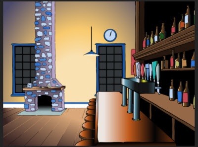
And here is the finished artwork of the same scene.  The fireplace is done and the lamp cord extended.

Next, a shot of the mantle closeup with all the props in place.

Below is the master background for Scenes 3, 5 and 7.  Notice the wreath, shown as a scanned line drawing in Part 3, now in place above the fireplace mantle.  This is a completely new rendering of the fireplace and floor, but the back wall with windows, clock and poster is reused from the bar shot.
You will also see in the shot above that one of the hanging lamps is lighted; it is supposed to be the only light source in the room.  Due to time and budget constraints, I decided to not put in any cast shadows.  These would have added to the drama and effectiveness of the lighting.  For example, the wall just to the left of the fireplace would have had a strong shadow cast by the column of the fireplace itself, and the objects on the mantle in the closeup would have cast shadows off to the left.  However I was able to get a pretty good effect with gradients indicating the source of the light.

Finally here is one more still shot showing the "beauty shot" of the fermenter for Scene 7.  The fermenter was modelled using multiple gradients, and on the conical lower portion, the gradients were set at various calculated angles to fill a series of wedge-shaped areas.  The client was pleased with the result.

Each of the seven scenes I made into a separate Animate Pro file; this is always recommended to keep layers and file size manageable.  Putting all your scenes in one file can otherwise be a nightmare to work with, partly because the timeline becomes so long it it hard to navigate.

My part was now about done.  I exported each of the scenes into a folder of png frames and sent them to my partner,  Don, for assembly and post production.  Because he had a plug-in that would create a good snowfall effect in Adobe After Effects, I had left the window panes transparent, and the png format supports the transparency.  Don then brought all the scenes together in Aftert Effects, added the fades and dissolves, and put in the snowfall effect both behind the windowpanes (for which Don requested a snowbank background to match the snowbanks in the exterior shot) and in the opening exterior shot itself.  There were some technical problems with the transparencies, but finally it all came together visually.  Don then added music, sound effects and the closing logo and titles, staying up most of the night since we were a day behind schedule.  He delivered the finished movie about noon the next day.


And now, all done in about two weeks time, here is the final 40-second movie:
 

Next:  Problem Five: The Fox Comes Down

Thursday, January 17, 2013

No. 27, Problem Four: Forty Seconds In Two Weeks (Part 3)

Storyboard to Production Art


With the storyboard approved, I was anxious and able to get to work on the actual production artwork.  First I created detailed "tight" pencil drawings of all the elements--backgrounds, props, Santa--everything except one view of the client's product, a beer fermenter that was to be the showpiece of the last scene.  This would be created from a photograph provided by the company.

Here are a few of the drawings:

The bar with long shot of the fireplace.  This was the most complex drawing of the whole project.
The mantle in closeup.


These were all scanned and imported to Animate Pro, each on its own layer, ready for tracing and color.
Finally, there was the fermenter, a shiny stainless steel tank on a stand, with valves and pipes.  Though I had good color photos of this, I felt that the lighting depicted was not right for the setting, so in Photoshop I stripped out all the color, made it into a high-contrast black-and white-image, and then deleted all but the most essential linear elements.  This is what I then imported into Animate Pro:
The fermenter in linear form. 
From now I would be doing everything entirely in Animate Pro.  After inking everthing in black with a thin but variable brush, I then filled all the forms with temporary colors, using a palette limited to just six values of blue-gray.  This was partly to establish my value range and partly to prove that all the inking gaps were closed.


Next: Color and Movement, and the Finished Movie

Thursday, January 10, 2013

No. 25, Problem Four: Forty Seconds In Two Weeks (Part 2)


The Storyboard


Here is the whole storyboard, panel by panel:
T
This storyboard was accepted enthusiastically by the client, with only two changes requested:  they wanted to start with an exterior shot of the brewpub--really, more of a large brewery--and to have a greeting card placed on the fireplace mantle.

My partner, Don, did a color comp of the exterior:
By now it was December 11, so we asked for a few days extension and they agreed to delivery on the 19th.  But now I had the green light to go ahead; I had to take all the elements from the storyboard and put them into a form that would work in Animate Pro.


Let's now evaluate what was required to get this little production out the door:

A--Background Art
One highly detailed view of the bar and taproom.  This was conceived in one-point perspective so that the back wall would work both with the wide taproom shot and also with the medium to close shot of the fireplace.

Another detailed background had been added: the opening exterior shot.

A closeup shot of the fireplace mantle, fairly simple.

B-Complex Props and Objects
This includes several shots of the client's tanks and other projects, with accurate logos.  Some logos would be hand-drawn, some taken from photos.  The beauty shot of the fermenter that is revealed when the bag falls open was a photo manipulated into line art in Photoshop, then further rendered and colored in Animate Pro.  This was the most critical and complicated element to do.

C-Simple Props and Objects
This category is comprised of all the mugs, plates, pretzels, the legs and arm of Santa, the wreath and the Christmas tree.

D-Animation
Aside from the snow falling, which was done with an automated process in Adobe After Effects, there were only three elements to animate: the beer foam sliding down the glass, Santa's arm reaching in, and the bag falling to the floor.  Only the bag would require multiple drawings.

E-Camera Moves
To be done in Animate Pro.

F-Post Production
 Includes FX such as dissolves and fades, SFX like sleigh bells and munching,  and music.  The end title card also ended up as a post production item .  Don was in charge of all this, but he couldn't start until I did my part.


Next: Getting the Art Into Toon Boom

Saturday, January 5, 2013

No. 24, Problem Four: Forty Seconds In Two Weeks (Part 1)

The Concept


Early in December, I got word from my associate and sometimes partner Don Wallace that he had had a request for a Christmas holiday ecard to be custom made.  The client did not know much about animation, and as is usual in such cases, had no idea of the cost or of the time involved in producing animation.  The client's original idea was far too ambitions for both the money they had to spend and the time allowed.  It had to be done by around December 15.

Don and I decided to counter propose with a concept that was doable both in time and money, yet which would be attractive and also fun to do.  Fun and creative stimulation are things I try to find or inject into all my projects.

The Counter Proposal


So far in this blog I have put a lot of emphasis on full animation, no matter how much time it takes.  This is possible because 1) my film, The Crossing, is a personal project with no deadlines, because 2) I am semi-retired and have a lot of time for it, and because 3) I have a lot of passion for that kind of animation.

But in reality, I am well schooled in time- and labor-saving techniques for just such a project as this one, and I know how to get a good-looking result in a short time.

I conceived an ecard that would get most of its movement from the camera, that would involve just a couple of elaborate backgrounds, and where the only place I would use full animation was in one climactic shot where that animation would consist of only about 15 drawings.

After conferencing with Don on the phone, I wrote a verbal script of my idea.  He submitted it to the client and got their approval.

I began drawing master layouts of the concepts that would make best use of our ideas of camera movement to tell the story.

The client was a metal fabricating company specializing in tanks and other equipment for brew pubs.  I looked at a lot of pictures of brewpubs and taprooms and came up with this drawing showing a "typical" taproom decorated for the Christmas season.  This is a freehand drawing, but it does conform to one-point perspective, with the vanishing point visible just to the right of the right-hand window.

This is another key layout showing how Santa would be standing at the hearth of the fireplace.  It was later decided at Don's suggestion that Santa would not be seen in full figure, that it would be more mysterious to show only parts of him close up, but this drawing was necessary for me to fully visualize the setup, of which I would be showing only details.

If you compare these two drawings with those of the storyboard or of images from the final film, you will see that it was also determined that the tables and chairs were unnecessary complications.


Two days later I submitted the storyboard.

Next: Storyboarding the e-card


Thursday, December 27, 2012

No. 22, Drawings into Digital: Part 4--Painting

Once you get your gaps closed (see Part 3), the painting is easy.  One thing you want to be sure to do right, though, is manage your palettes. Coloring anything that you might want to color again, without saving and labelling the color systematically, will be a mistake.

 Here is a shot of the basic Animate Pro palette:


Pretty simple, isn't it?  But this palette is just a jumping off place.  You can create hundreds or thousands of colors if needed, just by clicking on the New Color button, which is the + button at upper left.  Click  inside the color box, and you will be taken to Toon Boom's master palettes, where your choices are virtually limitless.

Here is my palette for the colors to be used in this scene:


In my case, I am still at a stage of production where I am not quite sure if the colors I am using for my characters will be the final choices.  But having labelled them Man Skin, Man Overalls, Fox Red, or whatever, I can then come back and change those colors in the palette, and everything that has been paiinted with the color of that name will change accordingly.  So not being sure of my colors turns out not to be a problem.

Here's an example of the first frame of the scene showing three layers (from the bottom: man, fox, tail) all assembled.

First frame of the scene, painted and assembled, but without the background.
Following are a couple of examples of the painted artwork of shots mentioned in earlier posts about this scene.

A shot of a fast motion double image of the fox, showing how I handled the coloring of the second "ghost" image.

A frame showing the fox's fur all bristled out, just after he shakes himself.

And finally, here is the last frame of the scene in full, anti-aliased render mode:


Next: The Whole Scene!

Sunday, November 25, 2012

No. 21, Drawings into Digital: Part 3--Closing the Gaps

As pointed out in Part 2, my use of a broken line inking style requires an extra operation using the Stroke tool to close the gaps in each paint area; otherwise, because the gaps are too large for automatic closing, the areas will not fill with color.

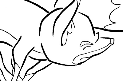
Here is an example of an inked fox image:
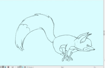
A fox image, inked but not yet ready for painting because of the large, deliberate gaps in the lines.

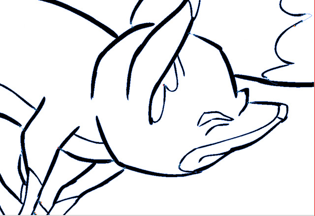
The large gaps shown here should be closed using the Stroke tool, which is on the toolbar in a pull-down menu with the Paint tool.  The Stroke tool is applied as you would use the pencil tool, in whatever straight or curved or even meandering style you care to employ.  It is important to understand not to use the Close Gap tool for these large gaps, because the Close Gap tool, while it will indeed close any gap, will always take the shortest and straightest path between the two points you are connecting, whereas you will find that you often may want to follow a suggested curve or other path when connecting two points.  For example, if I wanted to close the large gap at the back of the fox's head in the above illustration, I would want to follow the arc of the two lines being connected.

Here is the same image with the connecting strokes applied and made visible in blue.
A detail of the first image, with connecting strokes visible.
Note the stroke connecting the two curved lines at upper right.  This is an example of my stroke line completing the curves of the inked  lines and coming together in a soft point .

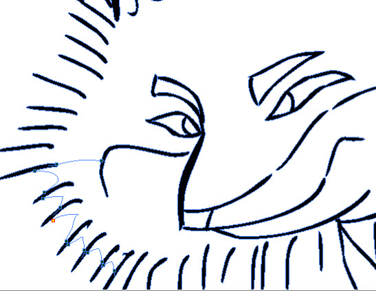
Here is an even closer view of the nose and brow area of the fox:
This shows clearly the strokes (in blue) connecting the line gaps in just the desired way.

When using the Stroke or Brush or just about any other  tool, be sure to take advantage of the instant-response Rotate View tool.  This is one of the greatest and most useful tools available in most of the Toon Boom family of products from Studio on up through Animate Pro and Harmony, allowing you to spin your drawing surface to obtain the most effective angle for your hand.  Rotate View is accessed on the Mac by pressing Alt+Command, and by a similar key combination on the PC.  The drawing disc icon that appears indicates its function; it is just like spinning the animator's  drawing disc that was set into a traditional Hollywood studio animation desk.

Sometimes the Stroke tool may be used in a more free-form or creative way than just for closing obvious gaps in lines.  Here is an example of that.
.  The gaps between each pair of border lines are connected using a line with a curve not based on the angles or curves of the inked lines.
Here the radial lines indicate the bristling fur of the fox.  I could have simply connected the lines with an arc perpendicular to the inked lines, but I wanted to finesse and soften the connections.  With the Stroke tool, this was easy to accomplish.

Next: Painting the Images


Wednesday, November 14, 2012

No. 20, Drawings Into Digital: Part 2--Inking

The scanned drawings are imported as batches into the timeline, all the drawings of each level to a new layer. The timing will be worked out later.  In my case, I have already worked out the timing in the pencil tests I did in Toki Line Test, so I will refer to the Xsheet from that when  spacing the drawings.

Here is what the timeline looks like after the  drawings are imported:

There are five layers of drawings showing here: Man, Tail_Behind, Body (the fox's body), Tail_infront, and Fur.  Above each of these layers I have created a drawing layer with the same names repeated, but in capital letters: MAN, TAIL-BEHIND, BODY, TAIL_INFRONT and FUR.  These are the layers I will be inking on, tracing from the layer below.

Note: I should mention that what I describe here is my own system.  Of the kinds of animation it is possible to do in Animate Pro, Toon Boom provides the least information and guidance about importing completed animation drawings.  No doubt this is because it is the least popular type of animation among its user base, so there is less demand for technical help, and because animators who can do all their animation on paper before entering the program usually know what they are doing.

At any rate, the drawings here are arranged in ascending number order in each layer, but the drawings of one layer do not yet have any meaningful relationship to the drawings of another layer.  For example, drawing 1 of the Body layer is meant to be held for many frames, but until it is inked and painted it will occupy only one.

I now begin the inking process, which looks like this:

The red frames on the layer BODY are the inked frames of the layer Body, directly below.

I have chosen a style using two weights of brush line, which are basically the default brush 2 and the default brush 3, although I have changed the property values of each somewhat.  Brush 2 gives a thin line without much variation, while brush 3 has a heavier line with a lot of thick and thin variation.  You will want to experiment to get the right amounts of Minimum and Maximum Size, and of Smoothness and Contour Optimization for your own purposes.  On the fox character I am using brush 2 for interior lines and anything else that is of a delicate nature, like the outlines of the lower legs.  Brush 3 is for everything else.

Also because I like the look, I am allowing the line to break, or to not always connect with other lines.  This will necessitate a lot of work with the Stroke tool, which adds invisible lines to connect these gaps.

Here is a closeup showing the inking being applied over the bitmap scanned image.  The scan was at 150dpi.  It is blurry and I was forced to refer frequently to the actual pencil drawings to be able to make out some details.

Since scanning these, I learned through an exchange on the LinkedIn group Animation Community Platform that I could be scanning my drawings vectorized rather than bitmap.  Here is an example, showing the much higher quality:
A grey mode vector scan, this time over a blue color card.
The vectorized scan also gives me alpha transparency, which the bitmap image does not.  I will be using this type of scan from now on.

Next: Closing the Gaps