Pages

For People Crazy About 2D Animation!

Acme Punched! is for people crazy about 2D animation. It may be enjoyed by beginners and others, but it is aimed at animators who know already something about the process of animation and the basics of character animation. In large part, it will attempt to provide a deep look into the problem solving that goes on in my head as I work out a scene, often in step-by-step posts that I will sometimes enter in "real time", without knowing in advance what the outcome will be. Mistakes and false starts will not only be included but emphasized, so that the creative process of animation will be portrayed realistically. And, while my own bias is for 2D drawn animation, many of the effects and principles discussed here can apply to CGI 3D animation as well. I hope the blog will prove useful and instructive for all.

-Jim Bradrick
Showing posts with label technology. Show all posts

Sunday, August 3, 2014

No. 71, Me vs Toon Boom StoryBoard Pro, Part Three


The Moving Storyboard


Now we get to the point where StoryBoard Pro is not just a storyboard platform but also a tool for creating an animatic. Like the storyboard itself, the animatic is a planning tool for discovering the best way to tell a story and for discovering problems before all the expense of creating animation and full production art.  Where a live-action film maker might shoot footage at a ratio of ten feet for every foot used in the final edit, the goal of the animation studio with its highly expensive and labor intensive production cost, was a ratio of one to one.  The storyboard and especially the animatic could make that happen.

Originally called a Leica reel, the animatic is a filmed (or videoed) storyboard, with the duration of each panel timed to play as nearly as possible to the calculated length of the same action in the final animation.  Thus an accurate animatic lasting ten minutes and twenty-two seconds onscreen will represent the final production lasting the same amount of time.

One thing that SBP can do is help the animator to accurately time transitions and certain types of movement upon the screen.  Here is my first example from the developing storyboard for my new film The Two Washingtons.


This is the establishing shot for the whole film.  Looking through the grid of a window, we see a huge jet taking off.  An appropriate sound effect will be added.  Then we dissolve to the interior of the airline terminal building, immediately pulling away from the window and widening out to reveal the large gate area crowded with people waiting for their flight to be called.  The background sound will change to the ambience of an airport building, with murmurring voices, footfalls, and the occasional PA announcement.

To accomplish this little sequence I used three of SBP's effects: 1) an animated layer (the airplane), 2) the cross-dissolve from the airplane shot to the interior shot, and 3) a long camera truck-out from the window to a wide shot of the whole room.

Let's think about it piece-by-piece.  The airplane shot might have taken from two to four frames of a conventional storyboard.  Limited to that, I think I would have done it like this:

How this shot might look in a conventional storyboard.


But SBP allows me to do it with just two drawings, the airplane and the window grid, and the result is about as good as I could hope to make it in the final film!

The Animated Layer


The animated layer is about as simple to do as can be.  You select your panel, then the layer you want to animate.  (Of course you will have to have planned this as you constructed your storyboard, so that anything moving will be on its own layer.  If you think something in a scene might move, or of course if the background is to be used in more than one panel, then you should be thinking and working in separate layers.) Next, you use the First Frame Transform tool and manipulate the image to its beginning position.  All the basic transform functions are available, so you can not only reposition but scale, skew, rotate, and so on.  In the case of the airliner, I slid it down out of the camera frame at lower left and also scaled it proportionally down.

The green rectangle is the camera field.


Then I clicked Last Frame Transform and pushed the airplane image off the screen at upper right.  Done!  The plane appears to be taking off outside the window, growing larger as it rises.


This is not actually the last frame position, because that happens near the end of the cross dissolve and is therefore nearly transparent, but it is near the end.


Camera Move

The second panel is done not as a layer move but as a camera move.  With the chosen panel selected, click on the Camera symbol in the toolbar, then open Tool Properties.

Tool Properties panel for Camera
As I am still learning this program, I do not yet fully understand the sections of this panel called Selected Keyframes and Static Attributes.  Here we will be concerned only with the top section, Camera Transform.

From left to right, the first three symbols are: 1) Set Keyframe at Beginning of Panel, 2) Set Keyframe at Current Frame of Panel, and 3) Set Keyframe at Last Frame of Panel. In my shot of the airport interior, I have used just 1 and 3, because the camera is to move throughout the shot. It is important to set both these keyframes, first and last, before moving your camera.  When you do this, the camera fields start out the same for both frames, so they are superimposed.  But at the bottom of the field, there is a green square for the first frame and a red square for the last.  Click and drag on each of these squares to adjust your opening and ending positions.  Here is what mine looked like after making those moves.

The panel in Camera View, clearly showing the move from start (green) to finish (red).


Note: a change in rotation is also possible here, as for example I could have rotated the green window so that the horizontal window bars started out parallel with the match shot in the previous panel.  I decided this was unnecessary however.

I am not quite finished here.  Rather than have the camera move at a constant rate, I decided to add ease in and ease out on both ends, but at different rates.  To do that, go to the Ease In, Ease Out lines in the Camera Transform box and just enter values for the durations of those eases.  In this case I chose 10 frames for the ease in (less than half a second at 24fps) and a full two seconds for the ease out.  These are easy to keep adjusting until they feel right.


The Transition

The last thing I have to do in this little two-panel scene is to add a smooth transition between panels. Find the New Transition icon in the toolbar and click on that.  I want to do a simple cross dissolve, which is the default option. There are also some wipe options.  Select the transition you want by double-clicking on the transition symbol on the timeline, or use the panel view.  The duration of the transition can be changed by pulling the edges of the transition symbol to left or right in the timeline.

Again, I applaud the ease of use of these functions.  I figured all this out and set it up in far less time than it took to write about it.


Next time I will show you another example of camera work in SBP, and I will also talk about some drawing options that are not available in Animate or Animate Pro.

Monday, July 14, 2014

No. 70, Me vs Toon Boom StoryBoard Pro, Part Two

The Hybrid Approach

 I still like drawing on paper.  Are you surprised?

Last time I featured mostly images that were drawn directly into StoryBoard Pro with a stylus and my Wacom tablet.  As I continued my exploration of SBP, I found that some complex setups were, for me, better done by working on paper, then importing the image into the program.  Could I have done them paperless?  Yes, but I think it would have taken me a longer time, and storyboarding is often required to be done quickly and efficiently.

Each user should make her or his own decision about this.  Yeah, I am an older guy with a long history of composing my work on paper, so that is my inclination.  If you grew up with computers, it will likely be easier for you to go all digital, and your results may be just as good that way.  I have plenty of respect for the all-digital artist.

However, Toon Boom has not neglected us paper-bound animators.  They have always accommodated import and scanning of hand-drawn and bitmap images of all kinds, including color images.

Smart Use of Your Smart Phone

My own procedure with animation drawings has been to scan them in with a Mustek scanner, with the Acme punched (there's that term again!) paper registered to a taped-down acme peg bar attached to the frame of the scanner, outside the scanning field.  For storyboard images, I could do something similar, but I have realized there is an even easier way.

A smartphone plus drawings equals easy import of rough pencil drawings.


Laying the drawings out flat on my desk, I just stand up and shoot photos of them individually with my iPhone.  Then I connect the iPhone to my laptop, open iPhoto, import the images, and copy them from iPhoto into a folder.  They come in as jpegs, and from there I can import them directly into SBP.

The raw smartphone image.


However, I do sometimes add one more step, which is to first bring them into Photoshop, crop them to get just the part of the image I want, and manipulate the brightness and contrast.  It is faster than using the scanner, and you can do it in a coffee shop or anywhere, with only your laptop or tablet plus your smart phone.

The same image brightened and cropped in Photoshop.


I would not use this method for any precision image such as a background layout because there can be slight distortions in perspective and proportions, but in the rough and sketchy world of storyboards, the results are perfectly acceptable.  You can still use that image as a rough layer, re-drawing the appropriate parts of the image onto separate layers using the SBP drawing tools.  This is what I refer to as the hybrid approach--combining imported rough pencil sketches, with final drawings made using SBP's drawing tools on layers above.

Try it!

The imported image partially inked with SBP drawing tools.


Exporting the Storyboard to PDF


I had a question from a reader this week about exporting from SBP to PDF; specifically, how to do it so that the Dialog  and other written notes would export and appear with the panels in the PDF.  Exporting to a printable format is of course often a desirable way to share a storyboard, making it possible for individuals to make notes and suggestions on paper that may then be considered as revisions.

I did some experimenting and found that this will work only if you choose certain options under PDF Export Parameters in the Export to PDF window.

The Export to PDF window, with 3 Panels Vertical selected.


My findings are that the first four options--3 Panels Horizontal, 3 Panels Vertical, Full Page (one panel) and Overview 2x4 Panels--all will include any notes or dialog in the PDF.  The others--Overview 4x3, Overview 8x10 and the Japanese formats--apparently will not.  These formats include so many panels per page that there is no room for the notes.

Caution:   In the formats that will include notes, if your notes run especially long, they will still be included, but at the expense of bumping one or more panels onto the next page.


Next:  Storyboards That Move!


Wednesday, July 2, 2014

No. 69, Me vs Toon Boom StoryBoard Pro, Part One

Whenever I take on a new software application, there is of course a period of intense struggle, the learning wall that I must climb before the program can be any fun to work with.  This is inevitable, and I have come to expect it.

In the case of Toon Boom's StoryBoard Pro, the wall was a short one, and I was boosted over by my previous experience with Toon Boom's other applications: first Studio, beginning back in 2006, then Animate and, finally, Animate Pro 2.  This was helpful because of the great similarities in the UI and terminology among the various ToonBoom applications, so that even as I opened the storyboarding program for the first time, much of what I saw in front of me was familiar--the same tools, icons, and organizational structure that I already knew.

Furthermore, Toon Boom's unparalleled tutorial resources which they provide free for all their applications, plus other tutorials both amateur and professional on You Tube, help to answer the many questions that arise when attempting to master StoryBoard Pro or any of their other products. Why all other software companies do not make similar efforts to freely educate the public in the use of their applications, preferring to rely on pay tutorial services, I do not understand.  The more people there are who know how to confidently use your product, the more likely it is that it will be bought and used.  Toon Boom has certainly got the right idea here.

The big attraction for me to StoryBoard Pro was its capability to generate animatics complete with camera maneuvers and soundtracks.

The big challenge for me, I knew, was to learn to comfortably draw directly into the panels with my stylus and Wacom tablet. 

Working With a Script

 Using as my test project the concept I call The Two Washingtons, the same one for which I have recently recounted my character design process [Acme Punched! posts no's 64 and 65], I started by writing a script complete with dialog and camera directions, during the course of which one of the two main characters changed completely in concept and had to be re-designed (see below.)

A change in character often necessitates a change in design.


The script notations included a sequential number for every scene (or camera shot, as it is called in live action.)  My script had 24 scenes, so when I opened StoryBoard Pro for my new project, I laid out 24 scenes and copy-pasted the directions for each scene from the script into the Action Notes box in the Panel View.  (I should note that as I write this, some of the staging for what is now scene 24 is unclear in my mind, and so I expect that when I get to that point in my storyboard, it will end up being divided into several more scenes. But the flexibility of StoryBoard Pro facilitates changes, just as in a paper storyboard, easily allowing additions, rearrangement and deletions, so this does not worry me.)

A section of page 1 of my script.

The script for Scene 1 pasted into the Action Notes window in StoryBoard Pro.


Using a written script may not be the best approach for everyone.  Some may prefer to work from the outset with visual representations of the scenes, but I have some experience in writing fiction and live-action scripts and so it appeals to me as the right way to begin.

Thumbnails

Along the way I was making thumbnails on paper which I kept before me as I worked. These were just quick sketches, only a few inches or centimeters high,  of poses and situations that I was visualizing as I worked through the script, and which I jotted down quickly without regard for character accuracy or precise drawing.  This can be a valuable way to work, and I recommend it.

Early thumbnail sketches.


Bitmap or Vector?

 The StoryBoard  Pro application allows drawing in either bitmap or vector modes, though not both on the same layer.  The default layer choice is vector (I did not find a way to change this), and after some experimentation I found this to be preferable because of the smoothing property, a feature found in many vector drawing apps.  This property may be set at any percentage from 0 to 100 and will help remove shaky or hesitant tremors in any drawn vector line. I like it set at around 20 most of the time, but this will be different for each artist.  Setting the smoothing very high, however, can cause the algorithm to redraw your line without any of its original character, so this should usually be avoided.

Testing three settings of the Smoothness property in vector inking.
Here I inked one rough drawing three times, using no smoothing, 50% smoothing and 100% smoothing, as indicated.  If you look closely, you can see that the 0% setting gave me the most faithful rendering of the rough, yet it contains some nervous lines at the top of the cap.  At the other end of the scale, the 100% setting straightened some curves completely (under the eye and at the mouth) and made very small detail almost impossible to render.  Drawing a round pupil in the eye was not possible, and getting it as good as I did required 4 or 5 repeated strokes.  Even the 50% version was taking too much control of the line to suit me.

Another advantage of vector inking, or course, is that the lines remain crisp at any scale.

Keeping It Rough

 With the idea of ending up with not just a storyboard but an animatic, I found that a good way to work was to go through the entire board in very rough form, using separate layers for whatever elements in the scene will be shown to move or change. 

In the course of roughing out the storyboard, new ideas for movement, transitions or other changes will naturally present themselves. If you are working rough, it will be less painful to create the necessary layers or panels to accommodate these new things than if you were working in a more finished way.

Rough storyboard panel.  The black rectangle is the camera field, which will be adjusted later.
I have roughed in more than half of this storyboard as of this writing.


Next: Part 2, The Hybrid Approach


Thursday, May 15, 2014

No. 64, My Process of Character Design, Part One

First, a note about the imminent discontinuance of a software application that has been an important part of my pipeline:

No More Toki Line Test


Got an email this morning, as did all other of their users, that Digital Salade is discontinuing sales and support of Toki Line Test by the end of this month (May, 2014.)

This is the pencil test program, costing just $100, that I have been using and recommending since I first signed on in October, 2011. I regret that they are discontinuing the program as their support was always first rate and very personal.  Of course the application will continue to function indefinitely, perhaps for years, and I expect to continue using it for the forseeable future.  But I can no longer recommend that anyone else take it on.

My Character Design Process


Character design is fun!  Anyway, I think so.  I have always enjoyed it since as a boy I used to try to design cartoon characters, superheroes, and others. My limited drawing skills were a frustration to me at the time, but I persisted until I could do it.

My natural tendency in character design leans toward classic Disney, which means I design from the same standpoint as a Maya designer: I am thinking in the round, as if my 2D drawings are just single viewpoints of a character I have visualized in three dimensions. From my designs a sculptor would have no trouble building a macquette or 3D model.  I have just learned that there is a term for this approach: centerline design.  I found this term in Amid Amidi's wonderful book Cartoon Modern (Chronicle Books, 2006.)  This book is devoted to alternative character and background design in animation, popularized in the United States in the 1950's and 1960's.

A double-page spread from from Cartoon Modern, by Amid Amidi, showing designs for Tex Avery's Symphony in Slang (MGM, 1951.)


The studios producing American theatrical cartoons were resistant at first because most of their artists and animators were uncomfortable doing anything besides the tried and true style exemplified by Tom and Jerry, Donald Duck, Bugs Bunny and Woody Woodpecker, and because the producers and distributors were afraid of such radical change.  Yet their were some designers among them, mostly younger men and a few women, who were eager to experiment and try new things.  Even at Disney there was a modern design mole hidden at the very top, among the famous Nine Old Men: Ward Kimball, who went from animating the stereotypically centerline character Jiminy Cricket in Pinocchio (1940) to the semi-modern Cheshire Cat in Alice in Wonderland (1951) to directing the ultra-graphic and revolutionary theatrical short Toot, Whistle, Plunk and Boom (1953).

While this modern design was at first used with great charm and thoughtfulness, in animation that remained lively and entertaining, its utility in the eyes of producers as a cost-cutting technique eventually devolved into the boring, tiresome and often ugly product called limited animation that dominated television cartoons from the mid-1960's onward.   But don't get me started about that!  (We hold these Filmation truths to be self evident.)

On the left, Centerline Albert. On the right is one way that a Modern Design Albert might look.


Centerline, on the other hand,  is perhaps not a self-evident term.  It seems to refer to a design principle found in organic forms in nature: bilateral symmetry, meaning that many living things, including humans, have a right half and a left half that approximately mirror one another.  It is the starting assumption for this kind of character design.

Modern design turns all this on its head; modern design approaches character design mostly as a silhouette, and it takes from abstract modern gallery art the concepts of simplifying form, of using the clearest angle of a form as its primary shape (the eye as viewed from the front; the nose and ear as viewed from the side of the head), and of largely ignoring or distorting principles of perspective and foreshortening, and rotation of solids.  Note the difference in the two approaches to my Albert character, above.

And while I remain fond of centerline design, and will continue to use it, I am also attracted to this modern design.  For my new project The Two Washingtons I feel it is an agreeable design avenue, so I am stepping a bit outside my comfort zone to push my characters in that direction.  Here's just one example where I took a character concept in an entirely new direction:

First and second draft of character design.


Next: How All the Characters Were Changed


Thursday, May 30, 2013

No. 40, Scanner Trouble, Part 2: My Solution

If you recall, I had complained here about the fact that my upgrade to Mac OS 10.8, known as Mountain Lion, had rendered my Mustek large format scanner useless: no drivers available!

My scanner was, in the words of another online complainant, no better than a doorstop--a dead weight.

My goal was to try to find a fix for this other than replacing the scanner itself.

First, of course, I tried software.  Nothing worked, including VueScan, where I actually talked to the owner, who said that scanner drivers are notoriously badly written.  Mustek's website said to go to Apple and get a driver from them, but there was nothing there.

Then I thought: what if I could get an old Mac that was still running on an earlier operating system, and dedicate it to the scanner?  And that is what I did.  The scanner is now paired with an iMac running Snow Leopard.  I did still have to download a driver for that, but it worked.

The Mountain Lion is tamed!


Now I am happily back in business!

A special thanks to David Nethery, who posted a comment just a few days ago suggesting both Vue Scan, which he didn't know I had tried, and the fact that Brother makes a couple of scanners that might have done the job for me, had I found it necessary to replace the Mustek.

Sunday, January 13, 2013

No. 26, Scanner Trouble

Mountain Lion Can Be Dangerous!


I am a long-time Mac user, and I felt I had gone too long without upgrading my operating system.  Last month I was still on plain Leopard, which was three upgrades behind.  Software was beginning to appear on the market that would not run on Leopard, so I had to first move up to Snow Leopard before I could move on to anything else.  But then I was able to leap over Lion to the current system, Mountain Lion.  Up to date once again, I could breathe a sigh of relief, until...

Until I attempted to scan a drawing.  First it crashed Photoshop, repeatedly.  Photoshop CS4 is what I have always used to import images from my scanner, a Mustek large-format flatbedl, the model A3 USB 1200 Pro.  I recently wrote glowingly about this scanner in my post Drawings Into Digital: Part 1--Scanning.  That was in early November of last year.

A paperless drawing.  Yes, I can do them, but I still want my scanner back!


Now I am out on a limb.  It turns out that Mustek does not have drivers for their scanners which work on OS 10.7 (Lion) or 10.8 (Mountain Lion).  For me, this is bad news.  My Epson Stylus CX5000 all-in-one (scanner, printer, copier) also will not work in scanning mode, but I could replace it for about US$80.  I can't replace my Mustek large format scanner so easily, and it is very important to my work.  As an animator who works on standard animation paper, which is 10 1/2" x 12 1/2", I have to have a large format scanner to get my hundreds--sometimes thousands--of drawings into the computer efficiently and in correct register.

My hope is that Mustek will soon provide the needed drivers, and I will be back in business.  My hope is that it is fair to say that they do not yet have the drivers--but that they soon will.

Anyway, for now I hope other Mac users who depend on their scanners will be alerted to this problem.  I will be posting some warnings on Linked In animation group sites also.

Sunday, November 25, 2012

No. 21, Drawings into Digital: Part 3--Closing the Gaps

As pointed out in Part 2, my use of a broken line inking style requires an extra operation using the Stroke tool to close the gaps in each paint area; otherwise, because the gaps are too large for automatic closing, the areas will not fill with color.

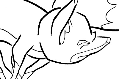
Here is an example of an inked fox image:
A fox image, inked but not yet ready for painting because of the large, deliberate gaps in the lines.

The large gaps shown here should be closed using the Stroke tool, which is on the toolbar in a pull-down menu with the Paint tool.  The Stroke tool is applied as you would use the pencil tool, in whatever straight or curved or even meandering style you care to employ.  It is important to understand not to use the Close Gap tool for these large gaps, because the Close Gap tool, while it will indeed close any gap, will always take the shortest and straightest path between the two points you are connecting, whereas you will find that you often may want to follow a suggested curve or other path when connecting two points.  For example, if I wanted to close the large gap at the back of the fox's head in the above illustration, I would want to follow the arc of the two lines being connected.

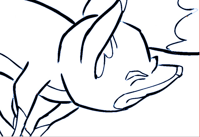
Here is the same image with the connecting strokes applied and made visible in blue.
A detail of the first image, with connecting strokes visible.
Note the stroke connecting the two curved lines at upper right.  This is an example of my stroke line completing the curves of the inked  lines and coming together in a soft point .

Here is an even closer view of the nose and brow area of the fox:
This shows clearly the strokes (in blue) connecting the line gaps in just the desired way.

When using the Stroke or Brush or just about any other  tool, be sure to take advantage of the instant-response Rotate View tool.  This is one of the greatest and most useful tools available in most of the Toon Boom family of products from Studio on up through Animate Pro and Harmony, allowing you to spin your drawing surface to obtain the most effective angle for your hand.  Rotate View is accessed on the Mac by pressing Alt+Command, and by a similar key combination on the PC.  The drawing disc icon that appears indicates its function; it is just like spinning the animator's  drawing disc that was set into a traditional Hollywood studio animation desk.

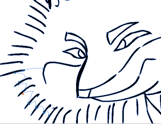
Sometimes the Stroke tool may be used in a more free-form or creative way than just for closing obvious gaps in lines.  Here is an example of that.
.  The gaps between each pair of border lines are connected using a line with a curve not based on the angles or curves of the inked lines.
Here the radial lines indicate the bristling fur of the fox.  I could have simply connected the lines with an arc perpendicular to the inked lines, but I wanted to finesse and soften the connections.  With the Stroke tool, this was easy to accomplish.

Next: Painting the Images


Wednesday, November 14, 2012

No. 20, Drawings Into Digital: Part 2--Inking

The scanned drawings are imported as batches into the timeline, all the drawings of each level to a new layer. The timing will be worked out later.  In my case, I have already worked out the timing in the pencil tests I did in Toki Line Test, so I will refer to the Xsheet from that when  spacing the drawings.

Here is what the timeline looks like after the  drawings are imported:

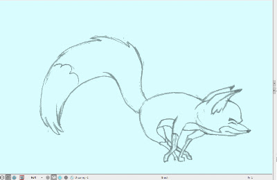
There are five layers of drawings showing here: Man, Tail_Behind, Body (the fox's body), Tail_infront, and Fur.  Above each of these layers I have created a drawing layer with the same names repeated, but in capital letters: MAN, TAIL-BEHIND, BODY, TAIL_INFRONT and FUR.  These are the layers I will be inking on, tracing from the layer below.

Note: I should mention that what I describe here is my own system.  Of the kinds of animation it is possible to do in Animate Pro, Toon Boom provides the least information and guidance about importing completed animation drawings.  No doubt this is because it is the least popular type of animation among its user base, so there is less demand for technical help, and because animators who can do all their animation on paper before entering the program usually know what they are doing.

At any rate, the drawings here are arranged in ascending number order in each layer, but the drawings of one layer do not yet have any meaningful relationship to the drawings of another layer.  For example, drawing 1 of the Body layer is meant to be held for many frames, but until it is inked and painted it will occupy only one.

I now begin the inking process, which looks like this:

The red frames on the layer BODY are the inked frames of the layer Body, directly below.

I have chosen a style using two weights of brush line, which are basically the default brush 2 and the default brush 3, although I have changed the property values of each somewhat.  Brush 2 gives a thin line without much variation, while brush 3 has a heavier line with a lot of thick and thin variation.  You will want to experiment to get the right amounts of Minimum and Maximum Size, and of Smoothness and Contour Optimization for your own purposes.  On the fox character I am using brush 2 for interior lines and anything else that is of a delicate nature, like the outlines of the lower legs.  Brush 3 is for everything else.

Also because I like the look, I am allowing the line to break, or to not always connect with other lines.  This will necessitate a lot of work with the Stroke tool, which adds invisible lines to connect these gaps.

Here is a closeup showing the inking being applied over the bitmap scanned image.  The scan was at 150dpi.  It is blurry and I was forced to refer frequently to the actual pencil drawings to be able to make out some details.

Since scanning these, I learned through an exchange on the LinkedIn group Animation Community Platform that I could be scanning my drawings vectorized rather than bitmap.  Here is an example, showing the much higher quality:
A grey mode vector scan, this time over a blue color card.
The vectorized scan also gives me alpha transparency, which the bitmap image does not.  I will be using this type of scan from now on.

Next: Closing the Gaps


Thursday, November 8, 2012

No. 19, Drawings Into Digital: Part 1--Scanning

Paper To Digital: Getting Started


Having cleaned up all drawings for this scene in black pencil, next I scanned them into the computer for "ink and paint", the old expression for getting the drawings into final line and color form on a transparent field, just as in pre computer days they were actually inked onto acetate celluloid, their colors painted in on the back of the cel.  I have actually done this, and as an independent animator I mean that I--not some employee or underling--have actually done it.  Mixing paints, doing test cels to get the right colors, doing let-downs (compensating for the gray density of each cel by lightening the paint colors incrementally, so that the parts of one character on multiple cel levels would all appear to the camera to be the same color and value), waiting for the paint to dry, repairing damaged cels where the paint turned out not to be dry, and so on.

All that is in the past, and I am glad to embrace what computer animation can do in this area.

First step is scanning, and I recommend the ScanExpress A3USB 1200 Pro Scanner by Mustek.  It costs under US$200 and scans up to 11.7" x 16.5" (29.7cm x 41.9cm).  I learned about this scanner from a comic book artist friend and was excited, because all scanners I knew about  that scanned any larger than American legal size (8 1/2" x 14") were priced in thousands of dollars.

The Mustek ScanExpress 1200
This scanner works in a wide variety of resolutions and scanning modes, and it can batch-scan 10 copies at a time. I access it through Photoshop, where the scans appear in a stack.   For mode I choose Grey.  In this way I get all the shadings of the pencil drawing, which I like to see when inking over them digitally.  But it is possible to also scan in color, at either 16, 24 or 48 bit.  Color scans of animation drawings may be useful when colored pencils have been used to code such things as match lines or  tracebacks,  or to indicate a particular inking color.

When scanning pencil animation drawings, registration is of course critical.  Unregistered drawings can be troublesome and time-consuming to correct.  And it is important to know that acme or other registration holes are not always consistent in their relationship with the edges and corners of the paper in which they are punched.  Therefore, even the most careful alignment of drawings into the corners and edges of the scanner bed will not assure registration.  The three registration holes may vary in their location from sheet to sheet by as much as 1/8" (.3cm) from the edge; moreover, they may be skewed--not level with the edge.  These variations are unacceptable and can ruin your animation or cause you much grief in their correction.

Toon Boom Animate Pro, as well as some other animation apps like Toonz, offer a peg hole detection feature, which automatically aligns your scans by their peg holes.  But to use this feature, one must scan in the Lineart mode, which produces an over-simplified rendering of the pencil drawing that I do not favor, all black or white with no values inbetween.  It also has low tolerance for any enlarged or irregular holes and can fail as often as not, in my experience.  In any case, as I prefer to see the bitmap nuances of the pencil drawings, this does not work for me.

Perhaps a better option is to equip your scanner with a pegbar.

A standard thin metal acme pegbar taped to frame of the sccanner bed, just outside the scanning field.
This will work very well for registration if 1) the specified scanning field is exactly consistent throughout the entire scene being scanned, and 2) the pegbar is taped down securely enough that it does not drift or shift its position in any way.

The Mustek scanner actually appears to have been engineered with this possibility in mind, as the inside surface of the scanner cover includes a slot all along its right side that will accomodate the acme pegs that project up from the pegbar.

Here an animation drawing has been placed face-down on the pegs of the scanner.
For this scene I scanned all the drawiings at 150dpi.  Even this rather high resolution does not show absolutely all the pencil detail once the drawings are imported into Animate Pro, so on certain critical scenes I will probably choose a resolution of 300dpi.  I would say that 72 or 96dpi would tend to be inadequate at any tiime.

Next: Inking the Drawings in Toon Boom Animate Pro.