Pages

For People Crazy About 2D Animation!

Acme Punched! is for people crazy about 2D animation. It may be enjoyed by beginners and others, but it is aimed at animators who know already something about the process of animation and the basics of character animation. In large part, it will attempt to provide a deep look into the problem solving that goes on in my head as I work out a scene, often in step-by-step posts that I will sometimes enter in "real time", without knowing in advance what the outcome will be. Mistakes and false starts will not only be included but emphasized, so that the creative process of animation will be portrayed realistically. And, while my own bias is for 2D drawn animation, many of the effects and principles discussed here can apply to CGI 3D animation as well. I hope the blog will prove useful and instructive for all.

-Jim Bradrick
Showing posts with label Digital. Show all posts

Sunday, February 22, 2015

No. 77, Blurring the Pencil Lines: 2D Animation in Today's Independent Films

As digital animation technology matures and disseminates down even to one-person studios like my own, the distinction between 2D and 3D animation becomes less clear--less easy to sort into just two piles and often less easy to identify in viewing.

A film may be animated on paper, then scanned in and completed digitally.  A very similar looking film may be animated directly into digital form, by using an electronic stylus and a Wacom or other tablet, but still adhering to the traditional process of superimposition of images for registration and then either animating straight ahead or by the more controlled method of extremes, breakdowns and inbetweens.

A traditional 2D film can be processed and enhanced digitally to the point that it greatly resembles something done with 3D models in Maya or another similar 3D program. Conversely, a film animated with CGI models can now be rendered to look like it was animated on paper. Then there is the increasingly dominant TV production method of 2D digital puppetry. And there are now numerous examples of hybrid productions, where some elements are singled out to be created as CGI models while others are still done in 2D, the output of both being blended in the production.

But just for fun, let's see what traditional 2D elements we can discern in the nine Oscar contender films I listed last week.

The Plainly 2D

Bus Story

Duet

Footprints

Me and my Moulton

The most obviously and directly 2D are Bus Story, Duet, Me and my Moulton and Footprints. They all show signs of having been animated on paper.  In Bus Story, Duet and Footprints, one can even see the character of pencil lines in the final render, although I wouldn't be too surprised to learn than someone has developed some automatic and logarithmic way to convincingly duplicate even that look.


Me and my Moulton looks inked in the same way that hand-traced cels used to look inked, but I would bet that this was all done in a computer.

The 2D, 3D Hybrids
The Dam Keeper
An interesting crossover is The Dam Keeper, with a final render style that looks like impasto paints applied with a large chiseled brush. And I rather thought that the characters were CGI modeled. According to online information, however, the drawings were on paper and the painting was digital.  I do think I saw some CGI images here and there, as with the tramcar and the mill interior.

Even with the Disney funded Feast,  I am not sure there is anything done on paper beyond the concept stage. But I have not found anyway production details about this film.  Anyone out there know?
The Unabashedly 3D
Of the three remaining, I feel certain that two are straightforward CGI model productions: A SingleLife and Sweet Cocoon, though the former has opted for a look that is somewhat in the clay animation style of a Nick Park.
A Single Life

Sweet Cocoon


And a Big Hand for Stop Motion
Last, and in many ways most interesting of the whole group, is the extraordinary stop motion film The Bigger Picture.  It is extraordinary in its intended audience, which is emphatically adult; it its scale, which is actual size (a character who is intended to represent a six foot man is actually six feet tall in from of the camera); in its variety of media, including wet, opaque paint on a wall and other flat surfaces, papier maché and real furniture and rooms as props and settings.
The Bigger Picture


So there you are.  But just now, as I type this, it is 5:06pm, Pacific Time, and that's time to go watch the Oscars presentations and see who wins!

Monday, January 26, 2015

No. 75, Me vs Toonboom StoryBoard Pro, Part Four

A Note to My Readers:

The internet is littered with the corpses of abandoned blogs, their authors having lost interest, become burnt-out or otherwise permanently diverted.  This is not one of them.  I have taken a long hiatus caused by a combination of things: a trip to Italy, some paid work that has kept me busy, and a couple of hangups with StoryBoard Pro that I will mention below, but I have not lost my enthusiasm for my little cause of learning and writing about animation.

I realize the value of posting regularly, and am back with the determination to regain your attention and interest.  I thank you for your past allegiance and intend to carry on now as before. Let us continue.

-Jim Bradrick


Trouble in StoryBoard Pro


Digital vs Paper

I made a valiant effort to do my storyboards digitally, but this has not proved easy for me.  This is perhaps the most significant thing that got me stalled last August.  I can do it, and if you took away all my paper and pencils, I would do it, just as I would certainly learn to draw again with my left hand if I lost my right.  Nevertheless, it still feels more comfortable to me to draw on paper, and so, for now, I have gone back to doing first-draft sketches on paper and scanning them into the computer. As I am the animator as well as the storyboard man on my own projects, these sketches often double as my animator's thumbnails, and when I have just a pencil in my hand I am not distracted by having to deal with such issues as layers, toolbars and keyboard shortcuts that cut into my creative line of thought.

Written down, these things seem less like good reasons than mere excuses, and I am sure I will get over my discomfort eventually, but my decision to return to paper and pencil allows me to move forward again, and that is the important thing.

Sound

Then there is the issue of sound.  My script for The Two Washingtons contains dialog, and as I approached the dialog sequences I found that I was having trouble with visualizing the complex character interplay that was to go on.  There are four character voices planned, with possibly a fifth, and I realized finally that I ought to go ahead and record a scratch track so that I could work out dialog timing. Other dynamics between the characters would also become apparent.

If you have ever priced professional sound recording equipment, you know that this can be expensive.  But my friend Don Wallace of Wallace Creative in Portland, Oregon, put me onto a solution that gives me high sound recording quality at an amazingly modest price.  This solution is the Zoom H1 Handy Recorder. Powered by just one AA battery, it gives you digital sound recording you may find hard to believe.

The ZOOM H1 recorder on its mini tripod and with a foam wind baffle covering the mic.

Armed with my script and a fondness for ham acting, I soon had the soundtrack I needed.  In Adobe Soundbooth I edited the track into clips, changed the pitch on the voice of one character, and imported the sound into SBP.  As expected, having the dialog sound on the SBP timeline helped greatly in timing the remainder of the storyboard.

In the timeline at bottom, note the sound clip showing in waveform mode.


Sunday, August 3, 2014

No. 71, Me vs Toon Boom StoryBoard Pro, Part Three


The Moving Storyboard


Now we get to the point where StoryBoard Pro is not just a storyboard platform but also a tool for creating an animatic. Like the storyboard itself, the animatic is a planning tool for discovering the best way to tell a story and for discovering problems before all the expense of creating animation and full production art.  Where a live-action film maker might shoot footage at a ratio of ten feet for every foot used in the final edit, the goal of the animation studio with its highly expensive and labor intensive production cost, was a ratio of one to one.  The storyboard and especially the animatic could make that happen.

Originally called a Leica reel, the animatic is a filmed (or videoed) storyboard, with the duration of each panel timed to play as nearly as possible to the calculated length of the same action in the final animation.  Thus an accurate animatic lasting ten minutes and twenty-two seconds onscreen will represent the final production lasting the same amount of time.

One thing that SBP can do is help the animator to accurately time transitions and certain types of movement upon the screen.  Here is my first example from the developing storyboard for my new film The Two Washingtons.


This is the establishing shot for the whole film.  Looking through the grid of a window, we see a huge jet taking off.  An appropriate sound effect will be added.  Then we dissolve to the interior of the airline terminal building, immediately pulling away from the window and widening out to reveal the large gate area crowded with people waiting for their flight to be called.  The background sound will change to the ambience of an airport building, with murmurring voices, footfalls, and the occasional PA announcement.

To accomplish this little sequence I used three of SBP's effects: 1) an animated layer (the airplane), 2) the cross-dissolve from the airplane shot to the interior shot, and 3) a long camera truck-out from the window to a wide shot of the whole room.

Let's think about it piece-by-piece.  The airplane shot might have taken from two to four frames of a conventional storyboard.  Limited to that, I think I would have done it like this:

How this shot might look in a conventional storyboard.


But SBP allows me to do it with just two drawings, the airplane and the window grid, and the result is about as good as I could hope to make it in the final film!

The Animated Layer


The animated layer is about as simple to do as can be.  You select your panel, then the layer you want to animate.  (Of course you will have to have planned this as you constructed your storyboard, so that anything moving will be on its own layer.  If you think something in a scene might move, or of course if the background is to be used in more than one panel, then you should be thinking and working in separate layers.) Next, you use the First Frame Transform tool and manipulate the image to its beginning position.  All the basic transform functions are available, so you can not only reposition but scale, skew, rotate, and so on.  In the case of the airliner, I slid it down out of the camera frame at lower left and also scaled it proportionally down.

The green rectangle is the camera field.


Then I clicked Last Frame Transform and pushed the airplane image off the screen at upper right.  Done!  The plane appears to be taking off outside the window, growing larger as it rises.


This is not actually the last frame position, because that happens near the end of the cross dissolve and is therefore nearly transparent, but it is near the end.


Camera Move

The second panel is done not as a layer move but as a camera move.  With the chosen panel selected, click on the Camera symbol in the toolbar, then open Tool Properties.

Tool Properties panel for Camera
As I am still learning this program, I do not yet fully understand the sections of this panel called Selected Keyframes and Static Attributes.  Here we will be concerned only with the top section, Camera Transform.

From left to right, the first three symbols are: 1) Set Keyframe at Beginning of Panel, 2) Set Keyframe at Current Frame of Panel, and 3) Set Keyframe at Last Frame of Panel. In my shot of the airport interior, I have used just 1 and 3, because the camera is to move throughout the shot. It is important to set both these keyframes, first and last, before moving your camera.  When you do this, the camera fields start out the same for both frames, so they are superimposed.  But at the bottom of the field, there is a green square for the first frame and a red square for the last.  Click and drag on each of these squares to adjust your opening and ending positions.  Here is what mine looked like after making those moves.

The panel in Camera View, clearly showing the move from start (green) to finish (red).


Note: a change in rotation is also possible here, as for example I could have rotated the green window so that the horizontal window bars started out parallel with the match shot in the previous panel.  I decided this was unnecessary however.

I am not quite finished here.  Rather than have the camera move at a constant rate, I decided to add ease in and ease out on both ends, but at different rates.  To do that, go to the Ease In, Ease Out lines in the Camera Transform box and just enter values for the durations of those eases.  In this case I chose 10 frames for the ease in (less than half a second at 24fps) and a full two seconds for the ease out.  These are easy to keep adjusting until they feel right.


The Transition

The last thing I have to do in this little two-panel scene is to add a smooth transition between panels. Find the New Transition icon in the toolbar and click on that.  I want to do a simple cross dissolve, which is the default option. There are also some wipe options.  Select the transition you want by double-clicking on the transition symbol on the timeline, or use the panel view.  The duration of the transition can be changed by pulling the edges of the transition symbol to left or right in the timeline.

Again, I applaud the ease of use of these functions.  I figured all this out and set it up in far less time than it took to write about it.


Next time I will show you another example of camera work in SBP, and I will also talk about some drawing options that are not available in Animate or Animate Pro.
Monday, July 14, 2014

No. 70, Me vs Toon Boom StoryBoard Pro, Part Two
The Hybrid Approach

 I still like drawing on paper.  Are you surprised?

Last time I featured mostly images that were drawn directly into StoryBoard Pro with a stylus and my Wacom tablet.  As I continued my exploration of SBP, I found that some complex setups were, for me, better done by working on paper, then importing the image into the program.  Could I have done them paperless?  Yes, but I think it would have taken me a longer time, and storyboarding is often required to be done quickly and efficiently.

Each user should make her or his own decision about this.  Yeah, I am an older guy with a long history of composing my work on paper, so that is my inclination.  If you grew up with computers, it will likely be easier for you to go all digital, and your results may be just as good that way.  I have plenty of respect for the all-digital artist.

However, Toon Boom has not neglected us paper-bound animators.  They have always accommodated import and scanning of hand-drawn and bitmap images of all kinds, including color images.

Smart Use of Your Smart Phone

My own procedure with animation drawings has been to scan them in with a Mustek scanner, with the Acme punched (there's that term again!) paper registered to a taped-down acme peg bar attached to the frame of the scanner, outside the scanning field.  For storyboard images, I could do something similar, but I have realized there is an even easier way.

A smartphone plus drawings equals easy import of rough pencil drawings.


Laying the drawings out flat on my desk, I just stand up and shoot photos of them individually with my iPhone.  Then I connect the iPhone to my laptop, open iPhoto, import the images, and copy them from iPhoto into a folder.  They come in as jpegs, and from there I can import them directly into SBP.

The raw smartphone image.


However, I do sometimes add one more step, which is to first bring them into Photoshop, crop them to get just the part of the image I want, and manipulate the brightness and contrast.  It is faster than using the scanner, and you can do it in a coffee shop or anywhere, with only your laptop or tablet plus your smart phone.

The same image brightened and cropped in Photoshop.


I would not use this method for any precision image such as a background layout because there can be slight distortions in perspective and proportions, but in the rough and sketchy world of storyboards, the results are perfectly acceptable.  You can still use that image as a rough layer, re-drawing the appropriate parts of the image onto separate layers using the SBP drawing tools.  This is what I refer to as the hybrid approach--combining imported rough pencil sketches, with final drawings made using SBP's drawing tools on layers above.

Try it!

The imported image partially inked with SBP drawing tools.


Exporting the Storyboard to PDF


I had a question from a reader this week about exporting from SBP to PDF; specifically, how to do it so that the Dialog  and other written notes would export and appear with the panels in the PDF.  Exporting to a printable format is of course often a desirable way to share a storyboard, making it possible for individuals to make notes and suggestions on paper that may then be considered as revisions.

I did some experimenting and found that this will work only if you choose certain options under PDF Export Parameters in the Export to PDF window.

The Export to PDF window, with 3 Panels Vertical selected.


My findings are that the first four options--3 Panels Horizontal, 3 Panels Vertical, Full Page (one panel) and Overview 2x4 Panels--all will include any notes or dialog in the PDF.  The others--Overview 4x3, Overview 8x10 and the Japanese formats--apparently will not.  These formats include so many panels per page that there is no room for the notes.

Caution:   In the formats that will include notes, if your notes run especially long, they will still be included, but at the expense of bumping one or more panels onto the next page.


Next:  Storyboards That Move!


Friday, February 28, 2014

No. 55, Setting the Color Palette

As I worked on this project of mine, I have tried a number of variations on character colors.  Now that I am ready to commit some scenes to digital ink and paint, the time has come to determine my final colors. 

At the same time, I have worked out the rendering style for my backgrounds.  Here is the result:

When choosing character colors, it is necessary to think not only of color but of value, getting good value contrast between adjacent color areas as much as possible.  Thus, the blue of the man's overalls and that of his shirt are not only different in hue but in value.  All of this makes the images read more clearly, just as good poses and silhouettes make things easier to read.

Here is a black and white rendering of the same shot:

This is a good way to prove out the readability of a chosen palette.  You will notice that in the lower left foreground, the grass stems are very close in value to that of the path, but the area is not a critical one and creates no confusion to the viewer.

Detail of the background.
The background style I have kept simple and graphic, with simple gradients or flat color as fills, no silhouette outlines on objects, and linear detail used sparingly and only inside objects, as shown here in the bits of grass and in the roof and wall textures on the house.

For some scenes I will need a night-time palette, but that will be worked out later.

Monday, January 21, 2013

No. 28, Problem Four: Forty Seconds In Two Weeks (Part 4)

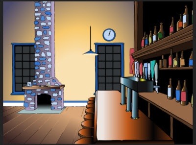
After inking the scanned drawings, I blocked in the color with flat fills in a monochromatic palette, then began working up the final colors in both flat and gradient fills.  Here is an early version of the bar, with many elements still showing in various shades of flat blue.


Next is a screenshot with more detail and color worked out; the beer labels, seats and beer pulls have been done.

And here is the finished artwork of the same scene.  The fireplace is done and the lamp cord extended.

Next, a shot of the mantle closeup with all the props in place.

Below is the master background for Scenes 3, 5 and 7.  Notice the wreath, shown as a scanned line drawing in Part 3, now in place above the fireplace mantle.  This is a completely new rendering of the fireplace and floor, but the back wall with windows, clock and poster is reused from the bar shot.
You will also see in the shot above that one of the hanging lamps is lighted; it is supposed to be the only light source in the room.  Due to time and budget constraints, I decided to not put in any cast shadows.  These would have added to the drama and effectiveness of the lighting.  For example, the wall just to the left of the fireplace would have had a strong shadow cast by the column of the fireplace itself, and the objects on the mantle in the closeup would have cast shadows off to the left.  However I was able to get a pretty good effect with gradients indicating the source of the light.

Finally here is one more still shot showing the "beauty shot" of the fermenter for Scene 7.  The fermenter was modelled using multiple gradients, and on the conical lower portion, the gradients were set at various calculated angles to fill a series of wedge-shaped areas.  The client was pleased with the result.

Each of the seven scenes I made into a separate Animate Pro file; this is always recommended to keep layers and file size manageable.  Putting all your scenes in one file can otherwise be a nightmare to work with, partly because the timeline becomes so long it it hard to navigate.

My part was now about done.  I exported each of the scenes into a folder of png frames and sent them to my partner,  Don, for assembly and post production.  Because he had a plug-in that would create a good snowfall effect in Adobe After Effects, I had left the window panes transparent, and the png format supports the transparency.  Don then brought all the scenes together in Aftert Effects, added the fades and dissolves, and put in the snowfall effect both behind the windowpanes (for which Don requested a snowbank background to match the snowbanks in the exterior shot) and in the opening exterior shot itself.  There were some technical problems with the transparencies, but finally it all came together visually.  Don then added music, sound effects and the closing logo and titles, staying up most of the night since we were a day behind schedule.  He delivered the finished movie about noon the next day.


And now, all done in about two weeks time, here is the final 40-second movie:
 

Next:  Problem Five: The Fox Comes Down

Monday, December 31, 2012

No. 23, Problem 3: The Fox On the Man's Head (Part 7)

The Finished Scene


It would have been perhaps just as appropriate to label this post Drawings Into Digital: Part 4--The Finished Scene, but for any of you who have been with me in parts 1 through 6 of The Fox On the Man's Head, I didn't want you to miss the payoff.

Here is the scene:

As I said I would, I have added a camera move-- a truck-in near the end--and an eye blink for the man, which I drew directly in Animate Pro and repeated once, to give the man's hold pose a little life.  I also put in a placeholder sound effect for the fox shaking himself out; it is not quite what I want there and I intend to switch it out when I find or record a more appropriate sound, but it will do for now.


This is my last post for 2012, and at this time I want to wish a Happy New Year to all my friends around the world.  I have been pleased this year to have hits not only in North America but from India, Ukraine, Spain, Sweden, Brazil, Australia, Israel, Germany, Macedonia and many other countries in every part of the earth.  I thank you for your interest.

For 2013 I promise you many more posts detailing my investigations into the fascinating world of 2D animation, mostly of the hand-drawn variety.  But first I will give you a look at a holiday ecard I was commissioned to do in a very short time--about two weeks--and which forced me to rely not on elaborate full animation but mostly on camerawork instead.


Next: Problem 4: Forty Seconds In Two Weeks (Part 1)  


Thursday, December 27, 2012

No. 22, Drawings into Digital: Part 4--Painting

Once you get your gaps closed (see Part 3), the painting is easy.  One thing you want to be sure to do right, though, is manage your palettes. Coloring anything that you might want to color again, without saving and labelling the color systematically, will be a mistake.

 Here is a shot of the basic Animate Pro palette:


Pretty simple, isn't it?  But this palette is just a jumping off place.  You can create hundreds or thousands of colors if needed, just by clicking on the New Color button, which is the + button at upper left.  Click  inside the color box, and you will be taken to Toon Boom's master palettes, where your choices are virtually limitless.

Here is my palette for the colors to be used in this scene:


In my case, I am still at a stage of production where I am not quite sure if the colors I am using for my characters will be the final choices.  But having labelled them Man Skin, Man Overalls, Fox Red, or whatever, I can then come back and change those colors in the palette, and everything that has been paiinted with the color of that name will change accordingly.  So not being sure of my colors turns out not to be a problem.

Here's an example of the first frame of the scene showing three layers (from the bottom: man, fox, tail) all assembled.

First frame of the scene, painted and assembled, but without the background.
Following are a couple of examples of the painted artwork of shots mentioned in earlier posts about this scene.

A shot of a fast motion double image of the fox, showing how I handled the coloring of the second "ghost" image.

A frame showing the fox's fur all bristled out, just after he shakes himself.

And finally, here is the last frame of the scene in full, anti-aliased render mode:


Next: The Whole Scene!

Sunday, November 25, 2012

No. 21, Drawings into Digital: Part 3--Closing the Gaps

As pointed out in Part 2, my use of a broken line inking style requires an extra operation using the Stroke tool to close the gaps in each paint area; otherwise, because the gaps are too large for automatic closing, the areas will not fill with color.

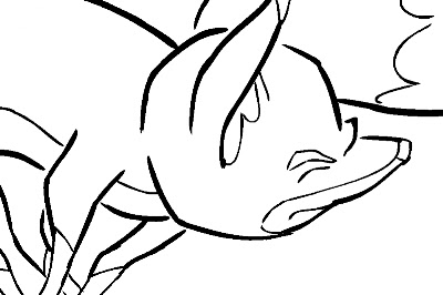
Here is an example of an inked fox image:
A fox image, inked but not yet ready for painting because of the large, deliberate gaps in the lines.

The large gaps shown here should be closed using the Stroke tool, which is on the toolbar in a pull-down menu with the Paint tool.  The Stroke tool is applied as you would use the pencil tool, in whatever straight or curved or even meandering style you care to employ.  It is important to understand not to use the Close Gap tool for these large gaps, because the Close Gap tool, while it will indeed close any gap, will always take the shortest and straightest path between the two points you are connecting, whereas you will find that you often may want to follow a suggested curve or other path when connecting two points.  For example, if I wanted to close the large gap at the back of the fox's head in the above illustration, I would want to follow the arc of the two lines being connected.

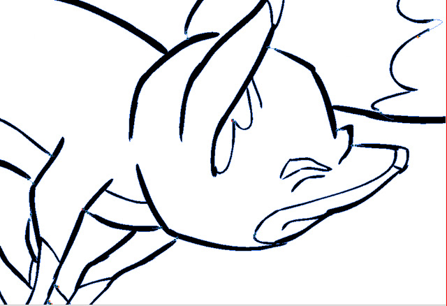
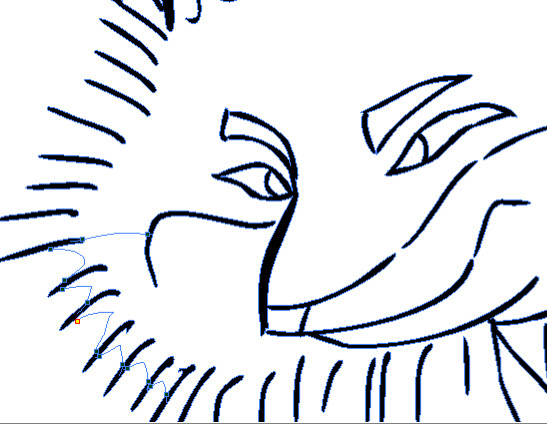
Here is the same image with the connecting strokes applied and made visible in blue.
A detail of the first image, with connecting strokes visible.
Note the stroke connecting the two curved lines at upper right.  This is an example of my stroke line completing the curves of the inked  lines and coming together in a soft point .

Here is an even closer view of the nose and brow area of the fox:
This shows clearly the strokes (in blue) connecting the line gaps in just the desired way.

When using the Stroke or Brush or just about any other  tool, be sure to take advantage of the instant-response Rotate View tool.  This is one of the greatest and most useful tools available in most of the Toon Boom family of products from Studio on up through Animate Pro and Harmony, allowing you to spin your drawing surface to obtain the most effective angle for your hand.  Rotate View is accessed on the Mac by pressing Alt+Command, and by a similar key combination on the PC.  The drawing disc icon that appears indicates its function; it is just like spinning the animator's  drawing disc that was set into a traditional Hollywood studio animation desk.

Sometimes the Stroke tool may be used in a more free-form or creative way than just for closing obvious gaps in lines.  Here is an example of that.
.  The gaps between each pair of border lines are connected using a line with a curve not based on the angles or curves of the inked lines.
Here the radial lines indicate the bristling fur of the fox.  I could have simply connected the lines with an arc perpendicular to the inked lines, but I wanted to finesse and soften the connections.  With the Stroke tool, this was easy to accomplish.

Next: Painting the Images


Wednesday, November 14, 2012

No. 20, Drawings Into Digital: Part 2--Inking

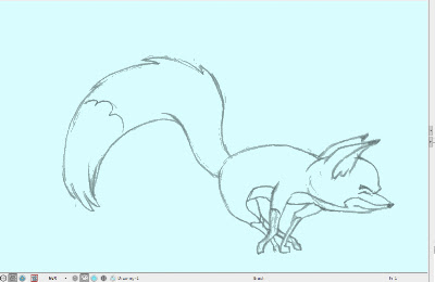
The scanned drawings are imported as batches into the timeline, all the drawings of each level to a new layer. The timing will be worked out later.  In my case, I have already worked out the timing in the pencil tests I did in Toki Line Test, so I will refer to the Xsheet from that when  spacing the drawings.

Here is what the timeline looks like after the  drawings are imported:

There are five layers of drawings showing here: Man, Tail_Behind, Body (the fox's body), Tail_infront, and Fur.  Above each of these layers I have created a drawing layer with the same names repeated, but in capital letters: MAN, TAIL-BEHIND, BODY, TAIL_INFRONT and FUR.  These are the layers I will be inking on, tracing from the layer below.

Note: I should mention that what I describe here is my own system.  Of the kinds of animation it is possible to do in Animate Pro, Toon Boom provides the least information and guidance about importing completed animation drawings.  No doubt this is because it is the least popular type of animation among its user base, so there is less demand for technical help, and because animators who can do all their animation on paper before entering the program usually know what they are doing.

At any rate, the drawings here are arranged in ascending number order in each layer, but the drawings of one layer do not yet have any meaningful relationship to the drawings of another layer.  For example, drawing 1 of the Body layer is meant to be held for many frames, but until it is inked and painted it will occupy only one.

I now begin the inking process, which looks like this:

The red frames on the layer BODY are the inked frames of the layer Body, directly below.

I have chosen a style using two weights of brush line, which are basically the default brush 2 and the default brush 3, although I have changed the property values of each somewhat.  Brush 2 gives a thin line without much variation, while brush 3 has a heavier line with a lot of thick and thin variation.  You will want to experiment to get the right amounts of Minimum and Maximum Size, and of Smoothness and Contour Optimization for your own purposes.  On the fox character I am using brush 2 for interior lines and anything else that is of a delicate nature, like the outlines of the lower legs.  Brush 3 is for everything else.

Also because I like the look, I am allowing the line to break, or to not always connect with other lines.  This will necessitate a lot of work with the Stroke tool, which adds invisible lines to connect these gaps.

Here is a closeup showing the inking being applied over the bitmap scanned image.  The scan was at 150dpi.  It is blurry and I was forced to refer frequently to the actual pencil drawings to be able to make out some details.

Since scanning these, I learned through an exchange on the LinkedIn group Animation Community Platform that I could be scanning my drawings vectorized rather than bitmap.  Here is an example, showing the much higher quality:
A grey mode vector scan, this time over a blue color card.
The vectorized scan also gives me alpha transparency, which the bitmap image does not.  I will be using this type of scan from now on.

Next: Closing the Gaps