Pages

For People Crazy About 2D Animation!

Acme Punched! is for people crazy about 2D animation. It may be enjoyed by beginners and others, but it is aimed at animators who know already something about the process of animation and the basics of character animation. In large part, it will attempt to provide a deep look into the problem solving that goes on in my head as I work out a scene, often in step-by-step posts that I will sometimes enter in "real time", without knowing in advance what the outcome will be. Mistakes and false starts will not only be included but emphasized, so that the creative process of animation will be portrayed realistically. And, while my own bias is for 2D drawn animation, many of the effects and principles discussed here can apply to CGI 3D animation as well. I hope the blog will prove useful and instructive for all.

-Jim Bradrick
Showing posts with label Step-by step. Show all posts

Monday, December 28, 2015

No. 85, An Exercise in Character Design, Part 3: Within a Single Sheet of Paper

Undo or Erase


As I work on all the phases of animation production, I like to think about what goes on in the animator's head while working--in this case, my own head.

As I have discovered over the past few years in writing this blog, many things are easy to document and demonstrate in my blog posts because the proof of the process exists on paper or in the computer in easily accessed snapshots, including many changes that are made from beginning concept to finished artwork.

But what about those still finer changes that disappear from the world and even from one's memory once they are done?  These are the things we erase either with the undo or delete button on the computer, or, on paper, with a rubber or plastic eraser.  These things are gone forever, aren't they?

Eraser on the legendary Blackwing 602 pencil; "half the pressure, twice the speed."


Perhaps this need not always be so.  A few days ago, while working on a character design for my film, as I drew in pencil, it occurred to me that I could record the things I was about to erase by shooting them with my smartphone camera.  I could photograph an entire sequence of the minute progression of my own creative thought as I drew and erased, drew and erased and drew again.

Certainly this is not something I intend to do very much.  It is a lot of trouble, and it is disruptive in itself of the creative process. (One might imagine an automatic system, a surveillance camera looking  over the artist's shoulder, that would snap a picture every time the artist picked up his eraser.)

But this one time, I did do it, and for whatever it is worth, here is the result.

The first drawings.

The right hand is changed.

The right hand is drawn from the front.  Plus, a new arm is drawn
at the side, experimenting with a different look.

Masking off his right side, I try drawing in the structure
of the new arm on the character's left side.
But I do not like the way this looks; I don't like the hand being hidden by the leg.  Time to try something else...

Here I have designed a new front view hand, at right, and changed
the character's right hand to the same design.
Of course now the side view hand is
out of agreement with the front view, so...
...I redraw that to match in a turnaround.
Next I add a 3/4 view to see how it works with the others.
Looks good!

This was sufficient design for me to begin storyboards. But in the storyboard stage, I tried still other angles and continued to analyze the character design for style and functionality, and I made mental notes for more refinement.  Eventually I sat back down with this same sheet of paper on my board and did my revisions.
The "final" model sheet.  Since I am still in my storyboard phase, other changes are still possible.
Here you will see that I have added facial expressions and more angles of the head.  Also, I decided that he should look a bit more elegant, with a nice if slightly ill-fitting suit.  The jacket is longer, and the limbs are smoother.

The changes I have made here might have been done differently, with new copies of the drawing that incorporated the modifications rather than erasure and redrawing.  Many of these things could easily have been done in the computer, with the multiple stages being preserved in save as copies. But here is how a design can evolve as the artist's conception evolves, all within a single sheet of paper.

.....................

To my readers: I want to remind you that I value your presence on my blog, and I invite you to comment. It encourages me when I get interaction with you.  And for any of you who haven't yet done so, why not also become a Follower? (As I like to say, just because you are a follower doesn't mean you cannot also be a Leader!)


Sunday, August 3, 2014

No. 71, Me vs Toon Boom StoryBoard Pro, Part Three


The Moving Storyboard


Now we get to the point where StoryBoard Pro is not just a storyboard platform but also a tool for creating an animatic. Like the storyboard itself, the animatic is a planning tool for discovering the best way to tell a story and for discovering problems before all the expense of creating animation and full production art.  Where a live-action film maker might shoot footage at a ratio of ten feet for every foot used in the final edit, the goal of the animation studio with its highly expensive and labor intensive production cost, was a ratio of one to one.  The storyboard and especially the animatic could make that happen.

Originally called a Leica reel, the animatic is a filmed (or videoed) storyboard, with the duration of each panel timed to play as nearly as possible to the calculated length of the same action in the final animation.  Thus an accurate animatic lasting ten minutes and twenty-two seconds onscreen will represent the final production lasting the same amount of time.

One thing that SBP can do is help the animator to accurately time transitions and certain types of movement upon the screen.  Here is my first example from the developing storyboard for my new film The Two Washingtons.


This is the establishing shot for the whole film.  Looking through the grid of a window, we see a huge jet taking off.  An appropriate sound effect will be added.  Then we dissolve to the interior of the airline terminal building, immediately pulling away from the window and widening out to reveal the large gate area crowded with people waiting for their flight to be called.  The background sound will change to the ambience of an airport building, with murmurring voices, footfalls, and the occasional PA announcement.

To accomplish this little sequence I used three of SBP's effects: 1) an animated layer (the airplane), 2) the cross-dissolve from the airplane shot to the interior shot, and 3) a long camera truck-out from the window to a wide shot of the whole room.

Let's think about it piece-by-piece.  The airplane shot might have taken from two to four frames of a conventional storyboard.  Limited to that, I think I would have done it like this:

How this shot might look in a conventional storyboard.


But SBP allows me to do it with just two drawings, the airplane and the window grid, and the result is about as good as I could hope to make it in the final film!

The Animated Layer


The animated layer is about as simple to do as can be.  You select your panel, then the layer you want to animate.  (Of course you will have to have planned this as you constructed your storyboard, so that anything moving will be on its own layer.  If you think something in a scene might move, or of course if the background is to be used in more than one panel, then you should be thinking and working in separate layers.) Next, you use the First Frame Transform tool and manipulate the image to its beginning position.  All the basic transform functions are available, so you can not only reposition but scale, skew, rotate, and so on.  In the case of the airliner, I slid it down out of the camera frame at lower left and also scaled it proportionally down.

The green rectangle is the camera field.


Then I clicked Last Frame Transform and pushed the airplane image off the screen at upper right.  Done!  The plane appears to be taking off outside the window, growing larger as it rises.


This is not actually the last frame position, because that happens near the end of the cross dissolve and is therefore nearly transparent, but it is near the end.


Camera Move

The second panel is done not as a layer move but as a camera move.  With the chosen panel selected, click on the Camera symbol in the toolbar, then open Tool Properties.

Tool Properties panel for Camera
As I am still learning this program, I do not yet fully understand the sections of this panel called Selected Keyframes and Static Attributes.  Here we will be concerned only with the top section, Camera Transform.

From left to right, the first three symbols are: 1) Set Keyframe at Beginning of Panel, 2) Set Keyframe at Current Frame of Panel, and 3) Set Keyframe at Last Frame of Panel. In my shot of the airport interior, I have used just 1 and 3, because the camera is to move throughout the shot. It is important to set both these keyframes, first and last, before moving your camera.  When you do this, the camera fields start out the same for both frames, so they are superimposed.  But at the bottom of the field, there is a green square for the first frame and a red square for the last.  Click and drag on each of these squares to adjust your opening and ending positions.  Here is what mine looked like after making those moves.

The panel in Camera View, clearly showing the move from start (green) to finish (red).


Note: a change in rotation is also possible here, as for example I could have rotated the green window so that the horizontal window bars started out parallel with the match shot in the previous panel.  I decided this was unnecessary however.

I am not quite finished here.  Rather than have the camera move at a constant rate, I decided to add ease in and ease out on both ends, but at different rates.  To do that, go to the Ease In, Ease Out lines in the Camera Transform box and just enter values for the durations of those eases.  In this case I chose 10 frames for the ease in (less than half a second at 24fps) and a full two seconds for the ease out.  These are easy to keep adjusting until they feel right.


The Transition

The last thing I have to do in this little two-panel scene is to add a smooth transition between panels. Find the New Transition icon in the toolbar and click on that.  I want to do a simple cross dissolve, which is the default option. There are also some wipe options.  Select the transition you want by double-clicking on the transition symbol on the timeline, or use the panel view.  The duration of the transition can be changed by pulling the edges of the transition symbol to left or right in the timeline.

Again, I applaud the ease of use of these functions.  I figured all this out and set it up in far less time than it took to write about it.


Next time I will show you another example of camera work in SBP, and I will also talk about some drawing options that are not available in Animate or Animate Pro.
Monday, July 14, 2014

No. 70, Me vs Toon Boom StoryBoard Pro, Part Two

The Hybrid Approach

 I still like drawing on paper.  Are you surprised?

Last time I featured mostly images that were drawn directly into StoryBoard Pro with a stylus and my Wacom tablet.  As I continued my exploration of SBP, I found that some complex setups were, for me, better done by working on paper, then importing the image into the program.  Could I have done them paperless?  Yes, but I think it would have taken me a longer time, and storyboarding is often required to be done quickly and efficiently.

Each user should make her or his own decision about this.  Yeah, I am an older guy with a long history of composing my work on paper, so that is my inclination.  If you grew up with computers, it will likely be easier for you to go all digital, and your results may be just as good that way.  I have plenty of respect for the all-digital artist.

However, Toon Boom has not neglected us paper-bound animators.  They have always accommodated import and scanning of hand-drawn and bitmap images of all kinds, including color images.

Smart Use of Your Smart Phone

My own procedure with animation drawings has been to scan them in with a Mustek scanner, with the Acme punched (there's that term again!) paper registered to a taped-down acme peg bar attached to the frame of the scanner, outside the scanning field.  For storyboard images, I could do something similar, but I have realized there is an even easier way.

A smartphone plus drawings equals easy import of rough pencil drawings.


Laying the drawings out flat on my desk, I just stand up and shoot photos of them individually with my iPhone.  Then I connect the iPhone to my laptop, open iPhoto, import the images, and copy them from iPhoto into a folder.  They come in as jpegs, and from there I can import them directly into SBP.

The raw smartphone image.


However, I do sometimes add one more step, which is to first bring them into Photoshop, crop them to get just the part of the image I want, and manipulate the brightness and contrast.  It is faster than using the scanner, and you can do it in a coffee shop or anywhere, with only your laptop or tablet plus your smart phone.

The same image brightened and cropped in Photoshop.


I would not use this method for any precision image such as a background layout because there can be slight distortions in perspective and proportions, but in the rough and sketchy world of storyboards, the results are perfectly acceptable.  You can still use that image as a rough layer, re-drawing the appropriate parts of the image onto separate layers using the SBP drawing tools.  This is what I refer to as the hybrid approach--combining imported rough pencil sketches, with final drawings made using SBP's drawing tools on layers above.

Try it!

The imported image partially inked with SBP drawing tools.


Exporting the Storyboard to PDF


I had a question from a reader this week about exporting from SBP to PDF; specifically, how to do it so that the Dialog  and other written notes would export and appear with the panels in the PDF.  Exporting to a printable format is of course often a desirable way to share a storyboard, making it possible for individuals to make notes and suggestions on paper that may then be considered as revisions.

I did some experimenting and found that this will work only if you choose certain options under PDF Export Parameters in the Export to PDF window.

The Export to PDF window, with 3 Panels Vertical selected.


My findings are that the first four options--3 Panels Horizontal, 3 Panels Vertical, Full Page (one panel) and Overview 2x4 Panels--all will include any notes or dialog in the PDF.  The others--Overview 4x3, Overview 8x10 and the Japanese formats--apparently will not.  These formats include so many panels per page that there is no room for the notes.

Caution:   In the formats that will include notes, if your notes run especially long, they will still be included, but at the expense of bumping one or more panels onto the next page.


Next:  Storyboards That Move!


Thursday, May 22, 2014

No. 65, My Process of Character Design, Part Two

Centerline Style into Modern Graphic Style


As discussed last time [No. 64, My Process of Character Design, Part One], after some preliminary sketching of characters I decided to go with a much more graphic style than my usual, somewhat Disney-like style.  I had already done one round of rough designs of characters that might be seen at an airport boarding gate, waiting in various ways for their flights, so I set about to modify them all into the more graphic style.

One issue to be considered is that of how this style may affect the animation.  Are there things I can do in centerline style that I can't do in using the more flattened, graphic style I have now adopted?

The answer is, yes; certainly.  For example, the kind of slow rotation of shapes one might do in centerline would not be convincing in the graphic style because the latter is not based in solid geometry.  Is this a particular problem?  Probably not, because while the graphic style might have limitations in that way, it also opens up opportunities of its own.  The graphic style is not expected to be convincing in the same way that centerline is, and it therefore can be manipulated and animated in surprising ways that can be valid and delightful in their own right.  

The Grand Vizier Zig Zag with King Nod.


For a good example of this contrast, look at any of the scenes from The Thief and the Cobbler where the highly graphic Zig Zag engages with the king or his daughter, who are both more traditional centerline designs. Richard Williams contrived to make them work well together.  

The Thief tangled up with Tack the Cobbler.


The cobbler, Tack, and the Thief were both clever hybrids of the two kinds of design.  (It should be remembered that Williams was a brilliant and accomplished designer before he ever took up animation.)

Now let's take a look at my own characters and how they have gone modern.

Woman solving sudoku.
These are all airline passengers waiting for their flights.  Most are incidental characters, so there won't be a lot of movement.  Above, I am showing you three versions  of this evolution.  Some of the others also had more than two versions before I got them the way I wanted them, but I will illustrate only two on most.

Man waiting unhappily.
Here is a symmetrical pose that remained the same; only the style and his expression have changed.  Sometimes twinning--having the right half mirror the left half in its pose--is okay!

Man using laptop computer.
Here I had another "twinned" character going and decided to change that.

Man sleeping in his seat.
This sleeping guy was a lot of fun to stylize, yet the pose remains essentially the same.

Young woman on her mobile phone.
Fun with curves and straight lines.  My approach has always been to do two or more drafts of  a character design.  It is exciting to see where this can take me.  When working toward a cartoon modern style, look for curves that can be combined and details that can be eliminated without losing the body language and information of the pose.

Older couple waiting patiently together.
Note how these two senior people have changed only in a few simple ways.

Boy playing video game.
Here's one that changed a lot between centerline style and modern style.  And changed for the better, I think.


And now, what about my two main characters?  Don't they have to be changed too?  You bet they do.  Here is how that looks:
The two main characters for the film.

Coming soon:   Storyboards for this project!

Wednesday, April 23, 2014

No. 62, A Walk Cycle for Albert, Part Five: Side View

 Solution to "Mystery Change"


In the last post (No. 61), I challenged you to find a difference in timing between the two versions of the walk cycle.  No one took me up on it, and I admit it was a subtle detail to find amid everything else that was going on in the cycle.  But the answer is: I changed the timing of the right arm (the one holding the bag).  In version 1, as the bag comes forward and then reverses direction to recede again, the movement seemed to me to have a stabbing aspect to it; that is, it took no time and no effort to reverse direction.  I thought this was inappropriate for a bag that might weigh 100 pounds or 45 kilograms.

I therefore took a look at the spacing of the drawings.  As the bag comes forward, it has an appropriate cushion-in.  The chart below shows the relative positions of the seam at the front of the bag.


But as the bag reverses direction, the drawings were not spaced so as to give a good impression of the cushion-out (the spacing that indicates that an object starts out slowly and accelerates.)  The next chart shows both the old and the improved spacings.  Again, it is the seam on the bag that we are following.
The original spacing is shown in red, on the left.  Final spacing on the right.
I think if you will now go back to post no. 61 and carefully compare the two versions, you will observe more of a slow-down and hesitation between the forward and backward movements of the bag.  It is more like the compression and release of a spring, as it should be, rather than like something bouncing.


Translating to the Side View

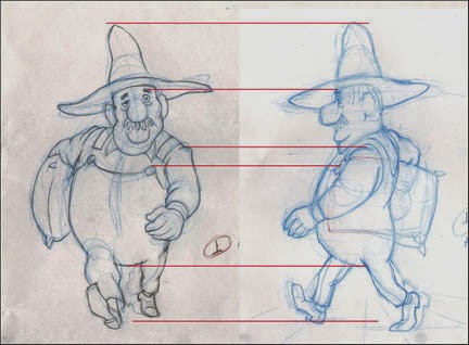
The obvious way to begin this translation of view is to construct the first image over the corresponding one of the other.  On my drawing board, that looks like this:
The front view showing through on my backlighted animation disk.
In a case like this, which is just a rotation on the Y axis, as the 3D-ers would think of it, many measurements can be directly applied from one drawing to the other.

Here are the two images separated, with a few points of congruence highlighted:
Showing where the top of the hat, the eyebrow, the shoulder seam, the top of the button and the bottom of the body mass coincide in both drawings.
Some things, of course, require adjustment.  Mainly these are the parts that project forward or backward in imagined space from the plane of the torso.  Thus the left hand appears larger in the front view to create the illusion that it is closer to the viewer, and the left foot is drawn smaller to show that it is farther back.

It should be emphasized that a walk cycle--or any animation, for that matter--should be designed with the perspective of its layout or background in mind; note the converging lines like floorboards on the drawing at right above, indicating the plane upon which the character is walking.  If you animate something without regard for the perspective and scale of the layout, you may be wasting time and work.  This should be considered even if creating something such as a gif animation meant to occupy the featureless expanse of a webpage.

Creating other angles wherein the viewpoint is raised or lowered is also possible, but here more sophisticated drawing skills are required to extrapolate from one to the other.
The same pose from a high angle, 3/4-front view.
I once was called upon to animate a character running while the camera swooped all about him--something a 3D animator of today would, admittedly, be able to do easily.  Yet once I had done a version of his run cycle from one viewpoint, I was able to work out all the other angles, and the whole thing worked very well.

Here is the first pencil test of the side view walk cycle:
I thought it worked pretty well, and it was fun to watch, yet something was not quite right for the walk of a man traveling a great distance.  Finally I decided that his stride was a bit too long; he is reaching a bit too far with each step.

So I shortened his stride by this much:
The erased images in red brackets show the original reach of his stride.
Here is the second test, incorporating the somewhat shorter stride along with a few other adjustments to the foot and leg positions in all the drawings:

I like this second version; except for details and cleanup, I am calling it done.

Your comments and questions are always welcome, and if you like what I am doing here, why not click on the Join This Site button and become a Follower?  That way you won't miss any posts, and I promise you many more to come!


Coming soon: Walks for Albert's Companions, a Fox and a Goose--two short-legged characters who must keep up with Albert's rapid pace!

Thursday, April 10, 2014

No. 61, A Walk Cycle for Albert, Part Four: Front View Final

I am going to present two versions of Albert's walk made this past week.  The first is about half cleaned up, with not all of my planned changes yet done.  The second is the final cleanup.  Later in this post, I will explain why I am including the half-finished version as well as the final.
The half-finished version. Here, some of the drawings are still in blue pencil but most of the planned changes are in.

This is the final pencil test; the drawings are all done in graphite pencil now and are ready to be scanned for digital ink-and-paint.

Cheap Trick Department:
When doing cycles such as this, one is constantly comparing the first half of the cycle with the other half; otherwise, the movement will not look balanced. In this case, drawing 1 (the right foot contact drawing) is more-or-less a mirror image of drawing 15 (the left foot contact drawing.)  Thus, each drawing in the cycle has its mirror counterpart.  With 14 drawings to track in this way, I have found it useful to give the drawings an alphabetic designation as well as its numeric one.  So drawings 1 and 15 are both also "A"; drawings 3 and 17 are both "B", and so on.  In this way it is easy to pull out both the drawings marked C or D or whatever for comparision to one another.

Changes made since the version shown in Post No. 60:
--More change of scale front to back.  That is, when Albert's foot or hand is closer to the camera, it is more obviously larger than when it is at the back, farthest from the camera.  This change of scale in what 3D animators call the Z axis can add depth and drama to a scene, even when the character's body remains a constant distance from the camera.  Opportunities to utilize this enhancement should not be neglected.

--Left arm animation.  As mentioned in No. 60, I was unhappy with the arc of the arm as it came forward.  This has been fixed.

--Shorter pants legs, with socks showing.  Shown only in the final.  Albert's socks are red, so there will be an amusing flash of color there.  Also I am simply complying with my own model sheets for Albert, bringing him on model.  The pants legs also are animated as a follow-through to the leg movement but this is rather subtle.

--Precise drawing.  Cleaning up the images in the same order in which they were drawn as roughs (extremes, then breakdowns, then inbetweens), everything has been tightened up.

--Foot slippage.  This could come under the heading of precise drawing, above, but in walk or run cycles it rates its own category.
Foot Slippage chart on drawing 17.
In doing the rough animation, I had just "eyeballed" the foot positions, but when it came time to clean the drawings up, I scrutinized them closely and found it useful to make this chart.  The lines represent the back of the heel on drawings where they are in contact with the ground.  Note the ghost images showing where the feet originally were in this drawing.

--Mystery Change ???  There is one other change I made here, and I challenge you to find it by comparing the Half-Finished and Final pencil tests above.  No new drawings were added, but something I haven't mentioned has been re-timed.

Can you find it?  I will post the answer next time, but I would like to hear from anyone who can find the change.  Moreover, can anyone tell me why I made this change?


Next: We Rotate Albert 90 Degrees and See His Walk from the Side.

Wednesday, April 2, 2014

No. 60, A Walk Cycle for Albert, Part Three: The Full Test

In addition to filling in all drawings for this walk cycle, this week I have improved the readability of these pencil tests.  Because I often do my rough drawings in blue pencil, the tests done in Toki Line Test software have been of such a low contrast that by the time they have been rendered as Quicktime Movies, they are hard to see, especially if there are multiple levels.  Now I have greatly improved this by exporting the drawings from Toki as jpegs, then adjusting their values in Photoshop before importing them once again into Toki Line Test.  I think you will appreciate the sharper, more high contrast result.

This test is now working in most ways.  A good walk cycle includes many details of movement besides just moving the feet and legs and swinging the arms. Here are some things I included in Albert's walk:

Rhythmic vertical movement. Does the character rise up or drop down on the passing positions, and by how much?  I have Albert rising up enough to be noticeable.

Shoulder action.  Albert's upper torso rotates in opposition to his hips, but his right shoulder is kept highest at all times because of the load he is carrying on that side.

The legs and feet.  They are working well.  Just before each of the contact drawings I inserted a little kick; he throws his foot out past the point of contact for one drawing (2 frames) which adds a nice confident snap to his walk.  It has an impact more felt than seen. Here is the detail showing that:

Two drawings before contact.
One drawing before contact; the foot is thrown forward, beyond the contact point.  


The contact drawing (his right foot.)
Head action.  I have made his head tilt to alternate sides on the contact drawings and to be verticle--untilted--on the passing positions. This will mean that in a side view of the same action, his face will be partially hidden by his hat brim when the right foot makes contact (see drawing above) but I have planned for that.

The swinging arm.  This works pretty well but I don't like the way the arm comes forward.  It should swing out farther rather than in as I have it now.

Follow through actions.  [1] After the contact drawings, the belly descends and delays coming up for a couple of drawings, giving him an appropriate heaviness.  I want to refine this some more.  [2] When the left hand reaches its full extent at the front it flips up.  [3] The hatbrim flips up and down a little as he bounces along, but that needs more refinement also.

These details and others can be thought about and added in now that the basic elements of the walk are in and approved.  Although it is possible to suggest secondary and follow-through action during the first pass through the animation, usually they will need some adjustment, and it is perfectly alright not to put them in at all until the first pass is complete.  A walk cycle like this presents a lot of challenges, so it is all-important to get the basics right first.

For an exhaustive look at animating walks, see Richard Williams' book The Animator's Survival Kit.


Next: Refining the Details of the Walk

Saturday, March 29, 2014

No. 59, A Walk Cycle for Albert, Part Two: Point of View

A Different Point of View


In thinking about this walk for Albert, I have most often pictured it from one side, the standard view for getting the most out of your drawing cycle.  In 3D terms he is walking along the X axis, but the camera stays with him and matches his speed so that he stays centered on the screen, while the background can be seen slipping past.

But even though I want to show this profile angle, there is a problem in designing it in this way because of the sack of grain he is carrying; its great weight forces him to walk assymetrically, and from the side this is very hard to visualize.  Here are a few sketches showing my struggles with this problem.


I seem to remember reading of an animator (Frank Thomas?) advising that if you are having trouble drawing a character from the camera angle, to first draw it from a more obvious angle, then extrapolate back to the original angle.  In other words, draw it first at an angle  from which you can understand the proportions and mechanics, and then rotate it in your mind to whatever it must be.  This is difficult but it is a skill most long-time pencil animators have developed.

So in this case, I decided to try looking at the walk from the front:


Right contact position.
Immediately I could see that this was the way to go.  Here are the other three key drawings for the cycle.

Passing position.
Left contact position.
Passing position.
And now I have a first pencil test made with just these 4 drawings:
The cycle is designed to last 28 frames at 24fps, a bit longer than usual.  Also I am putting the emphasis on the contact positions, so in the test, instead of exposing the 4 drawings equally, seven exposures for each, I gave the contact drawings 8 exposures and the passing positions only 6 each.  It still adds up to 28 frames, but the rhythm more nearly matches what I want the final result to be.


Next: The Test from the front, with all drawings filled in.

Tuesday, March 25, 2014

No. 58, A Walk Cycle for Albert, Part One: The Brief

If you have been following this blog at all, or if you go back now and look at some of my previous posts, you would have seen or will see a lot of my two human characters, a man and woman I call Albert and Victoria.

The long sequence I have been detailing for the blog has them facing each other, mostly standing in place.  But there are other planned scenes in which Albert is doing a lot of walking.  Mostly when he is walking, he is encumbered by a heavy burlap sack of grain under one arm.  Sometimes the full-grown goose is being carried under the other arm.


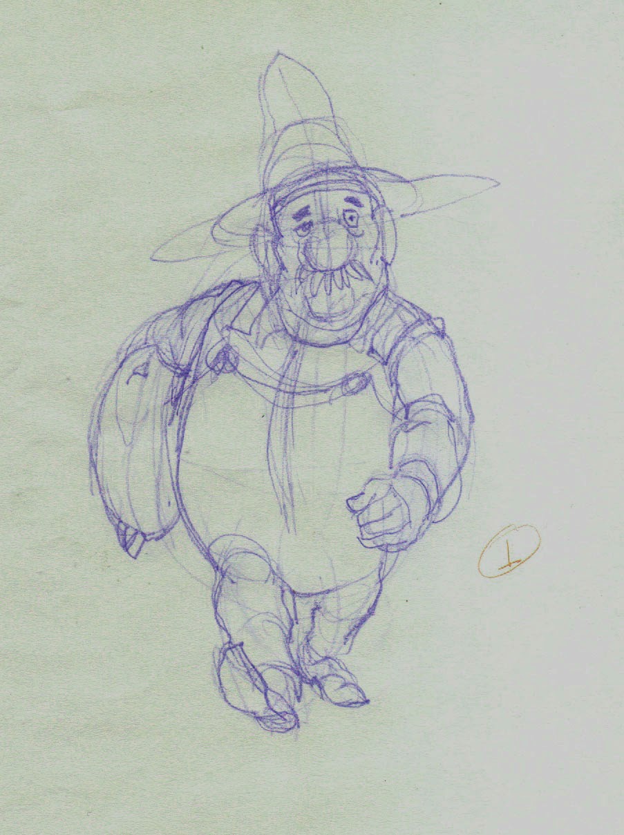
An early concept drawing of Albert walking.

Now that I am at the actual point of animating his walk, I want to pull together all the thoughts I have had about it as I worked with Albert in other ways.

Here is what I know about Albert and his walk:

  • He is a big man, overweight but solid rather than soft, and he is very strong.  
  • The sack of grain may weigh 100 pounds [45 kg] but it is not too much for Albert to carry under one arm.
  • He has miles to walk, so his walk will be deliberate and measured; something he can maintain over a long period of time.
  • He does not mind hard work, so to walk a long way with such a load does not in any way make him unhappy, and he is by nature a cheerful and optimistic man.

This is the kind of thinking that should go into the planning of any animation, but sometimes novice animators forget this when it comes to walks.  They think, I'll just sit down and animate my character walking, because they want to see it, but there really should not be any such thing as an all-purpose walk.  If a character is crossing a room, it is for some reason.  It will affect his or her posture, as well as the speed and style of the walk. His entire state of mind is important, too; whether he is in haste, is anxious or relaxed, is fearful or self-confident, is fatigued or energetic.

Perhaps a walk must be done even more carefully than non cyclic animation because it is a cycle and will be seen in repitition, giving the viewer time to study it that is not the case with a one-off.

I have been thinking about Albert's trekking walk a long time, and now I am ready to animate it.


Next: Choosing the Best Point of View for Designing the Walk

Monday, May 20, 2013

No. 39, Problem Six: Fox Bites Nose (Part 5)

For the next couple of weeks I will be working on my website, bradrick.com, to update it, make it easier for me to change by using Wordpress.org, and increasing its search engine optimization.  Meanwhile, here is a pencil test that came out right the first time!


Take One


Here I had to make the woman react as the fox bit and held onto her nose.  This called for a violent "take" of some kind, as she is struck by the shock (and some pain!) of being bitten by the cute little fox.  Takes are not something I have been much called upon to do in my career, so I looked in Richard Williams' book The Animator's Survival Guide at some classic formulae for takes which he had learned from animators of the Disney and Warners studios.


 The anticipation is on two's, then the upward "take" has two inbetweens on one's, followed by a "settle" on two's.  I cut to blank frames at the end because I want to cut away to a closeup at that point, without first going into a hold, and this shows me that the poses read well.

Tuesday, May 14, 2013

No. 38, Problem Six: Fox Bites Nose (Part 4)

A Reminder:

As this blog is focused on detail and the small decisions that accumulate to make a larger picture, in these posts we will often examine short sections of a scene instead of the whole scene.  This helps keep the presentation concise and clear.  However, I want to remind you (and myself) that normally it is best to look at an entire shot or scene all at once, to judge its rhythm and pacing. I hope that in your own animation work, you will not lose sight of this important idea.

Bad, Not-So-Bad, Better, Best


This time we will look at a part of the action of the woman.  The man holds the fox in his hands, having just lowered it down from his head, and the woman has moved in close.  At the beginning she is looking at the man.  She then turns to the fox and reaches out her hand to tickle him under his chin.

I have four pencil tests to show you.  The first one I call...

The Bad


If there is one bad habit I am most often guilty of, it is that of making my rough drawings too detailed before testing the action even once.  When it works, it works, but when it doesn't, then I have unnecessarily wasted a lot of time and effort.  This is an example of that.  The poses looked good to me, I didn't see how it could go wrong, and so I spent a lot of time drawing detailed hands, for instance, because I thought the animation was a sure thing.

It wasn't.  The head and body work fine, but in this first test I could see that the arms and hands are not saying what I want to say.  The left hand passes too close to her nose on its way to reach out to the fox, and the right hand makes a fluttery gesture that only distracts viewer attention from the main action.

The Not-So-Bad


Right hand fixed.  Left hand has been changed so that there is much more drag; the wrist leads the hand.  At first I thought this might be too theatrical a gesture for this character, but she is about to admire the cute little fox, so she is in a playful mood.

But now, as often happens when you change one thing, something else becomes apparent that needs to change.  The action in this test begins and ends with holds.  Everything begins moving all at once, and everything also stops all at once at the end.   It goes against the good advice that, going into a hold, everything should not arrive all at once.  This is something that people will notice, or at least it is something that will ring false even if they don't know why.  Rather than appearing to be alive, the character looks robotic and mechanical. (I did think that  the tickling movement of the finger that will begin as soon as her left hand comes to rest might be the overlapping movement I needed, but now I see a need for more overlap.)

The Better


Now the unfurling of her left hand has been delayed and finishes after her body and right hand have come to rest.   You can still see the  ghost images of the hand where they have been erased from other drawings.

To fill out the delayed movement of the left hand, I tried a moving hold of her fist, but it isn't working right.

The Best


I changed the left arm so that it moves in close to the body in an anticipation of the main movement.  This works pretty well now and I am happy with the result.


Pencil testing sometimes goes like this, through four or more versions before the scene looks and feels just right.  Other times, the animator hits it right the first time through.  In this case, the main thing I did wrong was to draw in too much detail before the rough movement was proven in pencil test.

"LET THAT BE A LESSON TO YOU!" the director (I) shouted at the animator ( me.)

Let it be a lesson to you, too.


Saturday, March 23, 2013

No. 35, Problem Six: Fox Bites Nose (Part 3)

For the pencil test of the drawings shown in Part 2, I have created two versions.  Version one is the entire scene comprised of all existing layers and drawings, so that the first part includes the fully animated layer of the man lowering the fox down.

But as this is rather dark and hard to view, due to the fact that there are four layers present, I also include a version with all layers turned off except the new one featuring the woman and the characters combined onto that layer.  The timing here is exactly the same.

In my opinion, this would work well enough when all the drawings have been added.  The action is clear, funny, logical in its cartoony way.  Yet I believe I have found a way to enhance it even more.  Now, using Toon Boom Storyboard, which I have just added to my animator's toolbox,  let me show you what I mean.

Here is the same scene with a closeup added at the peak of the take, where the woman has drawn far back with the fox gripping her nose.  
Adding this closeup necessitates some timing changes.  Now she pulls back just a little slower and will ease in to the hold just before we cut to the closeup.  Now there WILL be inbetweens as she pulls back, and the closeup will include some rapid eye blinks as she takes in the situation.

Now that I am satisfied with the timing of the animatic, the next step is to chart the spacing of the remaining drawings, then add the breakdown drawings and, finally, the inbetweens.

Next: The Scene With All the Drawings Present

Monday, March 18, 2013

No. 34, Problem Six: Fox Bites Nose (Part 2)

The Most Creative Step


Animation is a strange artform.  The process of production is so complicated, and the road to the final result so long, that it seems that the ember of inspiration might darken and grow cold before the animator ever gets to the end.  It is miraculous that an animator can hold and keep alive in her or his imagination that glowing spark through all the tedious stages it must endure: the timing calculations, the planning of layers, the process of construction and refinement of drawings, the endless adjustments and revisions.

And yet, we do.  It is the thrill of making it work, of making it seem to be alive, despite all the technical encumbrance, that keeps us going on to the end.

This post describes as best I can one of the high points of the journey.  This is the magic moment in the process when the animator sits at his drawing board and makes the key drawings upon which all else depends.

As we discussed in Part 1, my first attempt for this scene was wrongheaded in just about every way, and it was largely because I tried to handle the three characters separately from one another.  This was okay for the first part of the scene, described in Problem Five, where the woman is watching as the man lowers the fox down from atop his head.  After that it was a failure because the three characters were acting in concert and they needed to be regarded as one combined entity, rather than as separate elements.

At this time I have made sixteen new drawings spanning the entire scene.  The first eight depict the woman's behavior during the action covered in Problem Five, as the man reaches up and lifts down the fox.

The last eight drawings show all three characters together, as the fox bites and holds onto the woman's nose and she and the man react to that.

Let's look at the drawings.
Dwg 1.  She has been watching the thing on her husband's head turn into a fox.


(Drawing 2, formerly in this position, has been removed, to be replaced by Breakdown Drawing 65.)

Dwg 3.  The peak drawing of the take.
Dwg 4.  Hold drawing at end of take.
Dwg 5.  As the fox is lowered down, she pulls back out of the way.
Dwg 6.  Now she leans in for a closer look.
Dwg 7.  She turns to look at her husband.  Her head is on a separate layer here.
Dwg 8.  She turns back to the fox and tickles him under his chin, and then...
Dwg 9.  He snaps his jaws closed on her long nose.  She winces in pain.
Dwg 10.  Reflexively, she starts to jerk away.
Dwg 11.  But the fox hangs on.
Dwg 12.  The peak extreme of her action.
Dwg 13.  Realizing she must not resist, she yields to the fox.
Dwg 14.  Coming down, she looks to her bewildered husband...
Dwg 15.  ...who turns his attention to the fox.
Dwg 16.  Now they are at stalemate.
Note that these drawings are by no means evenly spaced throughout the scene.  They are the storytelling drawings.  Where there is more going on, there is need for more drawings.  Here, drawings 9 through 15 cover just 64 frames of time--a little more than 2 1/2 seconds, because that is where the violent action is.  In fact, drawings 9, 10, 11 and 12 are consecutive; there will be no inbetweens added there.  It may be unusual to consider them all as key drawings, but they were key to my understanding of the movement, and as I felt their structure so strongly, I thought it necessary to do them all at this time.  It was a tricky section that had to  be proved out, and I deemed them essential.

In Part 3, we will look at the pencil test/animatic of all this movement together.

Next: Pinning Down the Timing