Pages

For People Crazy About 2D Animation!

Acme Punched! is for people crazy about 2D animation. It may be enjoyed by beginners and others, but it is aimed at animators who know already something about the process of animation and the basics of character animation. In large part, it will attempt to provide a deep look into the problem solving that goes on in my head as I work out a scene, often in step-by-step posts that I will sometimes enter in "real time", without knowing in advance what the outcome will be. Mistakes and false starts will not only be included but emphasized, so that the creative process of animation will be portrayed realistically. And, while my own bias is for 2D drawn animation, many of the effects and principles discussed here can apply to CGI 3D animation as well. I hope the blog will prove useful and instructive for all.

-Jim Bradrick
Showing posts with label Drawing. Show all posts

Tuesday, December 1, 2015

No. 82, Adventures in Character Design, Part 1: Looking for My Character

What to Do when an Idea Isn't Working

Recently I came to a place in the planning of my new personal film where I felt blocked.  The concept was of two characters having a confrontation in an airport, and as I tried to commit the whole thing to storyboard, my progress and enthusiasm ground to a halt.

The original main characters.

I expressed this to a close friend who is also an animator, and he just shrugged and said, "Well, maybe there is something wrong with the whole idea. Rethink it."

Immediately I felt re-energized. And I also felt relief, because I was keeping with my new resolve not to animate anything without first storyboarding to the end. So I had not wasted a lot of work.

I began sorting through the ruins of my concept like a man standing amid the tornado-riven rubble of his home, looking for what might be salvaged.  There were some good character designs, and there was the airport location. There was a gag about an oversized suitcase that couldn't possibly make it past airport security and size regulations as a carry-on.

Part of the ruin was what had been my main character, a goofy guy who was funny-looking but hard to understand or empathize with, even for me. He was the one with the suitcase, and now I saw that he had to go, and he had to leave the suitcase behind.

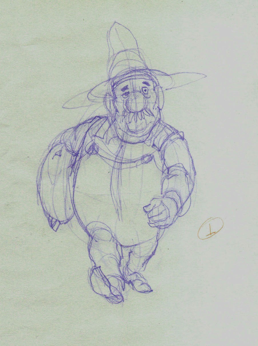
Keep the suitcase, lose the guy. These are my first sketches of the character, from a traveling notebook.
 But what could I replace him with?  Was it necessary to start over with that, too?  Or was there possibly something already there?

Next: A New Start

Wednesday, November 18, 2015

No. 81, Book Review: The Nine Old Men, by Andreas Deja.


By the beginning of Franklin Roosevelt's second term as President in 1937, he had begun to call the U.S. Supreme Court justices of the time "the nine old men" for their obstructive attitude toward his social policies and programs.  It became his aim to try to replace six of their number in order to get a court more friendly and supportive of his attempts to bolster the economy.

Roosevelt failed in that, but the phrase Nine Old Men was picked up by Walt Disney and applied to his crew of senior animators, who just happened to be nine in number. Who were these men? Among other things, they were all animators who had stayed on Walt's side during the studio's labor troubles of the early 1940s. All nine were born between 1907 and 1914, and all but one started at the Disney studio in the early to mid thirties when intensive hiring and training were ramping up for the move into feature animation. (The exception was Les Clark, who began in 1927 at the age of 20, which made him the only one to arrive before both sound and color came to the movies). None of these young men except Clark had animation experience, and Clark had to retrain himself now to keep up with the sophisticated design and animation that was in development; the old rubber hose limbs and often crude drawing of the silent days were obsolete.

Les Clark learned to animate very well indeed.  From Symphony Hour, 1942.


In the new book by Andreas Deja, The Nine Old Men (392 pages, CRC Press, 2015), these animators are spotlighted and compared with one another in their strengths and styles from the personal viewpoint of the author, a brilliant animator in his own right who knew many of them and who actually trained under Eric Larson, best known for his animation of the sultry dog Peg in Lady and the Tramp.

Larson didn't do only animals.  Here, from Peter Pan, Wendy fails at her first attempt to leap into flight. Now she crouches for a second attempt.


As in John Canemaker's 2001 book of a similar title, Deja's book is divided into nine sections, each devoted to one animator. But the new book, subtitled Lessons, Techniques and Inspiration from Disney's Great Animators, is all about the drawing and the animation, with shorter illustrated biographies that detail each man's development at the studio from novice to mature artist. The latter part of each chapter is comprised of sequences of key animation drawings from important work along the career arc of the artist.

If you want to get as close as you can to the work of a master animator, there is nothing short of being inside the man's head that is better than to look at his pencil animation. I have always treasured reproductions of animation pencil drawings, and there have been some good collections.  Examples in the past include the oversized Treasures of Disney Animation Art (Abbeville Press, 1982) and The Walt Disney Studios Archive Series volume on Animation (Disney Editions, 2009). Both of these are made up of color reproductions (even of mostly black and white drawings!) that have been printed the actual size of the originals. Wonderful to look at, but limited in the amount of material that can be covered in a single volume.  And the otherwise terrific Illusion of Life, written by Frank Thomas and Ollie Johnston (Abbeville Press, 1981), though considered an essential bible by most of us who love drawn animation, contains numerous animation sequences that are disappointing on the page, each image in a stark black and white that illustrates the action without displaying the subtleties of the artist's drawing.

Frank Thomas, a Nine Old Man and co-author of Disney Animation: The Illusion of Life, does Merryweather the fairy, from Sleeping Beauty, 1959.


Andreas Deja and his publishers have found a happy medium,  reproducing in color all the pencil lines, because those lines were not only black or grey; a single drawing might also include pencil lines in blue or red--sometimes even green and ochre! The multiple colors were used for roughing in or for indicating match lines or other cues for those who would ink the drawings onto cels. As a bonus, almost all the drawings in the sequence sections include the original drawing numbers written on the sheets by the animators.  The serious student of animation can deduce much about the timing of the scenes from these notations.  Seldom included here, alas, are spacing guides, which can be even more revealing.

A Woolie Reitherman drawing from the El Gaucho Goofy segment of Saludos Amigos, 1943. Note the use of multiple colors of pencil.  Note also this amazing action drawing by Woolie!


Though not the only good animators at the studio, the Nine were all excellent, they had the all-important support and respect of Walt Disney, himself, and they got the cream of the important scenes to animate.  Eventually they mostly became supervising animators, mentoring younger animators such as Andreas Deja, Glen Keane, and many others who were to succeed them when they retired.

Two frames of Smee from Peter Pan, by Ollie Johnston, who was known for his light touch, sensitive emotional interpretations, and speed.  Johnston is the other co-author of Illusion of Life.


Deja has the advantage over other Disney historians in that he lived the life, producing in his own right numerous memorable animated performances such as villains Gaston, Scar and Jafar, and the comic hero Hercules. His insights about these men and their work are keen, and his own unflagging enthusiasm for his subject shines through.

Somewhat amazing is the wide variety of personalities and temperaments among these men who, nevertheless, were all able to sit and perform these feats of acting and creation at their drawing desks. Several, despite their differences, had the discipline and versatility to follow each other's lead in design and animation on a character, so that they could provide sequences of their own that integrated seamlessly with the other man's work.

John Lounsbery could even capture the style of Milt Kahl, and he could define his own characters, too.  Here, John's character Ali Gator, from the Dance of the Hours sequence of Fantasia, 1941.

Ward Kimball managed to get through his Disney career without once having to animate a realistic character like a prince or princess.  He liked it that way, but he was amazingly innovative both as a designer and in staging his scenes.  Here are some wonderful Kimball roughs from the Peter and the Wolf segment of Make Mine Music, 1946. 

Milt Kahl, because of his wonderful draftsmanship, did more princes  than anyone, but he enjoyed the cartoony stuff as well.  Here is the eponymous star of Pinocchio, 1940, as he finds himself turning into a donkey on Pleasure Island.


Marc Davis, creator of Flower the skunk in Bambi, 1942, and two immortal female villains, Maleficent in Sleeping Beauty, 1959, and, shown here, Cruella DeVil from 101 Dalmations, 1961. Davis then became a principal designer for attractions at the Disney theme parks.

Any student or practitioner of 2D animation should certainly have this book for both inspiration and study, and 3D animators and designers could also learn from it.  These are the very men who discovered and perfected what are now known as the 12 Principles of Animation.  The Nine Old Men are all gone now, but they have much yet to teach us.

All images copyright Disney.

Sunday, November 8, 2015

No. 79, Drawing Problem 2: Breakdown Challenge—“Pulling the Switch”, Part 2

Last time I presented a drawing problem as another exercise in finding a meaningful breakdown drawing between two extreme drawings where the solution was not immediately obvious.

Here again are the extremes:

Extreme Pose 1


Extreme Pose 2

The issue is that if the king pulls down the knife switch, he will have to get out of the way of the arc of the switch handle.  In such a case as this, one might be tempted to re-stage the extremes so that no such problem exists and there is an unobstructed path for the switch, but I chose to persist in trying to come up with a plausible and workable solution. (In post No. 78, I encouraged readers to try their hand at a solution, but there were no takers.)

The Solution

Here is my solution to the problem:

The Breakdown Pose

As you can now see, what happens is that the king has to dodge out of the way of the switch in mid action, which is something we all naturally do in real life.  Approaching a door, for example, we do not always calculate in advance the arc that it needs to pivot on its hinges, and we have to back up a little or otherwise adjust our stance in order to get the door open.

Here is the very brief animation as it was done for the video game I have been working on. Unfortunately, I believe that this scene has been cut from the final game. Nevertheless:


This is just one more illustration of the truism that in animation, there can be multiple ways of doing something, each one arguably as valid as the others.

Sunday, May 24, 2015

No. 78, Drawing Problem 2: Breakdown Challenge--"Pulling the Switch"

Breakdown Challenge No. 2


Some of you may recall that we did this once before, in posts 36 and 37. Recently, in the course of my work on a new casino video game, I encountered another problem where the breakdown had to be an eccentric one in order for the scene to work at all.  That is, a straightforward half-way inbetween would not work; either the extremes had to be re-thought and re-designed, or else a solution would have to be found at the breakdown stage.

Breakdown Review


First let's review the nature of the breakdown drawing. In the process of pose-to-pose animation, breakdowns are the next step after the extreme drawings are done.  A skilled assistant may do them if there is nothing out of the ordinary, but as Eric Goldberg has pointed out so skillfully in his book Crash Course in Character Animation, the animator may often want to do the breakdown him or herself; it is his chance to weight the movement more toward one pose drawing over the other, or to otherwise add extra character to the movement.  The breakdowns are thus capable of being as critical to the final effect as the pose drawings or extremes, unlike the inbetweens which are more mechanical, less creative, and generally capable of being rendered by a far less experienced assistant.

Pulling the Switch


Here I had a scene where the main character of the game, a mischievous villain who is always trying to interfere with the game's players, throws a big knife switch on an electrical box and turns out the lights.

For this game we were under considerable constraints of time to get all the animation done, and so I had established a style of very rapid movement from pose to pose, often using smear or blur drawings. [There will be more about this in a future post.] But here and there, to emphasize some particular movement, I utilized more drawings in the movement to make the action especially clear.

Here are the two pose drawings we are concerned with.

Pose A--drawing 8

Pose B--drawing 12

As soon as I began on the breakdown between these 2 poses, the problem became apparent: the handle of the switch when it is half-way down projects far out to the left, interfering with the character's head and body [Figure 1].

Figure 1

The Challenge


With a little experimentation, I did figure out a way to solve this problem--without altering the pose drawings A and B.  

I invite any of you to take a shot at it.  If you want to give it a try, send me an email to: bradrick@olypen.com, and I will then send you the two extreme drawings above as jpegs for you to print.  Take the printed drawings and tape them each to a sheet of animation paper, so that the registration crosses are in alignment.  Then make your version of drawing 10 on a third sheet of paper.  Remember to trace the registration crosses onto your new drawing.  

Your challenge is to show the switch halfway down while making it work with the character poses as a convincing breakdown pose.  Remember, their may be more than one way to make this work; my way is just the way that occurred to me.

Send me your result as an email attachment, and I will either comment privately or in the blog, as you wish.

Good luck!

I will show you my own solution to this in a subsequent posting.


Monday, July 14, 2014

No. 70, Me vs Toon Boom StoryBoard Pro, Part Two

The Hybrid Approach

 I still like drawing on paper.  Are you surprised?

Last time I featured mostly images that were drawn directly into StoryBoard Pro with a stylus and my Wacom tablet.  As I continued my exploration of SBP, I found that some complex setups were, for me, better done by working on paper, then importing the image into the program.  Could I have done them paperless?  Yes, but I think it would have taken me a longer time, and storyboarding is often required to be done quickly and efficiently.

Each user should make her or his own decision about this.  Yeah, I am an older guy with a long history of composing my work on paper, so that is my inclination.  If you grew up with computers, it will likely be easier for you to go all digital, and your results may be just as good that way.  I have plenty of respect for the all-digital artist.

However, Toon Boom has not neglected us paper-bound animators.  They have always accommodated import and scanning of hand-drawn and bitmap images of all kinds, including color images.

Smart Use of Your Smart Phone

My own procedure with animation drawings has been to scan them in with a Mustek scanner, with the Acme punched (there's that term again!) paper registered to a taped-down acme peg bar attached to the frame of the scanner, outside the scanning field.  For storyboard images, I could do something similar, but I have realized there is an even easier way.

A smartphone plus drawings equals easy import of rough pencil drawings.


Laying the drawings out flat on my desk, I just stand up and shoot photos of them individually with my iPhone.  Then I connect the iPhone to my laptop, open iPhoto, import the images, and copy them from iPhoto into a folder.  They come in as jpegs, and from there I can import them directly into SBP.

The raw smartphone image.


However, I do sometimes add one more step, which is to first bring them into Photoshop, crop them to get just the part of the image I want, and manipulate the brightness and contrast.  It is faster than using the scanner, and you can do it in a coffee shop or anywhere, with only your laptop or tablet plus your smart phone.

The same image brightened and cropped in Photoshop.


I would not use this method for any precision image such as a background layout because there can be slight distortions in perspective and proportions, but in the rough and sketchy world of storyboards, the results are perfectly acceptable.  You can still use that image as a rough layer, re-drawing the appropriate parts of the image onto separate layers using the SBP drawing tools.  This is what I refer to as the hybrid approach--combining imported rough pencil sketches, with final drawings made using SBP's drawing tools on layers above.

Try it!

The imported image partially inked with SBP drawing tools.


Exporting the Storyboard to PDF


I had a question from a reader this week about exporting from SBP to PDF; specifically, how to do it so that the Dialog  and other written notes would export and appear with the panels in the PDF.  Exporting to a printable format is of course often a desirable way to share a storyboard, making it possible for individuals to make notes and suggestions on paper that may then be considered as revisions.

I did some experimenting and found that this will work only if you choose certain options under PDF Export Parameters in the Export to PDF window.

The Export to PDF window, with 3 Panels Vertical selected.


My findings are that the first four options--3 Panels Horizontal, 3 Panels Vertical, Full Page (one panel) and Overview 2x4 Panels--all will include any notes or dialog in the PDF.  The others--Overview 4x3, Overview 8x10 and the Japanese formats--apparently will not.  These formats include so many panels per page that there is no room for the notes.

Caution:   In the formats that will include notes, if your notes run especially long, they will still be included, but at the expense of bumping one or more panels onto the next page.


Next:  Storyboards That Move!


Wednesday, July 2, 2014

No. 69, Me vs Toon Boom StoryBoard Pro, Part One

Whenever I take on a new software application, there is of course a period of intense struggle, the learning wall that I must climb before the program can be any fun to work with.  This is inevitable, and I have come to expect it.

In the case of Toon Boom's StoryBoard Pro, the wall was a short one, and I was boosted over by my previous experience with Toon Boom's other applications: first Studio, beginning back in 2006, then Animate and, finally, Animate Pro 2.  This was helpful because of the great similarities in the UI and terminology among the various ToonBoom applications, so that even as I opened the storyboarding program for the first time, much of what I saw in front of me was familiar--the same tools, icons, and organizational structure that I already knew.

Furthermore, Toon Boom's unparalleled tutorial resources which they provide free for all their applications, plus other tutorials both amateur and professional on You Tube, help to answer the many questions that arise when attempting to master StoryBoard Pro or any of their other products. Why all other software companies do not make similar efforts to freely educate the public in the use of their applications, preferring to rely on pay tutorial services, I do not understand.  The more people there are who know how to confidently use your product, the more likely it is that it will be bought and used.  Toon Boom has certainly got the right idea here.

The big attraction for me to StoryBoard Pro was its capability to generate animatics complete with camera maneuvers and soundtracks.

The big challenge for me, I knew, was to learn to comfortably draw directly into the panels with my stylus and Wacom tablet. 

Working With a Script

 Using as my test project the concept I call The Two Washingtons, the same one for which I have recently recounted my character design process [Acme Punched! posts no's 64 and 65], I started by writing a script complete with dialog and camera directions, during the course of which one of the two main characters changed completely in concept and had to be re-designed (see below.)

A change in character often necessitates a change in design.


The script notations included a sequential number for every scene (or camera shot, as it is called in live action.)  My script had 24 scenes, so when I opened StoryBoard Pro for my new project, I laid out 24 scenes and copy-pasted the directions for each scene from the script into the Action Notes box in the Panel View.  (I should note that as I write this, some of the staging for what is now scene 24 is unclear in my mind, and so I expect that when I get to that point in my storyboard, it will end up being divided into several more scenes. But the flexibility of StoryBoard Pro facilitates changes, just as in a paper storyboard, easily allowing additions, rearrangement and deletions, so this does not worry me.)

A section of page 1 of my script.

The script for Scene 1 pasted into the Action Notes window in StoryBoard Pro.


Using a written script may not be the best approach for everyone.  Some may prefer to work from the outset with visual representations of the scenes, but I have some experience in writing fiction and live-action scripts and so it appeals to me as the right way to begin.

Thumbnails

Along the way I was making thumbnails on paper which I kept before me as I worked. These were just quick sketches, only a few inches or centimeters high,  of poses and situations that I was visualizing as I worked through the script, and which I jotted down quickly without regard for character accuracy or precise drawing.  This can be a valuable way to work, and I recommend it.

Early thumbnail sketches.


Bitmap or Vector?

 The StoryBoard  Pro application allows drawing in either bitmap or vector modes, though not both on the same layer.  The default layer choice is vector (I did not find a way to change this), and after some experimentation I found this to be preferable because of the smoothing property, a feature found in many vector drawing apps.  This property may be set at any percentage from 0 to 100 and will help remove shaky or hesitant tremors in any drawn vector line. I like it set at around 20 most of the time, but this will be different for each artist.  Setting the smoothing very high, however, can cause the algorithm to redraw your line without any of its original character, so this should usually be avoided.

Testing three settings of the Smoothness property in vector inking.
Here I inked one rough drawing three times, using no smoothing, 50% smoothing and 100% smoothing, as indicated.  If you look closely, you can see that the 0% setting gave me the most faithful rendering of the rough, yet it contains some nervous lines at the top of the cap.  At the other end of the scale, the 100% setting straightened some curves completely (under the eye and at the mouth) and made very small detail almost impossible to render.  Drawing a round pupil in the eye was not possible, and getting it as good as I did required 4 or 5 repeated strokes.  Even the 50% version was taking too much control of the line to suit me.

Another advantage of vector inking, or course, is that the lines remain crisp at any scale.

Keeping It Rough

 With the idea of ending up with not just a storyboard but an animatic, I found that a good way to work was to go through the entire board in very rough form, using separate layers for whatever elements in the scene will be shown to move or change. 

In the course of roughing out the storyboard, new ideas for movement, transitions or other changes will naturally present themselves. If you are working rough, it will be less painful to create the necessary layers or panels to accommodate these new things than if you were working in a more finished way.

Rough storyboard panel.  The black rectangle is the camera field, which will be adjusted later.
I have roughed in more than half of this storyboard as of this writing.


Next: Part 2, The Hybrid Approach


Thursday, May 15, 2014

No. 64, My Process of Character Design, Part One

First, a note about the imminent discontinuance of a software application that has been an important part of my pipeline:

No More Toki Line Test


Got an email this morning, as did all other of their users, that Digital Salade is discontinuing sales and support of Toki Line Test by the end of this month (May, 2014.)

This is the pencil test program, costing just $100, that I have been using and recommending since I first signed on in October, 2011. I regret that they are discontinuing the program as their support was always first rate and very personal.  Of course the application will continue to function indefinitely, perhaps for years, and I expect to continue using it for the forseeable future.  But I can no longer recommend that anyone else take it on.

My Character Design Process


Character design is fun!  Anyway, I think so.  I have always enjoyed it since as a boy I used to try to design cartoon characters, superheroes, and others. My limited drawing skills were a frustration to me at the time, but I persisted until I could do it.

My natural tendency in character design leans toward classic Disney, which means I design from the same standpoint as a Maya designer: I am thinking in the round, as if my 2D drawings are just single viewpoints of a character I have visualized in three dimensions. From my designs a sculptor would have no trouble building a macquette or 3D model.  I have just learned that there is a term for this approach: centerline design.  I found this term in Amid Amidi's wonderful book Cartoon Modern (Chronicle Books, 2006.)  This book is devoted to alternative character and background design in animation, popularized in the United States in the 1950's and 1960's.

A double-page spread from from Cartoon Modern, by Amid Amidi, showing designs for Tex Avery's Symphony in Slang (MGM, 1951.)


The studios producing American theatrical cartoons were resistant at first because most of their artists and animators were uncomfortable doing anything besides the tried and true style exemplified by Tom and Jerry, Donald Duck, Bugs Bunny and Woody Woodpecker, and because the producers and distributors were afraid of such radical change.  Yet their were some designers among them, mostly younger men and a few women, who were eager to experiment and try new things.  Even at Disney there was a modern design mole hidden at the very top, among the famous Nine Old Men: Ward Kimball, who went from animating the stereotypically centerline character Jiminy Cricket in Pinocchio (1940) to the semi-modern Cheshire Cat in Alice in Wonderland (1951) to directing the ultra-graphic and revolutionary theatrical short Toot, Whistle, Plunk and Boom (1953).

While this modern design was at first used with great charm and thoughtfulness, in animation that remained lively and entertaining, its utility in the eyes of producers as a cost-cutting technique eventually devolved into the boring, tiresome and often ugly product called limited animation that dominated television cartoons from the mid-1960's onward.   But don't get me started about that!  (We hold these Filmation truths to be self evident.)

On the left, Centerline Albert. On the right is one way that a Modern Design Albert might look.


Centerline, on the other hand,  is perhaps not a self-evident term.  It seems to refer to a design principle found in organic forms in nature: bilateral symmetry, meaning that many living things, including humans, have a right half and a left half that approximately mirror one another.  It is the starting assumption for this kind of character design.

Modern design turns all this on its head; modern design approaches character design mostly as a silhouette, and it takes from abstract modern gallery art the concepts of simplifying form, of using the clearest angle of a form as its primary shape (the eye as viewed from the front; the nose and ear as viewed from the side of the head), and of largely ignoring or distorting principles of perspective and foreshortening, and rotation of solids.  Note the difference in the two approaches to my Albert character, above.

And while I remain fond of centerline design, and will continue to use it, I am also attracted to this modern design.  For my new project The Two Washingtons I feel it is an agreeable design avenue, so I am stepping a bit outside my comfort zone to push my characters in that direction.  Here's just one example where I took a character concept in an entirely new direction:

First and second draft of character design.


Next: How All the Characters Were Changed


Thursday, April 10, 2014

No. 61, A Walk Cycle for Albert, Part Four: Front View Final

I am going to present two versions of Albert's walk made this past week.  The first is about half cleaned up, with not all of my planned changes yet done.  The second is the final cleanup.  Later in this post, I will explain why I am including the half-finished version as well as the final.
The half-finished version. Here, some of the drawings are still in blue pencil but most of the planned changes are in.

This is the final pencil test; the drawings are all done in graphite pencil now and are ready to be scanned for digital ink-and-paint.

Cheap Trick Department:
When doing cycles such as this, one is constantly comparing the first half of the cycle with the other half; otherwise, the movement will not look balanced. In this case, drawing 1 (the right foot contact drawing) is more-or-less a mirror image of drawing 15 (the left foot contact drawing.)  Thus, each drawing in the cycle has its mirror counterpart.  With 14 drawings to track in this way, I have found it useful to give the drawings an alphabetic designation as well as its numeric one.  So drawings 1 and 15 are both also "A"; drawings 3 and 17 are both "B", and so on.  In this way it is easy to pull out both the drawings marked C or D or whatever for comparision to one another.

Changes made since the version shown in Post No. 60:
--More change of scale front to back.  That is, when Albert's foot or hand is closer to the camera, it is more obviously larger than when it is at the back, farthest from the camera.  This change of scale in what 3D animators call the Z axis can add depth and drama to a scene, even when the character's body remains a constant distance from the camera.  Opportunities to utilize this enhancement should not be neglected.

--Left arm animation.  As mentioned in No. 60, I was unhappy with the arc of the arm as it came forward.  This has been fixed.

--Shorter pants legs, with socks showing.  Shown only in the final.  Albert's socks are red, so there will be an amusing flash of color there.  Also I am simply complying with my own model sheets for Albert, bringing him on model.  The pants legs also are animated as a follow-through to the leg movement but this is rather subtle.

--Precise drawing.  Cleaning up the images in the same order in which they were drawn as roughs (extremes, then breakdowns, then inbetweens), everything has been tightened up.

--Foot slippage.  This could come under the heading of precise drawing, above, but in walk or run cycles it rates its own category.
Foot Slippage chart on drawing 17.
In doing the rough animation, I had just "eyeballed" the foot positions, but when it came time to clean the drawings up, I scrutinized them closely and found it useful to make this chart.  The lines represent the back of the heel on drawings where they are in contact with the ground.  Note the ghost images showing where the feet originally were in this drawing.

--Mystery Change ???  There is one other change I made here, and I challenge you to find it by comparing the Half-Finished and Final pencil tests above.  No new drawings were added, but something I haven't mentioned has been re-timed.

Can you find it?  I will post the answer next time, but I would like to hear from anyone who can find the change.  Moreover, can anyone tell me why I made this change?


Next: We Rotate Albert 90 Degrees and See His Walk from the Side.

Wednesday, April 2, 2014

No. 60, A Walk Cycle for Albert, Part Three: The Full Test

In addition to filling in all drawings for this walk cycle, this week I have improved the readability of these pencil tests.  Because I often do my rough drawings in blue pencil, the tests done in Toki Line Test software have been of such a low contrast that by the time they have been rendered as Quicktime Movies, they are hard to see, especially if there are multiple levels.  Now I have greatly improved this by exporting the drawings from Toki as jpegs, then adjusting their values in Photoshop before importing them once again into Toki Line Test.  I think you will appreciate the sharper, more high contrast result.

This test is now working in most ways.  A good walk cycle includes many details of movement besides just moving the feet and legs and swinging the arms. Here are some things I included in Albert's walk:

Rhythmic vertical movement. Does the character rise up or drop down on the passing positions, and by how much?  I have Albert rising up enough to be noticeable.

Shoulder action.  Albert's upper torso rotates in opposition to his hips, but his right shoulder is kept highest at all times because of the load he is carrying on that side.

The legs and feet.  They are working well.  Just before each of the contact drawings I inserted a little kick; he throws his foot out past the point of contact for one drawing (2 frames) which adds a nice confident snap to his walk.  It has an impact more felt than seen. Here is the detail showing that:

Two drawings before contact.
One drawing before contact; the foot is thrown forward, beyond the contact point.  


The contact drawing (his right foot.)
Head action.  I have made his head tilt to alternate sides on the contact drawings and to be verticle--untilted--on the passing positions. This will mean that in a side view of the same action, his face will be partially hidden by his hat brim when the right foot makes contact (see drawing above) but I have planned for that.

The swinging arm.  This works pretty well but I don't like the way the arm comes forward.  It should swing out farther rather than in as I have it now.

Follow through actions.  [1] After the contact drawings, the belly descends and delays coming up for a couple of drawings, giving him an appropriate heaviness.  I want to refine this some more.  [2] When the left hand reaches its full extent at the front it flips up.  [3] The hatbrim flips up and down a little as he bounces along, but that needs more refinement also.

These details and others can be thought about and added in now that the basic elements of the walk are in and approved.  Although it is possible to suggest secondary and follow-through action during the first pass through the animation, usually they will need some adjustment, and it is perfectly alright not to put them in at all until the first pass is complete.  A walk cycle like this presents a lot of challenges, so it is all-important to get the basics right first.

For an exhaustive look at animating walks, see Richard Williams' book The Animator's Survival Kit.


Next: Refining the Details of the Walk

Saturday, March 29, 2014

No. 59, A Walk Cycle for Albert, Part Two: Point of View

A Different Point of View


In thinking about this walk for Albert, I have most often pictured it from one side, the standard view for getting the most out of your drawing cycle.  In 3D terms he is walking along the X axis, but the camera stays with him and matches his speed so that he stays centered on the screen, while the background can be seen slipping past.

But even though I want to show this profile angle, there is a problem in designing it in this way because of the sack of grain he is carrying; its great weight forces him to walk assymetrically, and from the side this is very hard to visualize.  Here are a few sketches showing my struggles with this problem.


I seem to remember reading of an animator (Frank Thomas?) advising that if you are having trouble drawing a character from the camera angle, to first draw it from a more obvious angle, then extrapolate back to the original angle.  In other words, draw it first at an angle  from which you can understand the proportions and mechanics, and then rotate it in your mind to whatever it must be.  This is difficult but it is a skill most long-time pencil animators have developed.

So in this case, I decided to try looking at the walk from the front:


Right contact position.
Immediately I could see that this was the way to go.  Here are the other three key drawings for the cycle.

Passing position.
Left contact position.
Passing position.
And now I have a first pencil test made with just these 4 drawings:
The cycle is designed to last 28 frames at 24fps, a bit longer than usual.  Also I am putting the emphasis on the contact positions, so in the test, instead of exposing the 4 drawings equally, seven exposures for each, I gave the contact drawings 8 exposures and the passing positions only 6 each.  It still adds up to 28 frames, but the rhythm more nearly matches what I want the final result to be.


Next: The Test from the front, with all drawings filled in.

Tuesday, March 25, 2014

No. 58, A Walk Cycle for Albert, Part One: The Brief

If you have been following this blog at all, or if you go back now and look at some of my previous posts, you would have seen or will see a lot of my two human characters, a man and woman I call Albert and Victoria.

The long sequence I have been detailing for the blog has them facing each other, mostly standing in place.  But there are other planned scenes in which Albert is doing a lot of walking.  Mostly when he is walking, he is encumbered by a heavy burlap sack of grain under one arm.  Sometimes the full-grown goose is being carried under the other arm.


An early concept drawing of Albert walking.

Now that I am at the actual point of animating his walk, I want to pull together all the thoughts I have had about it as I worked with Albert in other ways.

Here is what I know about Albert and his walk:

  • He is a big man, overweight but solid rather than soft, and he is very strong.  
  • The sack of grain may weigh 100 pounds [45 kg] but it is not too much for Albert to carry under one arm.
  • He has miles to walk, so his walk will be deliberate and measured; something he can maintain over a long period of time.
  • He does not mind hard work, so to walk a long way with such a load does not in any way make him unhappy, and he is by nature a cheerful and optimistic man.

This is the kind of thinking that should go into the planning of any animation, but sometimes novice animators forget this when it comes to walks.  They think, I'll just sit down and animate my character walking, because they want to see it, but there really should not be any such thing as an all-purpose walk.  If a character is crossing a room, it is for some reason.  It will affect his or her posture, as well as the speed and style of the walk. His entire state of mind is important, too; whether he is in haste, is anxious or relaxed, is fearful or self-confident, is fatigued or energetic.

Perhaps a walk must be done even more carefully than non cyclic animation because it is a cycle and will be seen in repitition, giving the viewer time to study it that is not the case with a one-off.

I have been thinking about Albert's trekking walk a long time, and now I am ready to animate it.


Next: Choosing the Best Point of View for Designing the Walk

Saturday, March 8, 2014

No. 56, All About Clean-up Drawings

In the world of hand-drawn animation, when the animation is done and approved it comes time to prepare the drawings for final rendering.  During the animation, where one is concerned mostly with timing and posing, the accurate rendering of the characters may be allowed to slip.  So long as the rough drawings depict the characters in reasonably accurate proportion, nothing about the cleanup process should intertere with the decisions made during animation.  (And if you do find yourself making changes to the animation at this stage, you should probably stop and admit to yourself that the drawings are not ready for cleanup!)

In animation involving a staff of several artists who work on the production drawings, the need for model control is all important, because no two people naturally draw alike.  Studios have always worked hard at making all the images of any character look uniform, which means they are involved in suppressing the individual quirks of all the artists to the point that the viewer will not be able to detect the work of one artist from any other. Even so, animators and animation historians can often spot the work of a Jim Tyer, a Milt Kahl or a Rod Scribner by their signature traits of drawing and movement.

Independent animators who work alone or almost alone have a simpler time of it.  They draw like they draw, they draw or supervise every frame of their films, and they alone determine how closely or how loosely they must adhere to their own model sheets.

In my case, interested as I am in drawing, I do take some pains to keep the characters on model throughout the whole creative process. Yet there is still some work to be done to get them back on model.

Here is a model sheet for Victoria, the woman character in my project, The Crossing.

Victoria model sheet.
Now take a look at this cleanup, on the right, as compared with the rough drawing to the left.
Victoria cleanup 1.
If you look closely you will be able to tell that this cleanup is not a re-tracing but a cleanup done on the same sheet of animation paper as the rough.  I simply lightened all the pencil lines with either a kneaded eraser or a white plastic eraser, then drew in the lines again with close reference to the character model sheet.  Most of the changes are in the face, where I made the jaw smaller and changed how the eyes relate to the nose.

Here is a second example, done the same day:
Victoria cleanup 2.
And in this one it appears at first glance--even to me--that I drastically altered the tilt of her head.  But in fact what I did was to correct some skewed elements in the rough, most important being the part in her hair, which was skewed too far to the left (her right.)  Also I made her face a little narrower, and I made the hands and wrists more delicate.

A third example:
Victoria cleanup 3.
This one shows the biggest changes of all.  I decided that the angle suggested by the eyes and back of the head required me to force all of the features much closer to a full profile, and all of the facial features needed to be made more delicate.  The final hands have also become smaller and thinner.

Cleanups like this need to be created in the same order as the animation drawings of a pose-to-pose scene:  first the extremes, then the breakdowns, then the inbetweens.  As you draw, you should be stacking your drawings on the pegs of your board exactly as you did when making the roughs, so that the drawing you are correcting is beiing constantly compared to the already-cleaned-up drawings that bracket it on either side. This may sound laborious but can actually be done quickly--much more quickly than the creation of your roughs.  And if your extremes and breakdowns are good, then your inbetweens ought to be good also.

I hope this provides some insight and encouragement for any of you with a stack of rough animation drawings that you have been reluctant to clean up.  Now get out your eraser, your sharpened pencils and your model sheets, and just do it!


Next: The Oldest Animation Book

Friday, February 28, 2014

No. 55, Setting the Color Palette

As I worked on this project of mine, I have tried a number of variations on character colors.  Now that I am ready to commit some scenes to digital ink and paint, the time has come to determine my final colors. 

At the same time, I have worked out the rendering style for my backgrounds.  Here is the result:

When choosing character colors, it is necessary to think not only of color but of value, getting good value contrast between adjacent color areas as much as possible.  Thus, the blue of the man's overalls and that of his shirt are not only different in hue but in value.  All of this makes the images read more clearly, just as good poses and silhouettes make things easier to read.

Here is a black and white rendering of the same shot:

This is a good way to prove out the readability of a chosen palette.  You will notice that in the lower left foreground, the grass stems are very close in value to that of the path, but the area is not a critical one and creates no confusion to the viewer.

Detail of the background.
The background style I have kept simple and graphic, with simple gradients or flat color as fills, no silhouette outlines on objects, and linear detail used sparingly and only inside objects, as shown here in the bits of grass and in the roof and wall textures on the house.

For some scenes I will need a night-time palette, but that will be worked out later.