Pages

For People Crazy About 2D Animation!

Acme Punched! is for people crazy about 2D animation. It may be enjoyed by beginners and others, but it is aimed at animators who know already something about the process of animation and the basics of character animation. In large part, it will attempt to provide a deep look into the problem solving that goes on in my head as I work out a scene, often in step-by-step posts that I will sometimes enter in "real time", without knowing in advance what the outcome will be. Mistakes and false starts will not only be included but emphasized, so that the creative process of animation will be portrayed realistically. And, while my own bias is for 2D drawn animation, many of the effects and principles discussed here can apply to CGI 3D animation as well. I hope the blog will prove useful and instructive for all.

-Jim Bradrick
Showing posts with label Inking. Show all posts

Monday, July 14, 2014

No. 70, Me vs Toon Boom StoryBoard Pro, Part Two

The Hybrid Approach

 I still like drawing on paper.  Are you surprised?

Last time I featured mostly images that were drawn directly into StoryBoard Pro with a stylus and my Wacom tablet.  As I continued my exploration of SBP, I found that some complex setups were, for me, better done by working on paper, then importing the image into the program.  Could I have done them paperless?  Yes, but I think it would have taken me a longer time, and storyboarding is often required to be done quickly and efficiently.

Each user should make her or his own decision about this.  Yeah, I am an older guy with a long history of composing my work on paper, so that is my inclination.  If you grew up with computers, it will likely be easier for you to go all digital, and your results may be just as good that way.  I have plenty of respect for the all-digital artist.

However, Toon Boom has not neglected us paper-bound animators.  They have always accommodated import and scanning of hand-drawn and bitmap images of all kinds, including color images.

Smart Use of Your Smart Phone

My own procedure with animation drawings has been to scan them in with a Mustek scanner, with the Acme punched (there's that term again!) paper registered to a taped-down acme peg bar attached to the frame of the scanner, outside the scanning field.  For storyboard images, I could do something similar, but I have realized there is an even easier way.

A smartphone plus drawings equals easy import of rough pencil drawings.


Laying the drawings out flat on my desk, I just stand up and shoot photos of them individually with my iPhone.  Then I connect the iPhone to my laptop, open iPhoto, import the images, and copy them from iPhoto into a folder.  They come in as jpegs, and from there I can import them directly into SBP.

The raw smartphone image.


However, I do sometimes add one more step, which is to first bring them into Photoshop, crop them to get just the part of the image I want, and manipulate the brightness and contrast.  It is faster than using the scanner, and you can do it in a coffee shop or anywhere, with only your laptop or tablet plus your smart phone.

The same image brightened and cropped in Photoshop.


I would not use this method for any precision image such as a background layout because there can be slight distortions in perspective and proportions, but in the rough and sketchy world of storyboards, the results are perfectly acceptable.  You can still use that image as a rough layer, re-drawing the appropriate parts of the image onto separate layers using the SBP drawing tools.  This is what I refer to as the hybrid approach--combining imported rough pencil sketches, with final drawings made using SBP's drawing tools on layers above.

Try it!

The imported image partially inked with SBP drawing tools.


Exporting the Storyboard to PDF


I had a question from a reader this week about exporting from SBP to PDF; specifically, how to do it so that the Dialog  and other written notes would export and appear with the panels in the PDF.  Exporting to a printable format is of course often a desirable way to share a storyboard, making it possible for individuals to make notes and suggestions on paper that may then be considered as revisions.

I did some experimenting and found that this will work only if you choose certain options under PDF Export Parameters in the Export to PDF window.

The Export to PDF window, with 3 Panels Vertical selected.


My findings are that the first four options--3 Panels Horizontal, 3 Panels Vertical, Full Page (one panel) and Overview 2x4 Panels--all will include any notes or dialog in the PDF.  The others--Overview 4x3, Overview 8x10 and the Japanese formats--apparently will not.  These formats include so many panels per page that there is no room for the notes.

Caution:   In the formats that will include notes, if your notes run especially long, they will still be included, but at the expense of bumping one or more panels onto the next page.

Next:  Storyboards That Move!


Sunday, November 25, 2012

No. 21, Drawings into Digital: Part 3--Closing the Gaps

As pointed out in Part 2, my use of a broken line inking style requires an extra operation using the Stroke tool to close the gaps in each paint area; otherwise, because the gaps are too large for automatic closing, the areas will not fill with color.

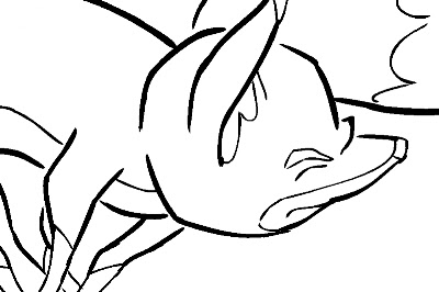
Here is an example of an inked fox image:
A fox image, inked but not yet ready for painting because of the large, deliberate gaps in the lines.

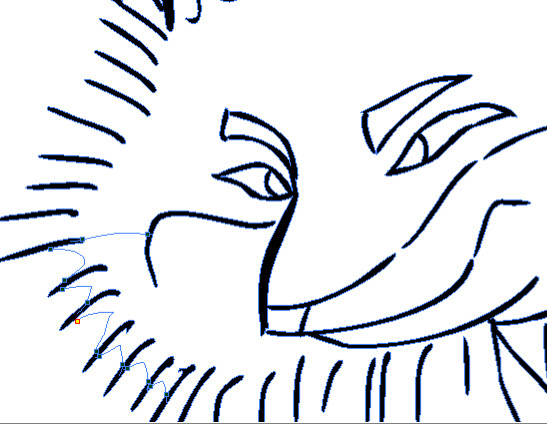
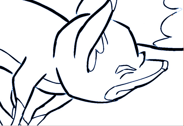
The large gaps shown here should be closed using the Stroke tool, which is on the toolbar in a pull-down menu with the Paint tool.  The Stroke tool is applied as you would use the pencil tool, in whatever straight or curved or even meandering style you care to employ.  It is important to understand not to use the Close Gap tool for these large gaps, because the Close Gap tool, while it will indeed close any gap, will always take the shortest and straightest path between the two points you are connecting, whereas you will find that you often may want to follow a suggested curve or other path when connecting two points.  For example, if I wanted to close the large gap at the back of the fox's head in the above illustration, I would want to follow the arc of the two lines being connected.

Here is the same image with the connecting strokes applied and made visible in blue.
A detail of the first image, with connecting strokes visible.
Note the stroke connecting the two curved lines at upper right.  This is an example of my stroke line completing the curves of the inked  lines and coming together in a soft point .

Here is an even closer view of the nose and brow area of the fox:
This shows clearly the strokes (in blue) connecting the line gaps in just the desired way.

When using the Stroke or Brush or just about any other  tool, be sure to take advantage of the instant-response Rotate View tool.  This is one of the greatest and most useful tools available in most of the Toon Boom family of products from Studio on up through Animate Pro and Harmony, allowing you to spin your drawing surface to obtain the most effective angle for your hand.  Rotate View is accessed on the Mac by pressing Alt+Command, and by a similar key combination on the PC.  The drawing disc icon that appears indicates its function; it is just like spinning the animator's  drawing disc that was set into a traditional Hollywood studio animation desk.

Sometimes the Stroke tool may be used in a more free-form or creative way than just for closing obvious gaps in lines.  Here is an example of that.
.  The gaps between each pair of border lines are connected using a line with a curve not based on the angles or curves of the inked lines.
Here the radial lines indicate the bristling fur of the fox.  I could have simply connected the lines with an arc perpendicular to the inked lines, but I wanted to finesse and soften the connections.  With the Stroke tool, this was easy to accomplish.

Next: Painting the Images


Wednesday, November 14, 2012

No. 20, Drawings Into Digital: Part 2--Inking

The scanned drawings are imported as batches into the timeline, all the drawings of each level to a new layer. The timing will be worked out later.  In my case, I have already worked out the timing in the pencil tests I did in Toki Line Test, so I will refer to the Xsheet from that when  spacing the drawings.

Here is what the timeline looks like after the  drawings are imported:

There are five layers of drawings showing here: Man, Tail_Behind, Body (the fox's body), Tail_infront, and Fur.  Above each of these layers I have created a drawing layer with the same names repeated, but in capital letters: MAN, TAIL-BEHIND, BODY, TAIL_INFRONT and FUR.  These are the layers I will be inking on, tracing from the layer below.

Note: I should mention that what I describe here is my own system.  Of the kinds of animation it is possible to do in Animate Pro, Toon Boom provides the least information and guidance about importing completed animation drawings.  No doubt this is because it is the least popular type of animation among its user base, so there is less demand for technical help, and because animators who can do all their animation on paper before entering the program usually know what they are doing.

At any rate, the drawings here are arranged in ascending number order in each layer, but the drawings of one layer do not yet have any meaningful relationship to the drawings of another layer.  For example, drawing 1 of the Body layer is meant to be held for many frames, but until it is inked and painted it will occupy only one.

I now begin the inking process, which looks like this:

The red frames on the layer BODY are the inked frames of the layer Body, directly below.

I have chosen a style using two weights of brush line, which are basically the default brush 2 and the default brush 3, although I have changed the property values of each somewhat.  Brush 2 gives a thin line without much variation, while brush 3 has a heavier line with a lot of thick and thin variation.  You will want to experiment to get the right amounts of Minimum and Maximum Size, and of Smoothness and Contour Optimization for your own purposes.  On the fox character I am using brush 2 for interior lines and anything else that is of a delicate nature, like the outlines of the lower legs.  Brush 3 is for everything else.

Also because I like the look, I am allowing the line to break, or to not always connect with other lines.  This will necessitate a lot of work with the Stroke tool, which adds invisible lines to connect these gaps.

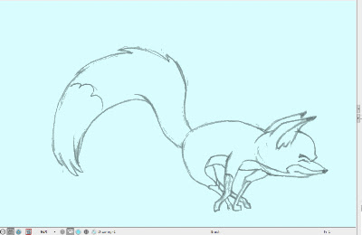
Here is a closeup showing the inking being applied over the bitmap scanned image.  The scan was at 150dpi.  It is blurry and I was forced to refer frequently to the actual pencil drawings to be able to make out some details.

Since scanning these, I learned through an exchange on the LinkedIn group Animation Community Platform that I could be scanning my drawings vectorized rather than bitmap.  Here is an example, showing the much higher quality:
A grey mode vector scan, this time over a blue color card.
The vectorized scan also gives me alpha transparency, which the bitmap image does not.  I will be using this type of scan from now on.

Next: Closing the Gaps