Pages

For People Crazy About 2D Animation!

Acme Punched! is for people crazy about 2D animation. It may be enjoyed by beginners and others, but it is aimed at animators who know already something about the process of animation and the basics of character animation. In large part, it will attempt to provide a deep look into the problem solving that goes on in my head as I work out a scene, often in step-by-step posts that I will sometimes enter in "real time", without knowing in advance what the outcome will be. Mistakes and false starts will not only be included but emphasized, so that the creative process of animation will be portrayed realistically. And, while my own bias is for 2D drawn animation, many of the effects and principles discussed here can apply to CGI 3D animation as well. I hope the blog will prove useful and instructive for all.

-Jim Bradrick
Showing posts with label Timing. Show all posts

Wednesday, June 4, 2014

No. 66, Creating a Four-legged Walk Cycle

FOXTROT


A short while back ( Acme Punched posts No. 60 thru 62) I showed you my approach to creating a walk cycle for my character Albert.  Now here is a walk cycle, or rather a trot, for the little fox character.

First, a bit of re-design was in order.  I made the original model sheet without much attention to the real anatomy of a fox.  This is a cartoon and you can do that, but he does walk on all four feet so I have now decided it would be good to have him move something like a real fox, and for that, he has to be constructed a bit more like a real fox.


In the original model sheet, above, he is rather swaybacked and holds his tail erect.

The revised design makes his spine arc upward a little, as in real canines, and shows him holding his tail almost straight out behind him when moving.


 The Animation

Once again I wanted to try something I had read about but had never actually done: to animate the head, body and tail before doing the leg animation.  This is effective in animating dance and other controlled movement such as sword fighting.  Disney animators have used the technique in animating such semi-realistic creatures like deer (Bambi), though others actually did the reverse, animating the legs before the body. (I would cite a reference for that, but can't recall exactly where I read it.)

Anyway I thought it might work on my cycle of a fox trotting.


This was the first test.  It was made using just three drawings, with the middle drawing favoring the highest one in its spacing (see Fig. 1). I thought the rhythm was fine, but since the fox will sometimes be quite small on the screen, I decided it was too subtle.


Now for a broader movement, in which I simply let his body drop down farther.


At the time (we will come back to this) I thought it was fine, and went with it. Here is the spacing.


Then I was ready to add in the legs.  This is a basic canine trot.  I referenced a favorite but little-known book of mine: Dog Locomotion and Gait Analysis, by Curtis M. Brown.  Brown is not an animator but a dog breeder and dog show judge, but the sequential drawings of the gaits of various breeds are a gold mine for anyone interested in how dogs move.

Here is the test.


Hmm.  I sort of liked it when I saw it, but...something was not right.  Can you see what is wrong without reading further?

If you said that the head was moving too much, you would be right.  I had lowered the head along with the torso.  It is the same as it was in the second version without the legs (see Figure 2 again also), but somehow it was not apparent to me until I saw it all put together.

Solution?  Leave the torso as it is but just space the head much closer to the other heads.


Now it is working right.  Many animals avoid movement that bounces their heads up and down very much, because either they need steady vision for pursuit of prey or to detect danger.

One more thing I thought to do was to see if I could vary the speed--make him move faster--without removing any drawings.  (He may have to trot quickly to keep up with Albert's brisk walk.)  The slow speed is 8 drawings on 2's, or sixteen exposures, thus: 1, 1, 3, 3, 5, 5, 7, 7, 9, 9, 11, 11, 13, 13, 15, 15.  The numbers in bold are the lowest position.  The obvious thing to try here is to see if it will simply work on 1's: 1, 3, 5, 7, 9, 11, 13, 15.  But it looked too fast and also jerky, so I am not even showing it to you.  Although it does not always work to have some drawings of a walk cycle on 1's while others are on 2's, because of the danger of "slipping" against the steady movement of the background, I decided to try this: 1, 3, 3, 5, 5, 7, 9, 11,11, 13, 13 ,15.  In other words, I dropped the second exposure on drawings 1, 7, 9, and 15--just four frames fewer, but look at the result:


It seems to work!


Next: More about working with 4-legged characters!

Wednesday, April 23, 2014

No. 62, A Walk Cycle for Albert, Part Five: Side View

 Solution to "Mystery Change"


In the last post (No. 61), I challenged you to find a difference in timing between the two versions of the walk cycle.  No one took me up on it, and I admit it was a subtle detail to find amid everything else that was going on in the cycle.  But the answer is: I changed the timing of the right arm (the one holding the bag).  In version 1, as the bag comes forward and then reverses direction to recede again, the movement seemed to me to have a stabbing aspect to it; that is, it took no time and no effort to reverse direction.  I thought this was inappropriate for a bag that might weigh 100 pounds or 45 kilograms.

I therefore took a look at the spacing of the drawings.  As the bag comes forward, it has an appropriate cushion-in.  The chart below shows the relative positions of the seam at the front of the bag.


But as the bag reverses direction, the drawings were not spaced so as to give a good impression of the cushion-out (the spacing that indicates that an object starts out slowly and accelerates.)  The next chart shows both the old and the improved spacings.  Again, it is the seam on the bag that we are following.
The original spacing is shown in red, on the left.  Final spacing on the right.
I think if you will now go back to post no. 61 and carefully compare the two versions, you will observe more of a slow-down and hesitation between the forward and backward movements of the bag.  It is more like the compression and release of a spring, as it should be, rather than like something bouncing.


Translating to the Side View

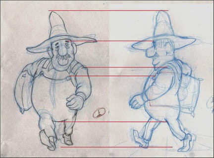
The obvious way to begin this translation of view is to construct the first image over the corresponding one of the other.  On my drawing board, that looks like this:
The front view showing through on my backlighted animation disk.
In a case like this, which is just a rotation on the Y axis, as the 3D-ers would think of it, many measurements can be directly applied from one drawing to the other.

Here are the two images separated, with a few points of congruence highlighted:
Showing where the top of the hat, the eyebrow, the shoulder seam, the top of the button and the bottom of the body mass coincide in both drawings.
Some things, of course, require adjustment.  Mainly these are the parts that project forward or backward in imagined space from the plane of the torso.  Thus the left hand appears larger in the front view to create the illusion that it is closer to the viewer, and the left foot is drawn smaller to show that it is farther back.

It should be emphasized that a walk cycle--or any animation, for that matter--should be designed with the perspective of its layout or background in mind; note the converging lines like floorboards on the drawing at right above, indicating the plane upon which the character is walking.  If you animate something without regard for the perspective and scale of the layout, you may be wasting time and work.  This should be considered even if creating something such as a gif animation meant to occupy the featureless expanse of a webpage.

Creating other angles wherein the viewpoint is raised or lowered is also possible, but here more sophisticated drawing skills are required to extrapolate from one to the other.
The same pose from a high angle, 3/4-front view.
I once was called upon to animate a character running while the camera swooped all about him--something a 3D animator of today would, admittedly, be able to do easily.  Yet once I had done a version of his run cycle from one viewpoint, I was able to work out all the other angles, and the whole thing worked very well.

Here is the first pencil test of the side view walk cycle:
I thought it worked pretty well, and it was fun to watch, yet something was not quite right for the walk of a man traveling a great distance.  Finally I decided that his stride was a bit too long; he is reaching a bit too far with each step.

So I shortened his stride by this much:
The erased images in red brackets show the original reach of his stride.
Here is the second test, incorporating the somewhat shorter stride along with a few other adjustments to the foot and leg positions in all the drawings:

I like this second version; except for details and cleanup, I am calling it done.

Your comments and questions are always welcome, and if you like what I am doing here, why not click on the Join This Site button and become a Follower?  That way you won't miss any posts, and I promise you many more to come!


Coming soon: Walks for Albert's Companions, a Fox and a Goose--two short-legged characters who must keep up with Albert's rapid pace!

Thursday, April 10, 2014

No. 61, A Walk Cycle for Albert, Part Four: Front View Final

I am going to present two versions of Albert's walk made this past week.  The first is about half cleaned up, with not all of my planned changes yet done.  The second is the final cleanup.  Later in this post, I will explain why I am including the half-finished version as well as the final.
The half-finished version. Here, some of the drawings are still in blue pencil but most of the planned changes are in.

This is the final pencil test; the drawings are all done in graphite pencil now and are ready to be scanned for digital ink-and-paint.

Cheap Trick Department:
When doing cycles such as this, one is constantly comparing the first half of the cycle with the other half; otherwise, the movement will not look balanced. In this case, drawing 1 (the right foot contact drawing) is more-or-less a mirror image of drawing 15 (the left foot contact drawing.)  Thus, each drawing in the cycle has its mirror counterpart.  With 14 drawings to track in this way, I have found it useful to give the drawings an alphabetic designation as well as its numeric one.  So drawings 1 and 15 are both also "A"; drawings 3 and 17 are both "B", and so on.  In this way it is easy to pull out both the drawings marked C or D or whatever for comparision to one another.

Changes made since the version shown in Post No. 60:
--More change of scale front to back.  That is, when Albert's foot or hand is closer to the camera, it is more obviously larger than when it is at the back, farthest from the camera.  This change of scale in what 3D animators call the Z axis can add depth and drama to a scene, even when the character's body remains a constant distance from the camera.  Opportunities to utilize this enhancement should not be neglected.

--Left arm animation.  As mentioned in No. 60, I was unhappy with the arc of the arm as it came forward.  This has been fixed.

--Shorter pants legs, with socks showing.  Shown only in the final.  Albert's socks are red, so there will be an amusing flash of color there.  Also I am simply complying with my own model sheets for Albert, bringing him on model.  The pants legs also are animated as a follow-through to the leg movement but this is rather subtle.

--Precise drawing.  Cleaning up the images in the same order in which they were drawn as roughs (extremes, then breakdowns, then inbetweens), everything has been tightened up.

--Foot slippage.  This could come under the heading of precise drawing, above, but in walk or run cycles it rates its own category.
Foot Slippage chart on drawing 17.
In doing the rough animation, I had just "eyeballed" the foot positions, but when it came time to clean the drawings up, I scrutinized them closely and found it useful to make this chart.  The lines represent the back of the heel on drawings where they are in contact with the ground.  Note the ghost images showing where the feet originally were in this drawing.

--Mystery Change ???  There is one other change I made here, and I challenge you to find it by comparing the Half-Finished and Final pencil tests above.  No new drawings were added, but something I haven't mentioned has been re-timed.

Can you find it?  I will post the answer next time, but I would like to hear from anyone who can find the change.  Moreover, can anyone tell me why I made this change?


Next: We Rotate Albert 90 Degrees and See His Walk from the Side.

Wednesday, April 2, 2014

No. 60, A Walk Cycle for Albert, Part Three: The Full Test

In addition to filling in all drawings for this walk cycle, this week I have improved the readability of these pencil tests.  Because I often do my rough drawings in blue pencil, the tests done in Toki Line Test software have been of such a low contrast that by the time they have been rendered as Quicktime Movies, they are hard to see, especially if there are multiple levels.  Now I have greatly improved this by exporting the drawings from Toki as jpegs, then adjusting their values in Photoshop before importing them once again into Toki Line Test.  I think you will appreciate the sharper, more high contrast result.

This test is now working in most ways.  A good walk cycle includes many details of movement besides just moving the feet and legs and swinging the arms. Here are some things I included in Albert's walk:

Rhythmic vertical movement. Does the character rise up or drop down on the passing positions, and by how much?  I have Albert rising up enough to be noticeable.

Shoulder action.  Albert's upper torso rotates in opposition to his hips, but his right shoulder is kept highest at all times because of the load he is carrying on that side.

The legs and feet.  They are working well.  Just before each of the contact drawings I inserted a little kick; he throws his foot out past the point of contact for one drawing (2 frames) which adds a nice confident snap to his walk.  It has an impact more felt than seen. Here is the detail showing that:

Two drawings before contact.
One drawing before contact; the foot is thrown forward, beyond the contact point.  


The contact drawing (his right foot.)
Head action.  I have made his head tilt to alternate sides on the contact drawings and to be verticle--untilted--on the passing positions. This will mean that in a side view of the same action, his face will be partially hidden by his hat brim when the right foot makes contact (see drawing above) but I have planned for that.

The swinging arm.  This works pretty well but I don't like the way the arm comes forward.  It should swing out farther rather than in as I have it now.

Follow through actions.  [1] After the contact drawings, the belly descends and delays coming up for a couple of drawings, giving him an appropriate heaviness.  I want to refine this some more.  [2] When the left hand reaches its full extent at the front it flips up.  [3] The hatbrim flips up and down a little as he bounces along, but that needs more refinement also.

These details and others can be thought about and added in now that the basic elements of the walk are in and approved.  Although it is possible to suggest secondary and follow-through action during the first pass through the animation, usually they will need some adjustment, and it is perfectly alright not to put them in at all until the first pass is complete.  A walk cycle like this presents a lot of challenges, so it is all-important to get the basics right first.

For an exhaustive look at animating walks, see Richard Williams' book The Animator's Survival Kit.


Next: Refining the Details of the Walk

Saturday, March 29, 2014

No. 59, A Walk Cycle for Albert, Part Two: Point of View

A Different Point of View


In thinking about this walk for Albert, I have most often pictured it from one side, the standard view for getting the most out of your drawing cycle.  In 3D terms he is walking along the X axis, but the camera stays with him and matches his speed so that he stays centered on the screen, while the background can be seen slipping past.

But even though I want to show this profile angle, there is a problem in designing it in this way because of the sack of grain he is carrying; its great weight forces him to walk assymetrically, and from the side this is very hard to visualize.  Here are a few sketches showing my struggles with this problem.


I seem to remember reading of an animator (Frank Thomas?) advising that if you are having trouble drawing a character from the camera angle, to first draw it from a more obvious angle, then extrapolate back to the original angle.  In other words, draw it first at an angle  from which you can understand the proportions and mechanics, and then rotate it in your mind to whatever it must be.  This is difficult but it is a skill most long-time pencil animators have developed.

So in this case, I decided to try looking at the walk from the front:


Right contact position.
Immediately I could see that this was the way to go.  Here are the other three key drawings for the cycle.

Passing position.
Left contact position.
Passing position.
And now I have a first pencil test made with just these 4 drawings:
The cycle is designed to last 28 frames at 24fps, a bit longer than usual.  Also I am putting the emphasis on the contact positions, so in the test, instead of exposing the 4 drawings equally, seven exposures for each, I gave the contact drawings 8 exposures and the passing positions only 6 each.  It still adds up to 28 frames, but the rhythm more nearly matches what I want the final result to be.


Next: The Test from the front, with all drawings filled in.

Tuesday, March 25, 2014

No. 58, A Walk Cycle for Albert, Part One: The Brief

If you have been following this blog at all, or if you go back now and look at some of my previous posts, you would have seen or will see a lot of my two human characters, a man and woman I call Albert and Victoria.

The long sequence I have been detailing for the blog has them facing each other, mostly standing in place.  But there are other planned scenes in which Albert is doing a lot of walking.  Mostly when he is walking, he is encumbered by a heavy burlap sack of grain under one arm.  Sometimes the full-grown goose is being carried under the other arm.


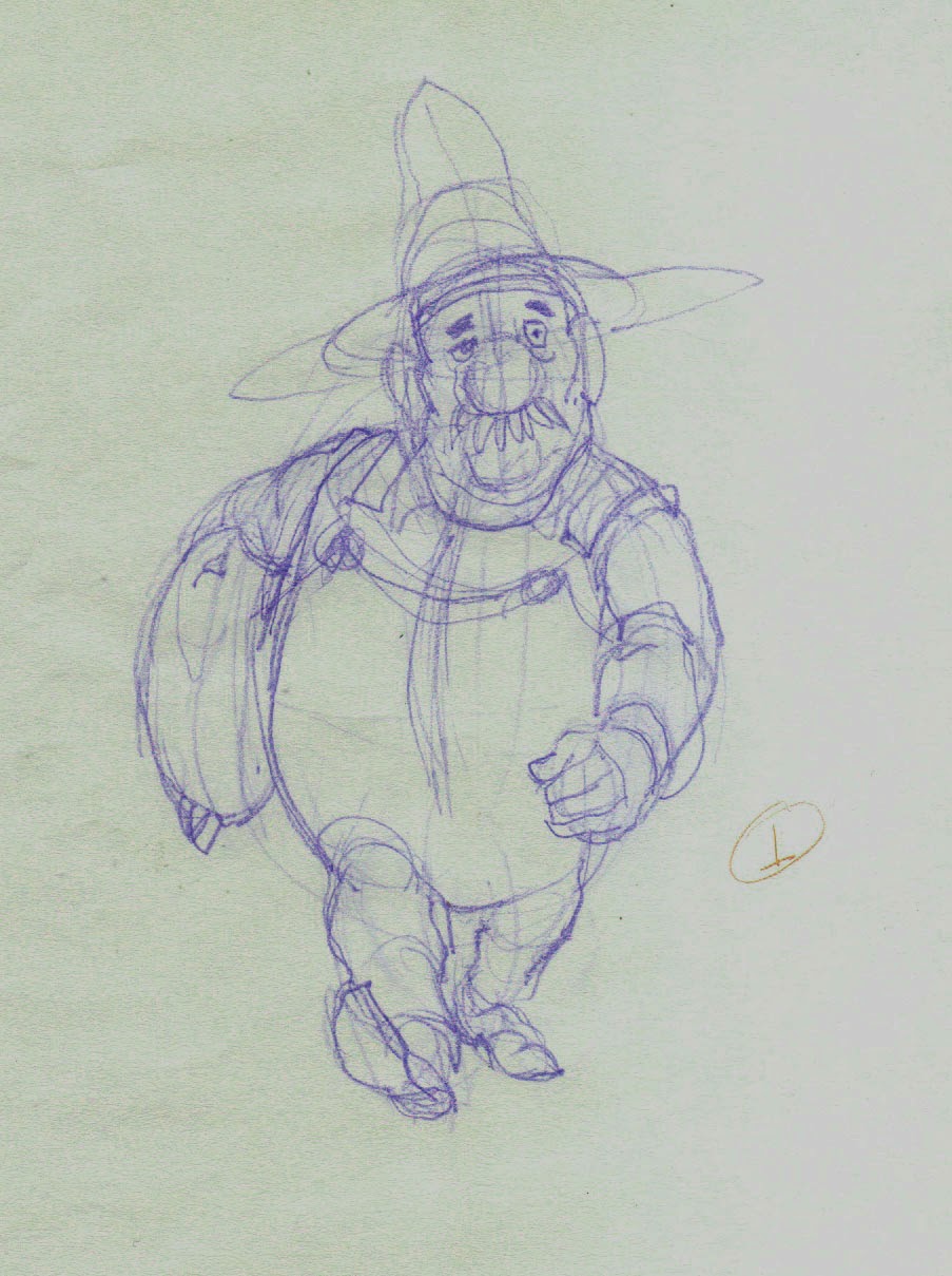
An early concept drawing of Albert walking.

Now that I am at the actual point of animating his walk, I want to pull together all the thoughts I have had about it as I worked with Albert in other ways.

Here is what I know about Albert and his walk:

  • He is a big man, overweight but solid rather than soft, and he is very strong.  
  • The sack of grain may weigh 100 pounds [45 kg] but it is not too much for Albert to carry under one arm.
  • He has miles to walk, so his walk will be deliberate and measured; something he can maintain over a long period of time.
  • He does not mind hard work, so to walk a long way with such a load does not in any way make him unhappy, and he is by nature a cheerful and optimistic man.

This is the kind of thinking that should go into the planning of any animation, but sometimes novice animators forget this when it comes to walks.  They think, I'll just sit down and animate my character walking, because they want to see it, but there really should not be any such thing as an all-purpose walk.  If a character is crossing a room, it is for some reason.  It will affect his or her posture, as well as the speed and style of the walk. His entire state of mind is important, too; whether he is in haste, is anxious or relaxed, is fearful or self-confident, is fatigued or energetic.

Perhaps a walk must be done even more carefully than non cyclic animation because it is a cycle and will be seen in repitition, giving the viewer time to study it that is not the case with a one-off.

I have been thinking about Albert's trekking walk a long time, and now I am ready to animate it.


Next: Choosing the Best Point of View for Designing the Walk

Monday, November 25, 2013

No. 51, Hollywood Cartoons: One's or Two's; Which Works Best?

Sometimes I like to load a DVD of classic cartoons into my laptop and step through parts of the animation, frame-by-frame.  This way you can learn something about the thinking and strategy of the animator and often pick up a few of his tricks.

The other day I was doing this with Bugs Bunny Rides Again, the 1947 cartoon directed by Friz Freleng.  This was the second appearance of Yosemite Sam, and the credited animators are Ken Champin, Virgil Ross, Gerry Chiniquy and Manny Perez.

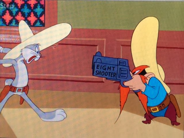
The big showdown between Bugs and Sam (six-shooter, seven-shooter, eight-shooter, nine-shooter, ten-shooter, pea-shooter) contained a surprise and a puzzle when viewed frame-by-frame: the animation of the quick draw action for Sam was mostly on two's; for Bugs, it was mostly on one's.

If you are not familiar with this terminology, here is a little explanation: it was generally held even at Disney that most action could be presented smoothly enough on two's--that is, two frames of film exposed for each drawing in film that ran at a projection speed of 24 frames per second.  So, for one second of action, you might need only 12 drawings instead of 24.

However, for very fast action, and especially where drawings exposed on two's would not overlap at all  (and overlap helps to smooth out the flow of animation), it was regarded as necessary to have a drawing for every frame of that very fast action.

Thus, an animated sequence could be expected to have sections where the slow bits were on twos and the very fast bits were on one's.

(Another circumstance where it is considered necessary to animate on one's is during a camera pan movement, because since the background is moving on one's, the character has to be doing the same.)

In the showdown between Sam and Bugs, they face each other and draw their two guns alternately.  Here is where I observed a difference in their animation.  It became obvious because this sequence escalates.  Sam has six-shooters; Bugs draws seven-shooters; Sam draws eight-shooters, and so on until Sam draws ten-shooters and Bugs draws a pea shooter.  And the same timing shows up in each instance  (and, yes, the animation is different each time; the studios at this point in animation history seldom engaged in reuse of animation.)

Below are the key frames from just one part of this action, where Sam draws eight-shooters (on two's) and then Bugs draws nine-shooters (on one's).  Let's look at them now, and then I will say more about them.

Start of the action.
Sam drawing one: 1 frame.
Sam drawing two: 1 frame.
Sam drawing three: 1 frame.
Sam drawing four: 1 frame.
Sam drawing five: 2 frames.  Here I skip 2 drawings of 2 frames each which are the anticipation as he grips his holstered guns.

Sam drawing eight: 2 frames.
Sam drawing nine: 2 frames.
Sam drawing ten: 2 frames.
Now it is Bugs' turn to draw.
Bugs drawing one: 1 frame.
Bugs drawing two: 1 frame.  Again, I skip a few frames as Bugs says something, then gets ready to draw his pistols.
Bugs drawing nine: 1 frame.
Bugs drawing ten: 1 frame.
Bugs drawing eleven: 1 frame.
Bugs drawing twelve: 1 frame.
Bugs drawing thirteen: 1 frame.
And they hold on the final drawing.
Studying this frame by frame, I wondered why it was that Bugs' draws were on ones (or 1's; to me it doesn't matter how you write it) and Sam's were on twos.  I even wondered momentarily if a separate animator had drawn each character.

Playing it with sound, everything became clear to me.  The timing is driven by the dialog.  Each character says something like, "Oh, no it don't!", and draws his guns on the last word.  Sam, as voiced by Mel Blanc, draws his words out a bit longer than Bugs, also voiced by Mel Blanc.  The animator was simply hitting accents, and with Bugs he needed fewer frames to get to the accent.

But what an interesting look at the use of 1's and 2's this is.  The actions are quite similar, the difference between use of 1's and use of 2's is, in this case, just about undetectable.  And they both work.  All the usual techniques are here: stretched shapes, dry-brushed speed and motion lines or tracks, and even a one-frame smear when Bugs brings out his pea-shooter (not shown.)

I invite you to look at some animation this way.  Many console  DVD players offer this step forward feature, and the DVD player of my Macbook Pro also works well for this, except that it will not step backwards.

Note: All images in this post are copyright of Warner Brothers Entertainment, Inc., and are used with their imagined indulgence.

Sunday, November 17, 2013

No. 50, Jim on a Limb: One (Part 6)

Animating the scene shown and described in No. 49 was a matter of trial and error.  For the most part, the poses worked and it was just a matter of working out the timing.  For example, the two changes of expression (from despair to determination, then to cunning) were at first almost identical in their timing.  I realized then that coming one right after the other, they needed to be different from each other.
Despair to determination is now shorter in frames, and the hold at the end is also shorter, than both those things in the second transition, from determination to cunning.  The latter thus gets more stress, and fittingly becomes the more important.

Three expressions: despair, determination, cunning.


To view the difference in timing, go here.

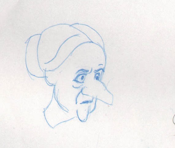
One pose that had to be re-done was this one showing her slumped down in despair.  For this character I wanted to use that limp-wristed attitude that at one time was so common among women when their hands were idle, but my first try had produced a pose that did not quite express the despairing mood. 


Also, when I saw the test in animation, I didn't like the movement, which showed the forearms and hands pulling back up too far after dropping down. It did not express the intended attitude of resignation and despair.

I replaced that pose with the one shown below, and I damped the movement until it seemed just right.


But one thing did go as I had hoped, and I got it right first time out.  This is the final movement where she settles into her attitude of supplication; she is saying, "Give me a break!  What did I ever do to you?"  Her arms come up and she knocks her fists together three times, hunching up her shoulders.


When something like this does go right, it makes all the other struggles worthwhile.


Next: Jim on a Limb: One (Part 7)  Doing What Is Necessary

Sunday, November 10, 2013

No. 49, Jim on a Limb: One (Part 5)

Note: I have now numbered all my posts chronologically, in addition to having series and subject headings.  I think this will make it a little easier for me to refer back to previous posts, and for you to locate them, especially as the parts of  series are are not always consecutive.


The Pencil Test


Here is the pencil test of Victoria as promised in my last post.  Remember that the fox has her firmly by the nose throughout this scene.  I have not included that layer of the fox only because using too many layers in a pencil test makes for a dark and murky image that you may have trouble viewiing.

[movie]

It works pretty well now, but as in most complex things that one tries to plan in advance, there were some changes along the way.


Changes to the Plan


First, two new extreme poses were added.  They fall between poses E and F as shown in Part 4.  Here are those poses again, with the new ones placed inbetween.

Pose E
Pose E expresses her feeling of despair.


Pose E-1
The first new pose, call it E-1, shows her stubborn nature returning; she will not be defeated!


Pose E-2
The second new pose, E-2, is a cunning expression; she has an idea and she is calculating whether it will persuade the fox.


Now we go to pose F and then G, where she gathers herself and then adopts an attitude of pleading or supplication.


Pose F

Pose G

Thus we have her thinking her problem through in a way that the viewer can easily follow.  This is the sort of deep exposition that I am just now learning to do, and which I have often failed to understand in the past, largely because my experience in professional animation has been mostly confined to commercials of 30 seconds or less, with no time and frames to spare for looking into a character's motivations and thought process.


In Part 6, I'll talk about how the animation itself went on this little scene.

Next: What Came Easy, and What Was Hard


Friday, October 25, 2013

No. 48, Jim on a Limb: One (Part 4)

Six weeks since I have posted.  Partly it was this and that, an illustration job, a couple of commercial jobs, the re-designing of my website, a busy late summer.  But also it was the difficulty of the problem here--the one I last mentioned in post no. 45, Jim on a Limb: One (Part 3)--in which I laid down the key drawings I needed to animate.  If you want to follow the continuity of this demonstration, please go back now and look at that post.

How It Looks in Pencil Test


Here is the result:

Of course this test is focused on the man.  His name is Albert.  I also have animation of the woman  about ready (her name is Victoria), but because too many layers make the pencil test dark and difficult to follow, I have left off all layers here except for two: Albert, and Albert's Head.

This is about what I wanted it to be in so far as Albert is concerned.  I think you can see him thinking.  He gets serious and cautious at the beginning, he communicates his plan to Victoria, and when he gets bumped in the nose by the fox as he lowers him down, Albert doesn't let it bother him much.  One thing I will make more clear is Albert's expression, which will remain disapproving until, at the end, he relaxes his stern expression to gaze in perplexity at the fox, who is behaving so badly.

Next it is Victoria who will try to deal with the fox, first as if to make some argument, then feeling hopeless, and finally just appealing to his good nature.  And all without a word of dialog or narration.

I have begun by adding a few more key drawings to define Victoria's performance; the first ones would be sufficient for a storyboard, but the animator must go further and think of everything that will be in the character's performance.

Victoria regards the stubborn fox.
Pose A is the last pose of the pencil test above.

She resolves to try something to make the fox let go.


Pose B shows her determination to act.  It also is an anticipation to Pose C.

She moves as if to speak out loud to the fox...
Pose C.  She might be about to actually say, "Why won't you let me go?"

...but stops short, realizing the futility of this.
Pose D pulls back a little from Pose C.  She holds for 16 frames, blinks.

Victoria slumps, feeling the situation as hopeless.
Pose E  expresses her feeling of despair.

An anticipation to pose G.
In Pose F, Victoria gathers herself for one last attempt.

The last pose: with her eyes she pleads for the fox's mercy.
Pose G shows her final supplication as she bats her eyelids and beats her fists together.

This is a tough bit to do because it is designed so that the character can barely move her head; where the fox grips her by the nose is a pivot point and anchor for the whole character, and the animator must work only with her expression, with her arms and hands, and with some cautious movement of her shoulders and body.


Next: Victoria and the Fox: the Pencil Test