Pages

For People Crazy About 2D Animation!

Acme Punched! is for people crazy about 2D animation. It may be enjoyed by beginners and others, but it is aimed at animators who know already something about the process of animation and the basics of character animation. In large part, it will attempt to provide a deep look into the problem solving that goes on in my head as I work out a scene, often in step-by-step posts that I will sometimes enter in "real time", without knowing in advance what the outcome will be. Mistakes and false starts will not only be included but emphasized, so that the creative process of animation will be portrayed realistically. And, while my own bias is for 2D drawn animation, many of the effects and principles discussed here can apply to CGI 3D animation as well. I hope the blog will prove useful and instructive for all.

-Jim Bradrick
Showing posts with label Hollywood Cartoons. Show all posts

Thursday, February 4, 2016

No. 89, "Easy Way to Draw"

My first real interest in 2D cartoon animation was inspired by a 1950's TV show, Woody Woodpecker. Each half-hour show was comprised of four theatrical cartoon shorts produced by the Walter Lantz studio over the past two decades, plus a live-action segment in which studio head Walter Lantz would do a mini documentary about some aspect of animation production.

Here is a link to one such segment now showing on You Tube.  Seen today, the live action footage includes scenes that were clearly staged for the filming, such as story conferences and animator interactions. But at the time I felt I was being let in on animation production secrets. Indeed, there was little information available to the general public on this subject, so anything at all was better than nothing.

At the time I could not discriminate between Walter Lantz studio quality and that of the Walt Disney organization, nor between Lantz and Warners or MGM. But I did recognize the sophisticated animation in the Woody Woodpecker cartoons of the late 40's and very early 50's, and I didn't know then that they were more the work of directors Shamus Culhane and Dick Lundy and their animators than of Lantz himself. It was Walter Lantz who seemed to have reached out to me, and so I wrote him a letter.


When the personal answer arrived, I was thrilled to be treated with respect and to have been acknowledged by this important animation producer. The book he mentions is Walter Lantz "Easy Way to Draw".  I don't remember now if I got the book because he mentioned it, or if I had it already.  It was an attractive book published by Whitman Publishing, who published hundreds of titles for children including many, many coloring books. This book was more-or-less in the style of a coloring book, and the illustrations were quite appealing.


As promised, there were many pages of step-by-step illustrations of the drawing of the Walter Lantz characters, and I tried and tried to copy and then extrapolate from these examples.

The bogus "basic shapes" process of drawing that has been enshrined in
so many learn-to-draw books over the years.

The only problem was, though there may be an easy way to draw, there is no easy way to learn to draw.  Aside from the examples of a very few natural artists, the rest of us have to work very hard to draw well. The professional artists who illustrated these pages had worked for years to be able to do this kind of work.  And let's face it, no one draws like this. How-to-draw-it lessons like these are really deconstructed; the artist starts with a finished drawing and works backward to arrive at the basic shapes.  I know, because I did it myself one time in a book called You Can Draw Animals Right Down to the Skin.

My own lesson in how-to-draw--or how-NOT-to-draw!

I can think of a dozen examples illustrating this same bogus process, including a wonderful parody by Farside creator Gary Larson.

Nevertheless, I was inspired. I yearned to be able to draw like this, well enough to be paid to do it. I kept after that dream, and eventually I have, I believe, learned to do it pretty well. But don't let anyone tell you that there is an easy way to draw, or an easy way to play classical piano, or an easy way to do just about anything worthwhile. There are only hard ways to learn an art, after which you may say you have "a way to make drawing look easy."

More exciting to me than the book itself was this picture on the back cover, my first glimpse of a real
animator's workspace: the desk, the shelving, the coiled pencil holder and the metal drawing disc with
Acme pegs. (actually, these pegs look like they might be Oxberry, a slight variation on Acme that was
common at one time in east coast studios.)
Next:
A Woody Woodpecker walk cycle I did at 12 years old.  Plus, proof that I could do 3D if I wanted to!


Wednesday, September 3, 2014

No. 73, Rare Animation Books: The Art of Animation

The Art of Animation, by Bob Thomas, 187 pages. Pub. 1958 by Simon and Schuster.

 This colorful book was conceived around the Disney studio's production of Sleeping Beauty (1959) and showcases its art in particular. And unlike the Robert D. Feild Art of Walt Disney, published in 1940 and reviewed in my post no. 72, it gives due credit to the names and personalities of the many great Disney artists throughout the history of the studio. Surprisingly, there is even a Compilation of Animation Credits section at the end. On the other hand,  it is also like the previous book in that it has the taint of a corporate production, a Disney promotion that makes no mention of any other studio or of anything negative such as the labor union battles of the 1940s or the diminished interest of Walt Disney himself in his animated productions.

A double-page spread using a still from the film of Sleeping Beauty.


The Disney story was presented in an entertaining and beautifully laid out book.  There was plenty of production art to look at, though it was often juxtaposed with non-production art that had the look of Little Golden Books art--flattened, not quite on model.  Even as a boy I recognized and resented this insertion by an art director of what I considered second generation interpretations of the real thing.

Another spread showing stills from three cartoons, two illustrations featuring production art, and at lower right a Golden Books-style illustration.


Nevertheless, there was information here that had never before reached such a wide audience, much of it in archival photographs and their captions.

Shot of a story conference in the old Hyperion studio, mid 1930's.  That's inspiration artist Albert Hurter at extreme right.

First photo and first mention of which I am aware of Disney's Nine Old Men of animation. The term was not used by Walt endearingly.


Pictures of the animators at work intrigued me particularly, as they showed the artists with pencils actually in hand, actualy animating, the stacks of drawings and pinned-up model sheets all around them. To me, already in love with the idea of animating as a career, it was thrilling.

Animator Ollie Johnston at his board, mugging into his mirror while animating a fairy.


Looking back from 2014, with all the wealth of critical writing about Walt that we now have, with all the interviews and research accomplished by animation historians like Jim Korkis and Mike Barrier, the Bob Thomas book seems without depth, but it marked the beginning of a time of greater interest in the people of animation who made Walt Disney look good and in the art of animation itself.

A spread showing the work of background stylist Eyvind Earle, whose angular and geometric designs influenced even the character design in Sleeping Beauty.


My copy is a first edition that I have owned for more than fifty years, as evidenced by its worn appearance.  An internet search through rare booksellers or ebay might turn up a copy for you.

Tuesday, August 26, 2014

No. 72, Rare Animation Books: The Art of Walt Disney, by Feild

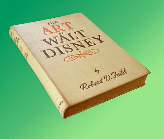
The Art of Walt Disney, by Robert D. Feild, 290 pages, pub. 1942 by Macmillan and Co.


First, you should understand that there are  two completely different books called The Art of Walt Disney. The better known of these is the most recent, a massive coffee table book by Christopher Finch first published in 1974.  In fact, when I went to Amazon just now to look at reviews of the earlier Art of Walt Disney, I found that all the reviews seemed to be of the 1974 book; all these people had no knowledge of the one published in the 1940s.  But the Finch version, rich in color artwork but short on real information about the animation studio, was for me a vast disappointment.

The other book known as The Art of Walt Disney was published in 1942 and written by a professor of art who was given a year of access to the Disney studio in Burbank between 1939 and 1940.  An interesting year it was, too, for Snow White and the Seven Dwarfs had premiered successfully in 1937, proving the viability of feature-length animation and spurring the studio to initiate production on not one but several new features.  The book therefore contains details on the production of Pinocchio, Fantasia, Bambi and Dumbo, all of which were in various stages of development, as well as many animated short subjects which were still a major division of production at Disney.

Early concepts of the 7 dwarfs. Some of these are by Albert Hurter.


As an art historian Feild admitted to a quandary about what the animated productions of the Disney studio actually meant as art, but he knew he was onto something big and exciting.  Disney the producer had thrown far more money back into raising the standards of animation than he had kept for himself, and the result was a clear lead in production quality and standards over every other Hollywood studio.  Efforts by other countries, from the Disney point of view, did not even exist.

Layout sketches, possibly by Tyrus Wong.


The book itself was the first serious literary survey of Disney or of any animation, and its publication was a tribute to the new recognition and respect accorded to Walt Disney after his sensational breakout from shorts starring Mickey Mouse, Donald Duck and Goofy into the world of feature films.  For an exhilerating two years or so after the release of Snow White, anything seemed possible and the continued success of the studio seemed assured.

World war beginning in  1939 with Hitler's invasion of Poland ended all that, closing lucrative distribution markets in Europe and, after 1941, diverting much of the studio's energy into jingoist war propaganda.  According to a 1942 review in Saturday Review, however, the book went to press before the December, 1941, bombing of Pearl Harbor, and so Feild's writing was not influenced by the direct involvement of America--and Hollywood--in World War II.

These may be examples of Shamus Culhane's "fast animation" technique.


There is an oft-told story of Walt Disney confronting one of his ambitious young artists back in the '30's, telling him not to get any ideas about making a name for himself at the studio; the only name the public was to see was that of Walt Disney. The story is true, though of course the features from Snow White on had artist credits just like any other feature films.  But Feild in his book maintained Disney's attitude about keeping the artists anonymous, and so there is not a single animator or designer mentioned by name in the entire book. From the point of view of historical interest, this is an unfortunate omission, although subsequent writing over the ensuing decades has illuminated some of this darkness. One can easily recognize the work of Marc Davis, of Milt Kahl, of Rico LeBrun and others.

Some of Preston Blair's dancing hippo drawings, made famous in his animation book.


The text  is written in a somewhat verbose style typical of the day, but the book does a good job of detailing the Disney production process and even makes an attempt to describe the intricacies of animating. Much is made of the expansive new Burbank production plant. Yet the refusal to name names continues to be an irritant throughout.  Besides Walt, only Roy Disney is mentioned by name.  How can you tell the story of Walt Disney without mention of Ub Iwerks?  Of Ham Luske and Norm Ferguson and Bill Tytla and Freddie Moore?  Yet Feild manages to keep them all behind the curtain, to the point that I suspect this anonymity was a precondition imposed on him by Walt.

Uncredited like all the others, here are some structural guides for deer animation by Rico LeBrun.


Nevertheless there are many full-page plates or illustrations, some in color, that make the book a worthwhile document of the Disney studio in the early 1940s.

Animation drawings of Ali the alligator, very possibly by John Lounsberry.


Feild's The Art of Walt Disney is considered a collector's item.  My copy is a British reprint (1944) published in London by Collins.  Copies available on the internet are few and  not inexpensive, but it is still possible to get one if you want it badly enough.


Thursday, May 15, 2014

No. 64, My Process of Character Design, Part One

First, a note about the imminent discontinuance of a software application that has been an important part of my pipeline:

No More Toki Line Test


Got an email this morning, as did all other of their users, that Digital Salade is discontinuing sales and support of Toki Line Test by the end of this month (May, 2014.)

This is the pencil test program, costing just $100, that I have been using and recommending since I first signed on in October, 2011. I regret that they are discontinuing the program as their support was always first rate and very personal.  Of course the application will continue to function indefinitely, perhaps for years, and I expect to continue using it for the forseeable future.  But I can no longer recommend that anyone else take it on.

My Character Design Process


Character design is fun!  Anyway, I think so.  I have always enjoyed it since as a boy I used to try to design cartoon characters, superheroes, and others. My limited drawing skills were a frustration to me at the time, but I persisted until I could do it.

My natural tendency in character design leans toward classic Disney, which means I design from the same standpoint as a Maya designer: I am thinking in the round, as if my 2D drawings are just single viewpoints of a character I have visualized in three dimensions. From my designs a sculptor would have no trouble building a macquette or 3D model.  I have just learned that there is a term for this approach: centerline design.  I found this term in Amid Amidi's wonderful book Cartoon Modern (Chronicle Books, 2006.)  This book is devoted to alternative character and background design in animation, popularized in the United States in the 1950's and 1960's.

A double-page spread from from Cartoon Modern, by Amid Amidi, showing designs for Tex Avery's Symphony in Slang (MGM, 1951.)


The studios producing American theatrical cartoons were resistant at first because most of their artists and animators were uncomfortable doing anything besides the tried and true style exemplified by Tom and Jerry, Donald Duck, Bugs Bunny and Woody Woodpecker, and because the producers and distributors were afraid of such radical change.  Yet their were some designers among them, mostly younger men and a few women, who were eager to experiment and try new things.  Even at Disney there was a modern design mole hidden at the very top, among the famous Nine Old Men: Ward Kimball, who went from animating the stereotypically centerline character Jiminy Cricket in Pinocchio (1940) to the semi-modern Cheshire Cat in Alice in Wonderland (1951) to directing the ultra-graphic and revolutionary theatrical short Toot, Whistle, Plunk and Boom (1953).

While this modern design was at first used with great charm and thoughtfulness, in animation that remained lively and entertaining, its utility in the eyes of producers as a cost-cutting technique eventually devolved into the boring, tiresome and often ugly product called limited animation that dominated television cartoons from the mid-1960's onward.   But don't get me started about that!  (We hold these Filmation truths to be self evident.)

On the left, Centerline Albert. On the right is one way that a Modern Design Albert might look.


Centerline, on the other hand,  is perhaps not a self-evident term.  It seems to refer to a design principle found in organic forms in nature: bilateral symmetry, meaning that many living things, including humans, have a right half and a left half that approximately mirror one another.  It is the starting assumption for this kind of character design.

Modern design turns all this on its head; modern design approaches character design mostly as a silhouette, and it takes from abstract modern gallery art the concepts of simplifying form, of using the clearest angle of a form as its primary shape (the eye as viewed from the front; the nose and ear as viewed from the side of the head), and of largely ignoring or distorting principles of perspective and foreshortening, and rotation of solids.  Note the difference in the two approaches to my Albert character, above.

And while I remain fond of centerline design, and will continue to use it, I am also attracted to this modern design.  For my new project The Two Washingtons I feel it is an agreeable design avenue, so I am stepping a bit outside my comfort zone to push my characters in that direction.  Here's just one example where I took a character concept in an entirely new direction:

First and second draft of character design.


Next: How All the Characters Were Changed


Monday, November 25, 2013

No. 51, Hollywood Cartoons: One's or Two's; Which Works Best?

Sometimes I like to load a DVD of classic cartoons into my laptop and step through parts of the animation, frame-by-frame.  This way you can learn something about the thinking and strategy of the animator and often pick up a few of his tricks.

The other day I was doing this with Bugs Bunny Rides Again, the 1947 cartoon directed by Friz Freleng.  This was the second appearance of Yosemite Sam, and the credited animators are Ken Champin, Virgil Ross, Gerry Chiniquy and Manny Perez.

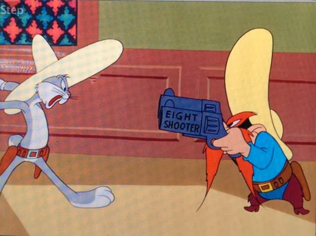
The big showdown between Bugs and Sam (six-shooter, seven-shooter, eight-shooter, nine-shooter, ten-shooter, pea-shooter) contained a surprise and a puzzle when viewed frame-by-frame: the animation of the quick draw action for Sam was mostly on two's; for Bugs, it was mostly on one's.

If you are not familiar with this terminology, here is a little explanation: it was generally held even at Disney that most action could be presented smoothly enough on two's--that is, two frames of film exposed for each drawing in film that ran at a projection speed of 24 frames per second.  So, for one second of action, you might need only 12 drawings instead of 24.

However, for very fast action, and especially where drawings exposed on two's would not overlap at all  (and overlap helps to smooth out the flow of animation), it was regarded as necessary to have a drawing for every frame of that very fast action.

Thus, an animated sequence could be expected to have sections where the slow bits were on twos and the very fast bits were on one's.

(Another circumstance where it is considered necessary to animate on one's is during a camera pan movement, because since the background is moving on one's, the character has to be doing the same.)

In the showdown between Sam and Bugs, they face each other and draw their two guns alternately.  Here is where I observed a difference in their animation.  It became obvious because this sequence escalates.  Sam has six-shooters; Bugs draws seven-shooters; Sam draws eight-shooters, and so on until Sam draws ten-shooters and Bugs draws a pea shooter.  And the same timing shows up in each instance  (and, yes, the animation is different each time; the studios at this point in animation history seldom engaged in reuse of animation.)

Below are the key frames from just one part of this action, where Sam draws eight-shooters (on two's) and then Bugs draws nine-shooters (on one's).  Let's look at them now, and then I will say more about them.

Start of the action.
Sam drawing one: 1 frame.
Sam drawing two: 1 frame.
Sam drawing three: 1 frame.
Sam drawing four: 1 frame.
Sam drawing five: 2 frames.  Here I skip 2 drawings of 2 frames each which are the anticipation as he grips his holstered guns.

Sam drawing eight: 2 frames.
Sam drawing nine: 2 frames.
Sam drawing ten: 2 frames.
Now it is Bugs' turn to draw.
Bugs drawing one: 1 frame.
Bugs drawing two: 1 frame.  Again, I skip a few frames as Bugs says something, then gets ready to draw his pistols.
Bugs drawing nine: 1 frame.
Bugs drawing ten: 1 frame.
Bugs drawing eleven: 1 frame.
Bugs drawing twelve: 1 frame.
Bugs drawing thirteen: 1 frame.
And they hold on the final drawing.
Studying this frame by frame, I wondered why it was that Bugs' draws were on ones (or 1's; to me it doesn't matter how you write it) and Sam's were on twos.  I even wondered momentarily if a separate animator had drawn each character.

Playing it with sound, everything became clear to me.  The timing is driven by the dialog.  Each character says something like, "Oh, no it don't!", and draws his guns on the last word.  Sam, as voiced by Mel Blanc, draws his words out a bit longer than Bugs, also voiced by Mel Blanc.  The animator was simply hitting accents, and with Bugs he needed fewer frames to get to the accent.

But what an interesting look at the use of 1's and 2's this is.  The actions are quite similar, the difference between use of 1's and use of 2's is, in this case, just about undetectable.  And they both work.  All the usual techniques are here: stretched shapes, dry-brushed speed and motion lines or tracks, and even a one-frame smear when Bugs brings out his pea-shooter (not shown.)

I invite you to look at some animation this way.  Many console  DVD players offer this step forward feature, and the DVD player of my Macbook Pro also works well for this, except that it will not step backwards.

Note: All images in this post are copyright of Warner Brothers Entertainment, Inc., and are used with their imagined indulgence.

Wednesday, August 7, 2013

No. 47, Hollywood Cartoons: A Disney Cel Puzzle, Part 2

I have a little bit to add to my piece in No. 46 about Who Killed Cock Robin.

One objective is to give due credit to the great Disney animator, Ham Luske.  Like Norm Ferguson, Luske was an early star talent in the thirties, responsible for much of the groundbreaking character animation that came out of the studio as the art was developing into the complex and subtle medium that reached its apex with the Nine Old Men.  Ham Luske may be best known as the animator of Max Hare, the brash and arrogant athlete of The Tortoise and the Hare.  But he also did the seductive, spot-on Mae West caricature , Jenny Wren, in Who Killed Cock Robin.

Second, after publishing the previous post, I recalled that there was mention of the Pegleg Pete gag in The Illusion of Life, the exhaustive Disney studio history and text by Frank Thomas and Ollie Johnston.  I looked it up and found this reference on page 50.

Turns out, it doesn't always have to be a bully or a villain doing this, as Oswald was a protagonist in his films.
Here you see the same gag three times--in 1928 with Oswald Rabbit (before Mickey), and with Pete in 1934 and in 1940.  These in addition to the one we mentioned from Cock Robin.

How many more times might it have appeared?  Perhaps Jerry Beck knows the exact number, but I am sure there must be a dozen examples at least.  It has occurred to me that the gag might be based on the business of some popular vaudeville or silent film comedian, but I don't know.

Saturday, July 27, 2013

No. 46, Hollywood Cartoons: A Disney Cel Puzzle

Time out for a little fun that came my way the other day when I was contacted by a man named Wesley Miller.  Mr. Miller has an interesting collection of animation art:  it consists of cels or drawings of characters being hit over the head.  He had contacted me becuase of an episode of the sitcom King of Queens I worked on in which the main character goes to bed in a fever, leaving the television on; he keeps changing channels, and in his delirium sees himself and his family in various popular TV shows (Wheel of Fortiune, The Honeymooners), one of which is animated.  In each segment his deceptions are discovered by his wife, and in our animated piece she hits him over the head with a mallet, then a skillet, and finally a piano.

When I replied, he sent me a scan of one of his acquisitions, telling me only that it was a Disney cel.  Here it is:

I decided it would be fun to see how much I could deduce from the image, based on my own knowledge of the evolution of  Disney styles and practices.

First of all, the characters were unknown to me--probably one-offs that did not appear in any other cartoons.  Most likely, it was from a Silly Symphony.

Notice the peg holes at the bottom: there are 5 of them.  This confirmed that it was Disney, all right, as the system is similar to Acme punching in that the end holes are oblongs and the center hole round.  The second and forth holes are uniquely Disney: a system for archiving the cels in binders; in this way the binder rings do not deteriorate the registration holes.  However, at Disney the old registration system of just two round holes was used into the early 1930's, so this cel must have come from a production that came after that innovation.

My next clue was more subtle: the drawiing style.  There is a crudeness and casualness to the drawing that, to me, places this example in the early thirties.  By 1936 the whole studio had been transformed by drawing classes and by high-minded work on Snow White into a temple of deliberately stylish drawing, often influenced  by anatomical knowledge even in the case of the most cartoony characters.  The famous  Three Little Pigs of 1933, despite its fine animation and characterization, still contains much design of the old school of animation: circles for heads and bodies and some rubber-hose style limbs.  Notice in the cel, how the judge's hands are inconsistent in their rendering: on the right hand, the little finger is longer than the ring finger, and the thumb seems to be confused with what may be a button on his robe.  A year later, no such ambiguity would be permitted at Disney.  The left hand with the mallet is equally casual with its small thumb and uncertain grip on the handle of the mallet, the head of which is squashed unconvincingly.

Even though this scene may have been the work of a junior animator, by the late thirties the styling even of inbetweens was rigidly consistent throughout the studio.

So I told Mr. Miller that I thought his cel was from between 1934 and 1936, and most likely 1934.  And it was!  Turns out it is from the Silly Symphony Who Killed Cock Robin?, which is most famous for its Jenny Wren character, a marvelous caricature in styling and movement of the voluptuous actress Mae West.  Released in 1935, it was probably drawn in 1934.

On YouTube, with a little work, I managed to isolate the very frame of film that captures this cel.  Here it is:


Notice that the expanding white impact flash now stands out well against the painted background.  The blur lines that trail after the mallet, however, hardly can be seen.

If you would like to see the whole cartoon, here is a good link.

This cartoon is a good example of the old style being overtaken by the new.  Let's look at a few more examples of this.

The repeatable gag, not repeated.
In the silent and black and white cartoons, well into the thirties, a funny gag was repeated once, twice, even three times, in an effort to get more mileage and screen time out of the footage.  This may have also been in the belief that the audience liked the repitition, or didn't realize they were seeing the same thing over again, or was too stupid to appreciate it in just one viewing.  In the beginning, Disney cartoons were as guilty of this as Warner Bros or the Fleischers.  At any rate it was commonplace, and here was a gag with that potential: the ambulance is flying along, encounters a big tree, and must veer sharply to make it between the bows.  But to my amazement, they do it only once!  The Disney studio has learned some restraint.


The cloned character gimmick.
Here's another convention that goes way back at all the studios, another technique regarded as a saver of time and work:  animating a character once, then inking the drawings multiple times, each time with the image displaced on the screen so that there appear to be two or more characters--in this case, eight!--all moving in unison like Rockettes.  Ub Iwerks did it in The Skeleton Dance from 1929, and it even appears as late as 1976 in Richard Williams feature Raggedy Ann and Andy (some dancing dolls).

But again, times were a-changin'...
Seven cops, seven different movements.

In another scene, these Keystone Kops characters, while all exactly alike in design, are all moving independently.  Disney has learned the appeal of complex and diverse movement in their quest for the "illusion of life."


The stereotype of the simple and lazy black man.
Racial stereotypes are found in many cartoons of this period, and even way into the 50's  (how about the lazy Mexicans in Friz Freleng's Speedy Gonzalez cartoons?) and the Disney organization was no exception to the rule.  Here we have a slow-talking character in the mold of Stepin Fetchit, dressed as a sleeping car porter, being victimized by a cop with an Irish (!) accent.


The tough guy raises his belly up...
...then lets it drop in a gesture signifying the bravado of a bully.
Here's a peculiar old gag that goes back at least as far as Pegleg Pete in Steamboat Willie.  I may be wrong, but I think it is exclusively a Disney gesture.  It may be just a takeoff on someone ostentatiously hitching up his pants.

Pete in Steamboat Willie, 1928, before he got his peg leg.
Here's Pete at full lift before dropping his belly, seven years prior to to the character in Cock Robin.  Old gags die hard.

Mae West aka Jenny Wren.
And here is an image of the Jenny Wren character, a real tour-de-force of personality animation for its day .


Please let me know if you enjoy this kind of analysis of some of the old Hollywood animation.  If I get a good response, I will do more.