Pages

For People Crazy About 2D Animation!

Acme Punched! is for people crazy about 2D animation. It may be enjoyed by beginners and others, but it is aimed at animators who know already something about the process of animation and the basics of character animation. In large part, it will attempt to provide a deep look into the problem solving that goes on in my head as I work out a scene, often in step-by-step posts that I will sometimes enter in "real time", without knowing in advance what the outcome will be. Mistakes and false starts will not only be included but emphasized, so that the creative process of animation will be portrayed realistically. And, while my own bias is for 2D drawn animation, many of the effects and principles discussed here can apply to CGI 3D animation as well. I hope the blog will prove useful and instructive for all.

-Jim Bradrick
Showing posts with label character design. Show all posts

Thursday, February 4, 2016

No. 89, "Easy Way to Draw"

My first real interest in 2D cartoon animation was inspired by a 1950's TV show, Woody Woodpecker. Each half-hour show was comprised of four theatrical cartoon shorts produced by the Walter Lantz studio over the past two decades, plus a live-action segment in which studio head Walter Lantz would do a mini documentary about some aspect of animation production.

Here is a link to one such segment now showing on You Tube.  Seen today, the live action footage includes scenes that were clearly staged for the filming, such as story conferences and animator interactions. But at the time I felt I was being let in on animation production secrets. Indeed, there was little information available to the general public on this subject, so anything at all was better than nothing.

At the time I could not discriminate between Walter Lantz studio quality and that of the Walt Disney organization, nor between Lantz and Warners or MGM. But I did recognize the sophisticated animation in the Woody Woodpecker cartoons of the late 40's and very early 50's, and I didn't know then that they were more the work of directors Shamus Culhane and Dick Lundy and their animators than of Lantz himself. It was Walter Lantz who seemed to have reached out to me, and so I wrote him a letter.


When the personal answer arrived, I was thrilled to be treated with respect and to have been acknowledged by this important animation producer. The book he mentions is Walter Lantz "Easy Way to Draw".  I don't remember now if I got the book because he mentioned it, or if I had it already.  It was an attractive book published by Whitman Publishing, who published hundreds of titles for children including many, many coloring books. This book was more-or-less in the style of a coloring book, and the illustrations were quite appealing.


As promised, there were many pages of step-by-step illustrations of the drawing of the Walter Lantz characters, and I tried and tried to copy and then extrapolate from these examples.

The bogus "basic shapes" process of drawing that has been enshrined in
so many learn-to-draw books over the years.

The only problem was, though there may be an easy way to draw, there is no easy way to learn to draw.  Aside from the examples of a very few natural artists, the rest of us have to work very hard to draw well. The professional artists who illustrated these pages had worked for years to be able to do this kind of work.  And let's face it, no one draws like this. How-to-draw-it lessons like these are really deconstructed; the artist starts with a finished drawing and works backward to arrive at the basic shapes.  I know, because I did it myself one time in a book called You Can Draw Animals Right Down to the Skin.

My own lesson in how-to-draw--or how-NOT-to-draw!

I can think of a dozen examples illustrating this same bogus process, including a wonderful parody by Farside creator Gary Larson.

Nevertheless, I was inspired. I yearned to be able to draw like this, well enough to be paid to do it. I kept after that dream, and eventually I have, I believe, learned to do it pretty well. But don't let anyone tell you that there is an easy way to draw, or an easy way to play classical piano, or an easy way to do just about anything worthwhile. There are only hard ways to learn an art, after which you may say you have "a way to make drawing look easy."

More exciting to me than the book itself was this picture on the back cover, my first glimpse of a real
animator's workspace: the desk, the shelving, the coiled pencil holder and the metal drawing disc with
Acme pegs. (actually, these pegs look like they might be Oxberry, a slight variation on Acme that was
common at one time in east coast studios.)
Next:
A Woody Woodpecker walk cycle I did at 12 years old.  Plus, proof that I could do 3D if I wanted to!


Thursday, January 7, 2016

No. 86, The Value of the Second Draft

There was a time when I was writing novels instead of working at animation.  In that time I was seldom ever 'blocked' in the sense of being unable to move forward.  Early on, I perceived that in the first draft, the point is to get the basic idea down on paper.  Writers who waited until it came out right the first time were the ones that got blocked.

Once you have it down on paper, you no longer have to worry about the empty paper; you can concentrate on fixing what is there.  And almost always, it got better in the second draft.  If it went to a third draft, so much the better.

As a film maker, I feel it is much the same process.  As a character designer too.  As an animator, however, I admit I want to get it right the first time, because of the labor. But in a way, if you plan it right, if you do your thumbnails, if you think it through down to the last blink and breath drawn, then you really have done one draft at least by the time you sit down to really animate.

Here is an example that happened just today. It involves both storyboarding and character development.


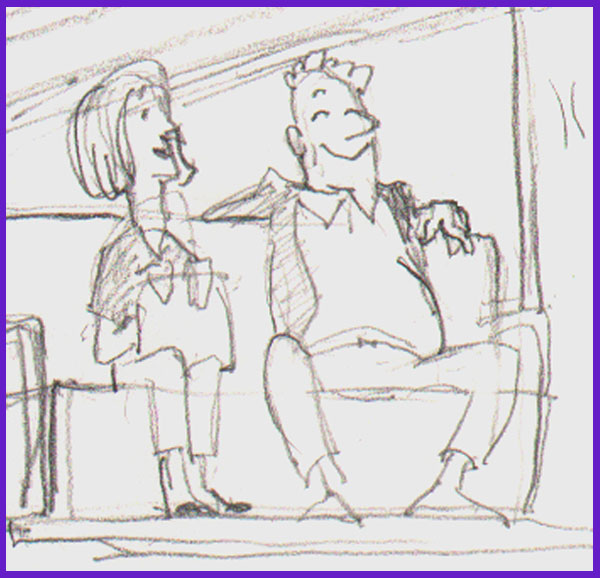
I had made this drawing of an electric airport cart from the rear, showing two passengers riding backward and looking happy about it.  Working on my storyboard today, I redrew the cart to fit my scene; the cart had to be facing left instead of right. Instead of tracing it and flipping the image, which might have been easier in some way, I just redrew it.


As I drew, I thought about the couple riding on the cart, and although they are minor characters, I decided it would be effective to add some contrast and interest by making the woman neat and prim and the man a sort of slob. They are still having a good time together, but now they are not alike.


The man is guilty of what we are calling in America the "subway sprawl", where his legs are spread wide apart in a comfortable but sometimes intimidating way.

The original sketch would have served well enough, but the second one is funnier and shows more character in a single pose, all because, instead of just copying the original, I gave it a second draft.

Next: More about storyboards, including my own Breakthrough!


Monday, December 28, 2015

No. 85, An Exercise in Character Design, Part 3: Within a Single Sheet of Paper

Undo or Erase


As I work on all the phases of animation production, I like to think about what goes on in the animator's head while working--in this case, my own head.

As I have discovered over the past few years in writing this blog, many things are easy to document and demonstrate in my blog posts because the proof of the process exists on paper or in the computer in easily accessed snapshots, including many changes that are made from beginning concept to finished artwork.

But what about those still finer changes that disappear from the world and even from one's memory once they are done?  These are the things we erase either with the undo or delete button on the computer, or, on paper, with a rubber or plastic eraser.  These things are gone forever, aren't they?

Eraser on the legendary Blackwing 602 pencil; "half the pressure, twice the speed."


Perhaps this need not always be so.  A few days ago, while working on a character design for my film, as I drew in pencil, it occurred to me that I could record the things I was about to erase by shooting them with my smartphone camera.  I could photograph an entire sequence of the minute progression of my own creative thought as I drew and erased, drew and erased and drew again.

Certainly this is not something I intend to do very much.  It is a lot of trouble, and it is disruptive in itself of the creative process. (One might imagine an automatic system, a surveillance camera looking  over the artist's shoulder, that would snap a picture every time the artist picked up his eraser.)

But this one time, I did do it, and for whatever it is worth, here is the result.

The first drawings.

The right hand is changed.

The right hand is drawn from the front.  Plus, a new arm is drawn
at the side, experimenting with a different look.

Masking off his right side, I try drawing in the structure
of the new arm on the character's left side.
But I do not like the way this looks; I don't like the hand being hidden by the leg.  Time to try something else...

Here I have designed a new front view hand, at right, and changed
the character's right hand to the same design.
Of course now the side view hand is
out of agreement with the front view, so...
...I redraw that to match in a turnaround.
Next I add a 3/4 view to see how it works with the others.
Looks good!

This was sufficient design for me to begin storyboards. But in the storyboard stage, I tried still other angles and continued to analyze the character design for style and functionality, and I made mental notes for more refinement.  Eventually I sat back down with this same sheet of paper on my board and did my revisions.
The "final" model sheet.  Since I am still in my storyboard phase, other changes are still possible.
Here you will see that I have added facial expressions and more angles of the head.  Also, I decided that he should look a bit more elegant, with a nice if slightly ill-fitting suit.  The jacket is longer, and the limbs are smoother.

The changes I have made here might have been done differently, with new copies of the drawing that incorporated the modifications rather than erasure and redrawing.  Many of these things could easily have been done in the computer, with the multiple stages being preserved in save as copies. But here is how a design can evolve as the artist's conception evolves, all within a single sheet of paper.

.....................

To my readers: I want to remind you that I value your presence on my blog, and I invite you to comment. It encourages me when I get interaction with you.  And for any of you who haven't yet done so, why not also become a Follower? (As I like to say, just because you are a follower doesn't mean you cannot also be a Leader!)


Saturday, December 19, 2015

No. 84, Adventures in Character Design, Part 2: Promotion from Within

In my last post on this subject (No. 82) I speculated that I might find the character I needed among the existing incidental characters in my storyboard of the original concept.

As I looked the drawings over, there was one in particular that I was attracted to. It was a frontal view of an old man, seated and holding his wife's hand.

First sketch of the old man character.


He was intended just as an extra, to be sitting in a row of airport chairs as my former protagonist moved past.  Unlike his wife, he was not even intended to be animated.  But as I looked at him I thought, what could be funnier as the bearer of an immensely heavy suitcase than a frail-looking old man?

Trying him from different angles showed his potential to move in 3 dimensions and allowed me to work out his body and head shapes and proportions.


In particular I needed to work out how he would look dragging his heavy suitcase by a thin length of rope.


Next we'll take a close look at what design changes can take place on a single sheet of paper--changes that are important to the character design process yet are unseen and forgotten steps to the final design.


Tuesday, December 1, 2015

No. 82, Adventures in Character Design, Part 1: Looking for My Character

What to Do when an Idea Isn't Working

Recently I came to a place in the planning of my new personal film where I felt blocked.  The concept was of two characters having a confrontation in an airport, and as I tried to commit the whole thing to storyboard, my progress and enthusiasm ground to a halt.

The original main characters.

I expressed this to a close friend who is also an animator, and he just shrugged and said, "Well, maybe there is something wrong with the whole idea. Rethink it."

Immediately I felt re-energized. And I also felt relief, because I was keeping with my new resolve not to animate anything without first storyboarding to the end. So I had not wasted a lot of work.

I began sorting through the ruins of my concept like a man standing amid the tornado-riven rubble of his home, looking for what might be salvaged.  There were some good character designs, and there was the airport location. There was a gag about an oversized suitcase that couldn't possibly make it past airport security and size regulations as a carry-on.

Part of the ruin was what had been my main character, a goofy guy who was funny-looking but hard to understand or empathize with, even for me. He was the one with the suitcase, and now I saw that he had to go, and he had to leave the suitcase behind.

Keep the suitcase, lose the guy. These are my first sketches of the character, from a traveling notebook.
 But what could I replace him with?  Was it necessary to start over with that, too?  Or was there possibly something already there?

Next: A New Start

Thursday, September 11, 2014

No. 74, Rare Animation Books: The Animated Film

The Animated Film, by Roger Manvell, pub. 1954 by Sylvan Press. 63 pages.


This book, subtitled "with pictures from the film 'Animal Farm' by Halas and Barchelor", was remarkable in its day for not being about the Walt Disney studio.  Indeed, it was about a British studio and their production of the first British feature-length animated film.  Across the pond at Disney, work was going forth on Lady and the Tramp, another sentimental adventure with songs that had become a Disney mainstay.  Animal Farm was nothing of the sort.

The film was based on a popular book of the same name by George Orwell, who was a journalist and, later on, author of the  more famous dystopian novel 1984. The book was a satire of the communist form of government and, more specifically, of the Soviet version of communism, which in its heavy handed way had become in many ways indistinguishable from fascism.  It told the story of farm animals who rise up and overthrow their human master and then attempt to govern themselves, with the more cunning and ruthless among them eventually rising to the top.  "All animals are equal," goes the famous quote, "but some are more equal than others."

Expressive animation of the pig who decided he was "more equal than others."


Two still frames in black and white from the color film Animal Farm.


Today it is known that the CIA, interested in any kind of anti-Soviet propaganda, obtained the film rights to Animal Farm, and that under the direction of Howard Hunt (of Watergate infamy) the producer Louis De Rochement was chosen as front man.  De Rochemont then selected the Halas and Batchelor studio to create the film. It is not generally believed that the studio had knowledge of the source of their funding at the time.

The Halas and Batchelor workflow chart of animation production.


The film was remarkable for being of adult interest rather than that of children.  John Halas, a Hungarian immigrant to England, and his wife and partner, Joy Batchelor, expanded their studio to a staff of 70 for the production. Three years, from 1951 to 1954, were spent in the making of the film. The technique and style chosen were not unlike the Disney model, with drawn animation traced and painted onto cels, and with care taken to achieve a certain amount of realism in the movement and design, again in the mode of Disney.  It was, after all, intended to be released as a commercial product, so it needed to be able to compete.

A page showing development of the design for one of the human characters in the film.

Model sheets of some of the animal characters.


The book includes expressive model sheets of the characters, sections of storyboard, layouts and animation drawings.

A detail of the Tension Chart.


An interesting insert is a foldout "Tension Chart" showing the flow of tension or excitement from beginning to end, including notes on mood, music and color.

Background layouts.


But although the film was in color, the books illustrations are all in black and white.  Altogether it is a fascinating look through a parallax lens of feature animation production in a country other than the US.

Views of production work around the Halas and Batchelor studios.


Roger Manvell, the author, was a writer who had worked for years with Halas and Batchelor "as a researcher, author and screenwriter", according to the 2006 book Halas and Batchelor Cartoons, An Animated History, by Vivien Halas and others.  In addition to The Animated Film, he also wrote in association with John Halas three other books on animation.

The Animated Film is out of print and likely to be very difficult to obtain.

Tuesday, August 26, 2014

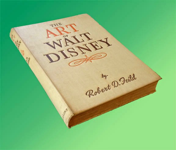
No. 72, Rare Animation Books: The Art of Walt Disney, by Feild

The Art of Walt Disney, by Robert D. Feild, 290 pages, pub. 1942 by Macmillan and Co.


First, you should understand that there are  two completely different books called The Art of Walt Disney. The better known of these is the most recent, a massive coffee table book by Christopher Finch first published in 1974.  In fact, when I went to Amazon just now to look at reviews of the earlier Art of Walt Disney, I found that all the reviews seemed to be of the 1974 book; all these people had no knowledge of the one published in the 1940s.  But the Finch version, rich in color artwork but short on real information about the animation studio, was for me a vast disappointment.

The other book known as The Art of Walt Disney was published in 1942 and written by a professor of art who was given a year of access to the Disney studio in Burbank between 1939 and 1940.  An interesting year it was, too, for Snow White and the Seven Dwarfs had premiered successfully in 1937, proving the viability of feature-length animation and spurring the studio to initiate production on not one but several new features.  The book therefore contains details on the production of Pinocchio, Fantasia, Bambi and Dumbo, all of which were in various stages of development, as well as many animated short subjects which were still a major division of production at Disney.

Early concepts of the 7 dwarfs. Some of these are by Albert Hurter.


As an art historian Feild admitted to a quandary about what the animated productions of the Disney studio actually meant as art, but he knew he was onto something big and exciting.  Disney the producer had thrown far more money back into raising the standards of animation than he had kept for himself, and the result was a clear lead in production quality and standards over every other Hollywood studio.  Efforts by other countries, from the Disney point of view, did not even exist.

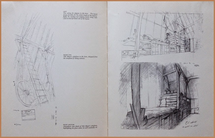
Layout sketches, possibly by Tyrus Wong.


The book itself was the first serious literary survey of Disney or of any animation, and its publication was a tribute to the new recognition and respect accorded to Walt Disney after his sensational breakout from shorts starring Mickey Mouse, Donald Duck and Goofy into the world of feature films.  For an exhilerating two years or so after the release of Snow White, anything seemed possible and the continued success of the studio seemed assured.

World war beginning in  1939 with Hitler's invasion of Poland ended all that, closing lucrative distribution markets in Europe and, after 1941, diverting much of the studio's energy into jingoist war propaganda.  According to a 1942 review in Saturday Review, however, the book went to press before the December, 1941, bombing of Pearl Harbor, and so Feild's writing was not influenced by the direct involvement of America--and Hollywood--in World War II.

These may be examples of Shamus Culhane's "fast animation" technique.


There is an oft-told story of Walt Disney confronting one of his ambitious young artists back in the '30's, telling him not to get any ideas about making a name for himself at the studio; the only name the public was to see was that of Walt Disney. The story is true, though of course the features from Snow White on had artist credits just like any other feature films.  But Feild in his book maintained Disney's attitude about keeping the artists anonymous, and so there is not a single animator or designer mentioned by name in the entire book. From the point of view of historical interest, this is an unfortunate omission, although subsequent writing over the ensuing decades has illuminated some of this darkness. One can easily recognize the work of Marc Davis, of Milt Kahl, of Rico LeBrun and others.

Some of Preston Blair's dancing hippo drawings, made famous in his animation book.


The text  is written in a somewhat verbose style typical of the day, but the book does a good job of detailing the Disney production process and even makes an attempt to describe the intricacies of animating. Much is made of the expansive new Burbank production plant. Yet the refusal to name names continues to be an irritant throughout.  Besides Walt, only Roy Disney is mentioned by name.  How can you tell the story of Walt Disney without mention of Ub Iwerks?  Of Ham Luske and Norm Ferguson and Bill Tytla and Freddie Moore?  Yet Feild manages to keep them all behind the curtain, to the point that I suspect this anonymity was a precondition imposed on him by Walt.

Uncredited like all the others, here are some structural guides for deer animation by Rico LeBrun.


Nevertheless there are many full-page plates or illustrations, some in color, that make the book a worthwhile document of the Disney studio in the early 1940s.

Animation drawings of Ali the alligator, very possibly by John Lounsberry.


Feild's The Art of Walt Disney is considered a collector's item.  My copy is a British reprint (1944) published in London by Collins.  Copies available on the internet are few and  not inexpensive, but it is still possible to get one if you want it badly enough.


Wednesday, July 2, 2014

No. 69, Me vs Toon Boom StoryBoard Pro, Part One

Whenever I take on a new software application, there is of course a period of intense struggle, the learning wall that I must climb before the program can be any fun to work with.  This is inevitable, and I have come to expect it.

In the case of Toon Boom's StoryBoard Pro, the wall was a short one, and I was boosted over by my previous experience with Toon Boom's other applications: first Studio, beginning back in 2006, then Animate and, finally, Animate Pro 2.  This was helpful because of the great similarities in the UI and terminology among the various ToonBoom applications, so that even as I opened the storyboarding program for the first time, much of what I saw in front of me was familiar--the same tools, icons, and organizational structure that I already knew.

Furthermore, Toon Boom's unparalleled tutorial resources which they provide free for all their applications, plus other tutorials both amateur and professional on You Tube, help to answer the many questions that arise when attempting to master StoryBoard Pro or any of their other products. Why all other software companies do not make similar efforts to freely educate the public in the use of their applications, preferring to rely on pay tutorial services, I do not understand.  The more people there are who know how to confidently use your product, the more likely it is that it will be bought and used.  Toon Boom has certainly got the right idea here.

The big attraction for me to StoryBoard Pro was its capability to generate animatics complete with camera maneuvers and soundtracks.

The big challenge for me, I knew, was to learn to comfortably draw directly into the panels with my stylus and Wacom tablet. 

Working With a Script

 Using as my test project the concept I call The Two Washingtons, the same one for which I have recently recounted my character design process [Acme Punched! posts no's 64 and 65], I started by writing a script complete with dialog and camera directions, during the course of which one of the two main characters changed completely in concept and had to be re-designed (see below.)

A change in character often necessitates a change in design.


The script notations included a sequential number for every scene (or camera shot, as it is called in live action.)  My script had 24 scenes, so when I opened StoryBoard Pro for my new project, I laid out 24 scenes and copy-pasted the directions for each scene from the script into the Action Notes box in the Panel View.  (I should note that as I write this, some of the staging for what is now scene 24 is unclear in my mind, and so I expect that when I get to that point in my storyboard, it will end up being divided into several more scenes. But the flexibility of StoryBoard Pro facilitates changes, just as in a paper storyboard, easily allowing additions, rearrangement and deletions, so this does not worry me.)

A section of page 1 of my script.

The script for Scene 1 pasted into the Action Notes window in StoryBoard Pro.


Using a written script may not be the best approach for everyone.  Some may prefer to work from the outset with visual representations of the scenes, but I have some experience in writing fiction and live-action scripts and so it appeals to me as the right way to begin.

Thumbnails

Along the way I was making thumbnails on paper which I kept before me as I worked. These were just quick sketches, only a few inches or centimeters high,  of poses and situations that I was visualizing as I worked through the script, and which I jotted down quickly without regard for character accuracy or precise drawing.  This can be a valuable way to work, and I recommend it.

Early thumbnail sketches.


Bitmap or Vector?

 The StoryBoard  Pro application allows drawing in either bitmap or vector modes, though not both on the same layer.  The default layer choice is vector (I did not find a way to change this), and after some experimentation I found this to be preferable because of the smoothing property, a feature found in many vector drawing apps.  This property may be set at any percentage from 0 to 100 and will help remove shaky or hesitant tremors in any drawn vector line. I like it set at around 20 most of the time, but this will be different for each artist.  Setting the smoothing very high, however, can cause the algorithm to redraw your line without any of its original character, so this should usually be avoided.

Testing three settings of the Smoothness property in vector inking.
Here I inked one rough drawing three times, using no smoothing, 50% smoothing and 100% smoothing, as indicated.  If you look closely, you can see that the 0% setting gave me the most faithful rendering of the rough, yet it contains some nervous lines at the top of the cap.  At the other end of the scale, the 100% setting straightened some curves completely (under the eye and at the mouth) and made very small detail almost impossible to render.  Drawing a round pupil in the eye was not possible, and getting it as good as I did required 4 or 5 repeated strokes.  Even the 50% version was taking too much control of the line to suit me.

Another advantage of vector inking, or course, is that the lines remain crisp at any scale.

Keeping It Rough

 With the idea of ending up with not just a storyboard but an animatic, I found that a good way to work was to go through the entire board in very rough form, using separate layers for whatever elements in the scene will be shown to move or change. 

In the course of roughing out the storyboard, new ideas for movement, transitions or other changes will naturally present themselves. If you are working rough, it will be less painful to create the necessary layers or panels to accommodate these new things than if you were working in a more finished way.

Rough storyboard panel.  The black rectangle is the camera field, which will be adjusted later.
I have roughed in more than half of this storyboard as of this writing.


Next: Part 2, The Hybrid Approach


Wednesday, June 4, 2014

No. 66, Creating a Four-legged Walk Cycle

FOXTROT


A short while back ( Acme Punched posts No. 60 thru 62) I showed you my approach to creating a walk cycle for my character Albert.  Now here is a walk cycle, or rather a trot, for the little fox character.

First, a bit of re-design was in order.  I made the original model sheet without much attention to the real anatomy of a fox.  This is a cartoon and you can do that, but he does walk on all four feet so I have now decided it would be good to have him move something like a real fox, and for that, he has to be constructed a bit more like a real fox.


In the original model sheet, above, he is rather swaybacked and holds his tail erect.

The revised design makes his spine arc upward a little, as in real canines, and shows him holding his tail almost straight out behind him when moving.


 The Animation

Once again I wanted to try something I had read about but had never actually done: to animate the head, body and tail before doing the leg animation.  This is effective in animating dance and other controlled movement such as sword fighting.  Disney animators have used the technique in animating such semi-realistic creatures like deer (Bambi), though others actually did the reverse, animating the legs before the body. (I would cite a reference for that, but can't recall exactly where I read it.)

Anyway I thought it might work on my cycle of a fox trotting.


This was the first test.  It was made using just three drawings, with the middle drawing favoring the highest one in its spacing (see Fig. 1). I thought the rhythm was fine, but since the fox will sometimes be quite small on the screen, I decided it was too subtle.


Now for a broader movement, in which I simply let his body drop down farther.


At the time (we will come back to this) I thought it was fine, and went with it. Here is the spacing.


Then I was ready to add in the legs.  This is a basic canine trot.  I referenced a favorite but little-known book of mine: Dog Locomotion and Gait Analysis, by Curtis M. Brown.  Brown is not an animator but a dog breeder and dog show judge, but the sequential drawings of the gaits of various breeds are a gold mine for anyone interested in how dogs move.

Here is the test.


Hmm.  I sort of liked it when I saw it, but...something was not right.  Can you see what is wrong without reading further?

If you said that the head was moving too much, you would be right.  I had lowered the head along with the torso.  It is the same as it was in the second version without the legs (see Figure 2 again also), but somehow it was not apparent to me until I saw it all put together.

Solution?  Leave the torso as it is but just space the head much closer to the other heads.


Now it is working right.  Many animals avoid movement that bounces their heads up and down very much, because either they need steady vision for pursuit of prey or to detect danger.

One more thing I thought to do was to see if I could vary the speed--make him move faster--without removing any drawings.  (He may have to trot quickly to keep up with Albert's brisk walk.)  The slow speed is 8 drawings on 2's, or sixteen exposures, thus: 1, 1, 3, 3, 5, 5, 7, 7, 9, 9, 11, 11, 13, 13, 15, 15.  The numbers in bold are the lowest position.  The obvious thing to try here is to see if it will simply work on 1's: 1, 3, 5, 7, 9, 11, 13, 15.  But it looked too fast and also jerky, so I am not even showing it to you.  Although it does not always work to have some drawings of a walk cycle on 1's while others are on 2's, because of the danger of "slipping" against the steady movement of the background, I decided to try this: 1, 3, 3, 5, 5, 7, 9, 11,11, 13, 13 ,15.  In other words, I dropped the second exposure on drawings 1, 7, 9, and 15--just four frames fewer, but look at the result:


It seems to work!


Next: More about working with 4-legged characters!