Pages

For People Crazy About 2D Animation!

Acme Punched! is for people crazy about 2D animation. It may be enjoyed by beginners and others, but it is aimed at animators who know already something about the process of animation and the basics of character animation. In large part, it will attempt to provide a deep look into the problem solving that goes on in my head as I work out a scene, often in step-by-step posts that I will sometimes enter in "real time", without knowing in advance what the outcome will be. Mistakes and false starts will not only be included but emphasized, so that the creative process of animation will be portrayed realistically. And, while my own bias is for 2D drawn animation, many of the effects and principles discussed here can apply to CGI 3D animation as well. I hope the blog will prove useful and instructive for all.

-Jim Bradrick

Thursday, March 2, 2017

No. 123, The Empty Wall: Approaching an End to the Storyboard Phase

When the wall was busy. This is before I settled on a more formal 7 x 7 pattern.
For months, my storyboard pinup wall has been covered with storyboard panels--not just one set of 40 or 50 drawings, but waves of them, one after the other. My wall holds about fifty drawings at a time, seven rows of seven panels each. Some sequences took more than two sets of fifty drawings to tell their stories. It has gone on and on, and at times it seemed like there might be no end to it.


The empty wall.
But now it has ended, and my wall looks like this, studded with pushpins that have nothing to support but themselves.

But though I am about at the end of making drawings for my storyboard, it isn't the end of the storyboard work. Now I have scanned all my drawings and imported them into Storyboard Pro to create an animatic for each sequence.  This involves a lot of copying and pasting of layers, of making determinations for the duration of each panel in a scene, and of the addition of camera and layer movement--zooms and pans and rotations. Then there is a scratch track to be built, with dialog and sound effects and even some music to try to approximate what the finished film will feel and sound like.
Screen shot of a scene of my storyboard for Carry On.

And then? I will stitch the seven sequences together as a Quicktime movie and send it out to several friends for them to review. In the meantime, I will start on some actual animation of scenes without dialog.

Actual animation--I can barely believe it!

Thursday, February 23, 2017

No. 122. Maquettes, Part 4: When Is It Not a Good Idea?

Maquette: When Not to Make It


Let's talk about when it may not be a good idea to create a maquette.

To review, for animators a maquette is a little model of a character for use as drawing reference. When sculptors made small models of proposed heroic sculptures to be done in stone or bronze, they used the word to mean "sculpted sketch."

The animator, required to draw her or his character from most any angle, relies on a maquette to find out how that foreshortened nose looks from the bottom, or how an ear turns in perspective with the head.

All well and good. But I think of two situations when it may not be such a good idea.

If The Character Design Is Truly Flat


Despite our claim on the two-dimensional, many 2D animation characters are designed as if they were actually 3 dimensional. In an effort to look "real" (whatever that means), the designs try to imagine the character in 3 dimensions, so that every detail of any drawing of the character is intended to make sense with every other drawing in terms of solid geometry. Bugs Bunny is like this, and so is Maui, the warrior from the recent Disney movie. Drawing a character in this geometrically convincing way can be a compelling part of the "illusion of life" approach to animation that is seductive to so many animators, myself included.

The ultimate outcome of the thrust in this direction is the technology of the digitally modeled and animated character; in this view, the virtual maquette, like the puppet Pinocchio, has come alive.

But some characters are conceived without regard for any kind of three-dimensionality. Designed on a flat surface, the designer allows their two-dimensionality to remain obvious and even uses flatness boldly in defiance of graphic realism. A model sheet of such a character may show various typical angles, but one angle may not logically rotate to another. We make it work in animation by seldom moving slowly from one angle to the next, and some angles are entirely avoided or at least not given more than one or two frames in passing.

Let's consider an example or two of this sort of truly two-dimensional character.


Here is a character whose turban is a graphic, angular spiral and whose facial
features are deliberately flat; this is not a good candidate for a maquette.


This guy looking to his right has both eyes on one side of his nose. If he turned to
look to the left, his eyes would be on that side. Maquette? I think not.

This cowboy has an appealing flat design that would not
do well if sculpted into a maquette.

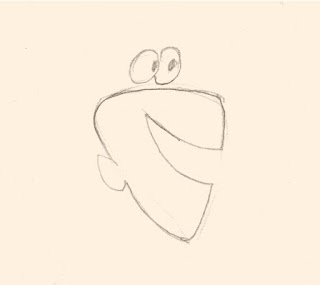
This character with his floating eyes and flat, profile mouth and ear would look
better on an Egyptian frieze than as a maquette.

Also there is a hybrid approach to character design, which is what I subscribe to, choosing to accentuate either two-dimensionality or three-dimensionality as seems appropriate, and sometimes to combine both in the same character. This playful and open-minded attitude can even be seen in the drawings of the great Disney animators, who would often simplify a pose for graphic clarity, for example creating a single beautiful arc reaching from ankle to fingertips of a character stretching to one side

The Old Man character from my current film Carry On is of this hybrid type. His design contains some elements that I prefer for the sake of clarity to leave in the zone of two-dimensional graphics rather than to try to render them like solid objects.  (See notations in the illustration below.)  Also, I have found myself able to draw him from every desirable angle, and so a maquette of him is simply not needed.

This character is both round and flat. I never want to show his eyeglass lenses on edge (note profile view) and I take many
liberties with his ears and hat, among other things, that would be hard to depict in three dimensions.


If The Animator Is Too Literal


For beginning character animators especially, the hazard of using a maquette is in taking its rigid shape too literally. Despite the rigid parts of a head, for instance--the skull and the jaw--great liberties can be taken in animation that strict adherence to the proportions of a maquette can dampen out. The jaw can move from side to side as well as up and down, for example, and temporary distortions of elasticity even of the skull may sometimes be desirable. Someone too dependent on the maquette in her or his hand may miss opportunities where accents involving geometric exaggeration could enhance the animation.

For earlier discussion of the subject of the maquette, see posts nos. 116, 118 and 119.
Tuesday, February 14, 2017

No. 121, More about Crowds

Thanks to Rafael Silva, who in a comment to Post No. 120 (Bring In the Crowds) directed me to the comments of Mark Kennedy on drawing crowd scenes in the blog Seven Camels. The link is repeated here: http://sevencamels.blogspot.pt/2016/09/drawing-crowds.html .

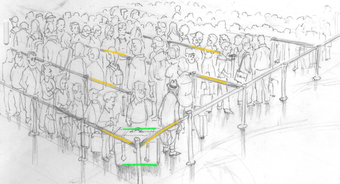
This stimulates me to say a little more about my own crowd drawing, and the three tricks I used to make it effective. At one time I worked for Dark Horse Comics, doing a funny animal series called Wacky Squirrel, among other things. Working in pen or brush and black ink, you learn a lot about how to depict things clearly.

1. All the characters in the first four rows are distinct enough that you can tell which way they are facing.  This was important to show the direction of traffic flow through the maze of the security queue--back and forth, evoking an image of cattle in a slaughter house.


2. Height graduated in waves. This is not what you would normally see in a crowd, but it helps the eye to follow a file of people standing in line so that the progression is clearly seen as a line rather than just a mass.


3. Diagonal contrasted with horizontal. With the dominating directions of the lines of people and of course the tapes that separate them being diagonal, the Old Man's trunk being placed horizontally stands out from everything else. I would add that I composed this part instinctually, only realizing later how well it worked!


Sunday, February 12, 2017

No. 120, Bring In the Crowds

If there is one thing that artists in hand-drawn animation do not like to attempt, it is probably the crowd. Doing a convincing representation of thirty or more people moving about is a nightmare, even with the virtually unlimited number of layers that can now be used digitally.

But in setting my film Carry On in a busy international airport, I kept feeling a kind of pressure in my own mind to at least once show a great many people, since no one in a big airport can not be aware of the mass of humanity in motion all around.

I had storyboarded a scene where the camera slowly panned left to right over a file of passengers waiting to go through the security scanners.  But the scene only showed seven people besides the Old Man character, and I thought it was the least effective looking scene in my whole storyboard.  I decided to re-imagine it.

Online I began looking at images of people waiting in airports, and I finally got the inspiration I needed.

The scene opens on a medium closeup of the old man.

He idly turns his head to the right, so we see him in profile, and then his head swivels back as before.

The camera begins to zoom out.


Dissolve to a wider view, still zooming out, until the crowd below is revealed.  Also the ambient airport sound will fade up as the camera pulls back.


Then a quick fade out/fade in to the scene where my protagonist is at the head of the security line.

So there is my crowd scene, all done with just a few drawings, but showing how my character had to get in line with everyone else.  And the fact that the people in the crowd do not move is justified; they are merely standing still, waiting for their line to get moving again.


Next: What?!! My Storyboard is DONE??!

Tuesday, January 24, 2017

No. 119, Maquette, Part 3

The Character Maquette Realized


Finally tore myself away from feverish storyboarding on Carry On to finish this maquette.

Somewhat imperfect in its fine details, it is completely usable now for its purpose--to show me any angle I desire of this character.

It has been baked (275°f for 1/2 hour) so now instead of having clay-like malleability, it is hard like a soft stone and can be sanded or carved.  I may do some sanding just to smooth it out, but as it is only a drawing aid and not for public display, it is basically finished.

I could also paint it if I wanted to, preferably using flat acrylics, but I doubt that I will go that far.

I can now even see that one extreme angle that got me started, looking up at him from below his chin.

To see earlier stages of the sculpting, see post No. 118.

Wednesday, January 11, 2017

No. 118, How I Got It Right--and How I Got It Wrong: Maquette, Part 2

Off and on I have slowly been working on my Sculpey maquette, which I began soon after publishing post no. 116 in which I declared that I needed to do that for one of the characters.

First, let's review the front and side view drawings that I made.


Working directly from the drawings, I built a basic armature on a block of wood. An armature is an inner support like a skeleton that bears the weight of a clay or other plastic (i.e. malleable) sculpture and holds it in place.  I neglected to photograph the naked armature, but here I got a shot before it was completely covered up. It consists of a length of heavy gauge steel wire stapled to the wooden block and then bent and shaped upward around a 3" (8 cm) screw that I had driven firmly into the block. The screw is the basic neck support. The upper end of the wire was then coiled around to support the skull space. The exact size front and side images were carefully studied to make certain that the wire would not extend outside the volume of the head. I then wrapped the wire and screw in aluminum foil; this saves on Sculpey material both in weight and volume, and a hollow layer of Sculpey will cure easier than a big solid lump.


Working still quite closely with the drawings, trying to get the linear dimensions and contours of the model to exactly match them, I began adding the modeling clay a little at a time. This is a painstaking process, and at first it doesn't look like much.


You have to work hard to keep the sculpture symmetrical, repeatedly examining it from every angle. Now it is beginning to come together.


And now with the eyes in place, it begins to look like what it is supposed to be.


Well, so far, so good. It is on the way to being a good match for both the front and side views, right? We just need the ears and hair and a few other details, right?


But wait. What of that 3/4 view that I also drew? If it was a well-done inbetween, it ought to be looking good also--right? Let's take a look.


Well, part of it looks accurate, but the head shape is wrong. Note how close to the eye I have shown the side hair to be. Why would that have happened?

The answer is that cartoonists and cartoon animators are used to working with character heads that are basically spheres. But Kevin's head is not a sphere.  Here is a view of it from the top looking down.

The head is actually longer front to back than side to side, a shape
that hat makers call "long oval".
So, the maquette is proving useful already. Here is a new drawing of a 3/4 view based on observation of my unfinished maquette.


Check back here soon where I will do a post showing the finished Kevin maquette.

Wednesday, January 4, 2017

No. 117, A Chuck Jones Wireframe from 1947--or is it?

No, it isn't what computer modelers call a wireframe, but it does employ the same idea of a grid of lines to define the contours of a shape.

In Chuck Jones case, it is just some detail found on a model sheet of Porky Pig. There were no personal computers, and this side of sculpting a maquette [see post no. 116], this was the best way in its time to make sure that he was understood. Jones, who had more formal art training than most of his contemporaries in animation at the time, wanted to make sure his animators grasped something subtle about Porky's jowls.  He created what in an art school is called a contour drawing--imagining a series of parallel lines that follow a surface and thus define that surface in space.
Unlike a wireframe rendering, Chuck Jones' contour drawings have lines going in only one direction,
but the intent of precise understanding of a shape is the same.
In art schools, this was a common exercise to encourage precise observation in drawing students.
We were told to draw a leg or a torso or some inanimate object by this method, thus defining the subtleties of its surface without resorting to tonal (shaded) technique.

In the cel animation world of linear drawing, this was an ingenious yet simple way of conveying his instruction.