Maquette: When Not to Make It
Let's talk about when it may not be a good idea to create a maquette.
To review, for animators a maquette is a little model of a character for use as drawing reference. When sculptors made small models of proposed heroic sculptures to be done in stone or bronze, they used the word to mean "sculpted sketch."
The animator, required to draw her or his character from most any angle, relies on a maquette to find out how that foreshortened nose looks from the bottom, or how an ear turns in perspective with the head.
All well and good. But I think of two situations when it may not be such a good idea.
If The Character Design Is Truly Flat
Despite our claim on the two-dimensional, many 2D animation characters are designed as if they were actually 3 dimensional. In an effort to look "real" (whatever that means), the designs try to imagine the character in 3 dimensions, so that every detail of any drawing of the character is intended to make sense with every other drawing in terms of solid geometry. Bugs Bunny is like this, and so is Maui, the warrior from the recent Disney movie. Drawing a character in this geometrically convincing way can be a compelling part of the "illusion of life" approach to animation that is seductive to so many animators, myself included.
The ultimate outcome of the thrust in this direction is the technology of the digitally modeled and animated character; in this view, the virtual maquette, like the puppet Pinocchio, has come alive.
But some characters are conceived without regard for any kind of three-dimensionality. Designed on a flat surface, the designer allows their two-dimensionality to remain obvious and even uses flatness boldly in defiance of graphic realism. A model sheet of such a character may show various typical angles, but one angle may not logically rotate to another. We make it work in animation by seldom moving slowly from one angle to the next, and some angles are entirely avoided or at least not given more than one or two frames in passing.
Let's consider an example or two of this sort of truly two-dimensional character.
 |
| Here is a character whose turban is a graphic, angular spiral and whose facial features are deliberately flat; this is not a good candidate for a maquette. |
 |
| This guy looking to his right has both eyes on one side of his nose. If he turned to look to the left, his eyes would be on that side. Maquette? I think not. |
 |
| This cowboy has an appealing flat design that would not do well if sculpted into a maquette. |
 |
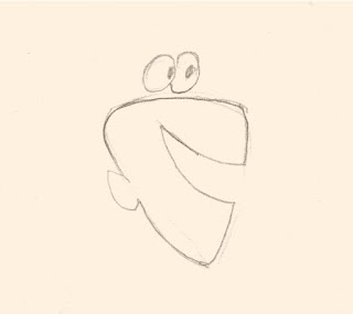
| This character with his floating eyes and flat, profile mouth and ear would look better on an Egyptian frieze than as a maquette. |
Also there is a hybrid approach to character design, which is what I subscribe to, choosing to accentuate either two-dimensionality or three-dimensionality as seems appropriate, and sometimes to combine both in the same character. This playful and open-minded attitude can even be seen in the drawings of the great Disney animators, who would often simplify a pose for graphic clarity, for example creating a single beautiful arc reaching from ankle to fingertips of a character stretching to one side
The Old Man character from my current film Carry On is of this hybrid type. His design contains some elements that I prefer for the sake of clarity to leave in the zone of two-dimensional graphics rather than to try to render them like solid objects. (See notations in the illustration below.) Also, I have found myself able to draw him from every desirable angle, and so a maquette of him is simply not needed.
If The Animator Is Too Literal
For beginning character animators especially, the hazard of using a maquette is in taking its rigid shape too literally. Despite the rigid parts of a head, for instance--the skull and the jaw--great liberties can be taken in animation that strict adherence to the proportions of a maquette can dampen out. The jaw can move from side to side as well as up and down, for example, and temporary distortions of elasticity even of the skull may sometimes be desirable. Someone too dependent on the maquette in her or his hand may miss opportunities where accents involving geometric exaggeration could enhance the animation.
For earlier discussion of the subject of the maquette, see posts nos. 116, 118 and 119.


No comments:
Post a Comment