Pages

For People Crazy About 2D Animation!

Acme Punched! is for people crazy about 2D animation. It may be enjoyed by beginners and others, but it is aimed at animators who know already something about the process of animation and the basics of character animation. In large part, it will attempt to provide a deep look into the problem solving that goes on in my head as I work out a scene, often in step-by-step posts that I will sometimes enter in "real time", without knowing in advance what the outcome will be. Mistakes and false starts will not only be included but emphasized, so that the creative process of animation will be portrayed realistically. And, while my own bias is for 2D drawn animation, many of the effects and principles discussed here can apply to CGI 3D animation as well. I hope the blog will prove useful and instructive for all.

-Jim Bradrick

Wednesday, April 23, 2014

No. 62, A Walk Cycle for Albert, Part Five: Side View

 Solution to "Mystery Change"


In the last post (No. 61), I challenged you to find a difference in timing between the two versions of the walk cycle.  No one took me up on it, and I admit it was a subtle detail to find amid everything else that was going on in the cycle.  But the answer is: I changed the timing of the right arm (the one holding the bag).  In version 1, as the bag comes forward and then reverses direction to recede again, the movement seemed to me to have a stabbing aspect to it; that is, it took no time and no effort to reverse direction.  I thought this was inappropriate for a bag that might weigh 100 pounds or 45 kilograms.

I therefore took a look at the spacing of the drawings.  As the bag comes forward, it has an appropriate cushion-in.  The chart below shows the relative positions of the seam at the front of the bag.


But as the bag reverses direction, the drawings were not spaced so as to give a good impression of the cushion-out (the spacing that indicates that an object starts out slowly and accelerates.)  The next chart shows both the old and the improved spacings.  Again, it is the seam on the bag that we are following.
The original spacing is shown in red, on the left.  Final spacing on the right.
I think if you will now go back to post no. 61 and carefully compare the two versions, you will observe more of a slow-down and hesitation between the forward and backward movements of the bag.  It is more like the compression and release of a spring, as it should be, rather than like something bouncing.


Translating to the Side View

The obvious way to begin this translation of view is to construct the first image over the corresponding one of the other.  On my drawing board, that looks like this:
The front view showing through on my backlighted animation disk.
In a case like this, which is just a rotation on the Y axis, as the 3D-ers would think of it, many measurements can be directly applied from one drawing to the other.

Here are the two images separated, with a few points of congruence highlighted:
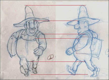
Showing where the top of the hat, the eyebrow, the shoulder seam, the top of the button and the bottom of the body mass coincide in both drawings.
Some things, of course, require adjustment.  Mainly these are the parts that project forward or backward in imagined space from the plane of the torso.  Thus the left hand appears larger in the front view to create the illusion that it is closer to the viewer, and the left foot is drawn smaller to show that it is farther back.

It should be emphasized that a walk cycle--or any animation, for that matter--should be designed with the perspective of its layout or background in mind; note the converging lines like floorboards on the drawing at right above, indicating the plane upon which the character is walking.  If you animate something without regard for the perspective and scale of the layout, you may be wasting time and work.  This should be considered even if creating something such as a gif animation meant to occupy the featureless expanse of a webpage.

Creating other angles wherein the viewpoint is raised or lowered is also possible, but here more sophisticated drawing skills are required to extrapolate from one to the other.
The same pose from a high angle, 3/4-front view.
I once was called upon to animate a character running while the camera swooped all about him--something a 3D animator of today would, admittedly, be able to do easily.  Yet once I had done a version of his run cycle from one viewpoint, I was able to work out all the other angles, and the whole thing worked very well.

Here is the first pencil test of the side view walk cycle:
I thought it worked pretty well, and it was fun to watch, yet something was not quite right for the walk of a man traveling a great distance.  Finally I decided that his stride was a bit too long; he is reaching a bit too far with each step.

So I shortened his stride by this much:
The erased images in red brackets show the original reach of his stride.
Here is the second test, incorporating the somewhat shorter stride along with a few other adjustments to the foot and leg positions in all the drawings:

I like this second version; except for details and cleanup, I am calling it done.

Your comments and questions are always welcome, and if you like what I am doing here, why not click on the Join This Site button and become a Follower?  That way you won't miss any posts, and I promise you many more to come!


Coming soon: Walks for Albert's Companions, a Fox and a Goose--two short-legged characters who must keep up with Albert's rapid pace!

Thursday, April 10, 2014

No. 61, A Walk Cycle for Albert, Part Four: Front View Final

I am going to present two versions of Albert's walk made this past week.  The first is about half cleaned up, with not all of my planned changes yet done.  The second is the final cleanup.  Later in this post, I will explain why I am including the half-finished version as well as the final.
The half-finished version. Here, some of the drawings are still in blue pencil but most of the planned changes are in.

This is the final pencil test; the drawings are all done in graphite pencil now and are ready to be scanned for digital ink-and-paint.

Cheap Trick Department:
When doing cycles such as this, one is constantly comparing the first half of the cycle with the other half; otherwise, the movement will not look balanced. In this case, drawing 1 (the right foot contact drawing) is more-or-less a mirror image of drawing 15 (the left foot contact drawing.)  Thus, each drawing in the cycle has its mirror counterpart.  With 14 drawings to track in this way, I have found it useful to give the drawings an alphabetic designation as well as its numeric one.  So drawings 1 and 15 are both also "A"; drawings 3 and 17 are both "B", and so on.  In this way it is easy to pull out both the drawings marked C or D or whatever for comparision to one another.

Changes made since the version shown in Post No. 60:
--More change of scale front to back.  That is, when Albert's foot or hand is closer to the camera, it is more obviously larger than when it is at the back, farthest from the camera.  This change of scale in what 3D animators call the Z axis can add depth and drama to a scene, even when the character's body remains a constant distance from the camera.  Opportunities to utilize this enhancement should not be neglected.

--Left arm animation.  As mentioned in No. 60, I was unhappy with the arc of the arm as it came forward.  This has been fixed.

--Shorter pants legs, with socks showing.  Shown only in the final.  Albert's socks are red, so there will be an amusing flash of color there.  Also I am simply complying with my own model sheets for Albert, bringing him on model.  The pants legs also are animated as a follow-through to the leg movement but this is rather subtle.

--Precise drawing.  Cleaning up the images in the same order in which they were drawn as roughs (extremes, then breakdowns, then inbetweens), everything has been tightened up.

--Foot slippage.  This could come under the heading of precise drawing, above, but in walk or run cycles it rates its own category.
Foot Slippage chart on drawing 17.
In doing the rough animation, I had just "eyeballed" the foot positions, but when it came time to clean the drawings up, I scrutinized them closely and found it useful to make this chart.  The lines represent the back of the heel on drawings where they are in contact with the ground.  Note the ghost images showing where the feet originally were in this drawing.

--Mystery Change ???  There is one other change I made here, and I challenge you to find it by comparing the Half-Finished and Final pencil tests above.  No new drawings were added, but something I haven't mentioned has been re-timed.

Can you find it?  I will post the answer next time, but I would like to hear from anyone who can find the change.  Moreover, can anyone tell me why I made this change?


Next: We Rotate Albert 90 Degrees and See His Walk from the Side.

Wednesday, April 2, 2014

No. 60, A Walk Cycle for Albert, Part Three: The Full Test

In addition to filling in all drawings for this walk cycle, this week I have improved the readability of these pencil tests.  Because I often do my rough drawings in blue pencil, the tests done in Toki Line Test software have been of such a low contrast that by the time they have been rendered as Quicktime Movies, they are hard to see, especially if there are multiple levels.  Now I have greatly improved this by exporting the drawings from Toki as jpegs, then adjusting their values in Photoshop before importing them once again into Toki Line Test.  I think you will appreciate the sharper, more high contrast result.

This test is now working in most ways.  A good walk cycle includes many details of movement besides just moving the feet and legs and swinging the arms. Here are some things I included in Albert's walk:

Rhythmic vertical movement. Does the character rise up or drop down on the passing positions, and by how much?  I have Albert rising up enough to be noticeable.

Shoulder action.  Albert's upper torso rotates in opposition to his hips, but his right shoulder is kept highest at all times because of the load he is carrying on that side.

The legs and feet.  They are working well.  Just before each of the contact drawings I inserted a little kick; he throws his foot out past the point of contact for one drawing (2 frames) which adds a nice confident snap to his walk.  It has an impact more felt than seen. Here is the detail showing that:

Two drawings before contact.
One drawing before contact; the foot is thrown forward, beyond the contact point.  


The contact drawing (his right foot.)
Head action.  I have made his head tilt to alternate sides on the contact drawings and to be verticle--untilted--on the passing positions. This will mean that in a side view of the same action, his face will be partially hidden by his hat brim when the right foot makes contact (see drawing above) but I have planned for that.

The swinging arm.  This works pretty well but I don't like the way the arm comes forward.  It should swing out farther rather than in as I have it now.

Follow through actions.  [1] After the contact drawings, the belly descends and delays coming up for a couple of drawings, giving him an appropriate heaviness.  I want to refine this some more.  [2] When the left hand reaches its full extent at the front it flips up.  [3] The hatbrim flips up and down a little as he bounces along, but that needs more refinement also.

These details and others can be thought about and added in now that the basic elements of the walk are in and approved.  Although it is possible to suggest secondary and follow-through action during the first pass through the animation, usually they will need some adjustment, and it is perfectly alright not to put them in at all until the first pass is complete.  A walk cycle like this presents a lot of challenges, so it is all-important to get the basics right first.

For an exhaustive look at animating walks, see Richard Williams' book The Animator's Survival Kit.


Next: Refining the Details of the Walk

Saturday, March 29, 2014

No. 59, A Walk Cycle for Albert, Part Two: Point of View

A Different Point of View


In thinking about this walk for Albert, I have most often pictured it from one side, the standard view for getting the most out of your drawing cycle.  In 3D terms he is walking along the X axis, but the camera stays with him and matches his speed so that he stays centered on the screen, while the background can be seen slipping past.

But even though I want to show this profile angle, there is a problem in designing it in this way because of the sack of grain he is carrying; its great weight forces him to walk assymetrically, and from the side this is very hard to visualize.  Here are a few sketches showing my struggles with this problem.


I seem to remember reading of an animator (Frank Thomas?) advising that if you are having trouble drawing a character from the camera angle, to first draw it from a more obvious angle, then extrapolate back to the original angle.  In other words, draw it first at an angle  from which you can understand the proportions and mechanics, and then rotate it in your mind to whatever it must be.  This is difficult but it is a skill most long-time pencil animators have developed.

So in this case, I decided to try looking at the walk from the front:


Right contact position.
Immediately I could see that this was the way to go.  Here are the other three key drawings for the cycle.

Passing position.
Left contact position.
Passing position.
And now I have a first pencil test made with just these 4 drawings:
The cycle is designed to last 28 frames at 24fps, a bit longer than usual.  Also I am putting the emphasis on the contact positions, so in the test, instead of exposing the 4 drawings equally, seven exposures for each, I gave the contact drawings 8 exposures and the passing positions only 6 each.  It still adds up to 28 frames, but the rhythm more nearly matches what I want the final result to be.


Next: The Test from the front, with all drawings filled in.

Tuesday, March 25, 2014

No. 58, A Walk Cycle for Albert, Part One: The Brief

If you have been following this blog at all, or if you go back now and look at some of my previous posts, you would have seen or will see a lot of my two human characters, a man and woman I call Albert and Victoria.

The long sequence I have been detailing for the blog has them facing each other, mostly standing in place.  But there are other planned scenes in which Albert is doing a lot of walking.  Mostly when he is walking, he is encumbered by a heavy burlap sack of grain under one arm.  Sometimes the full-grown goose is being carried under the other arm.


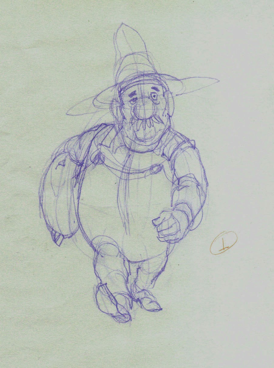
An early concept drawing of Albert walking.

Now that I am at the actual point of animating his walk, I want to pull together all the thoughts I have had about it as I worked with Albert in other ways.

Here is what I know about Albert and his walk:

  • He is a big man, overweight but solid rather than soft, and he is very strong.  
  • The sack of grain may weigh 100 pounds [45 kg] but it is not too much for Albert to carry under one arm.
  • He has miles to walk, so his walk will be deliberate and measured; something he can maintain over a long period of time.
  • He does not mind hard work, so to walk a long way with such a load does not in any way make him unhappy, and he is by nature a cheerful and optimistic man.

This is the kind of thinking that should go into the planning of any animation, but sometimes novice animators forget this when it comes to walks.  They think, I'll just sit down and animate my character walking, because they want to see it, but there really should not be any such thing as an all-purpose walk.  If a character is crossing a room, it is for some reason.  It will affect his or her posture, as well as the speed and style of the walk. His entire state of mind is important, too; whether he is in haste, is anxious or relaxed, is fearful or self-confident, is fatigued or energetic.

Perhaps a walk must be done even more carefully than non cyclic animation because it is a cycle and will be seen in repitition, giving the viewer time to study it that is not the case with a one-off.

I have been thinking about Albert's trekking walk a long time, and now I am ready to animate it.


Next: Choosing the Best Point of View for Designing the Walk

Monday, March 17, 2014

No. 57, Rare Animation Books: The Oldest Animation Book

 The oldest film animation book that I know of is so old, Walt Disney and Friz Freleng learned their craft from it.  It is so old, it predates not only color movies but sound movies.  It is ninety-four years old.


Published in 1920 by Scribners, the book is called simply Animated Cartoons, How They Are Made, Their Origin and Development, by E.G. Lutz.  Let's consider the state of the art in 1920.

In the United States the industry was dominated by such studios as Hearst, J.R. Bray and Paul Terry.  Many of the series being produced then were animated versions of popular newspaper comic strips, and were looked upon by the syndicates as additional promotion for their newspaper features.

The technology of motion picture film, cameras and projectors was just twenty-five years old.  Winsor McCay had produced Gertie the Dinosaur in 1914, just six years earlier.  Disney was still a very young man in Kansas City; he hadn't even begun his work for Kansas City Film Ad and Newman's Laugh-o-Grams, much less his Alice in Cartoonland series.  And Mickey Mouse?  The Mouse was still seven years in the future.  Even Felix the Cat, the  first-ever character and marketing sensation in animation, had just been established that year.

A Farmer Alfalfa of 1916, produced by Paul Terry at the old Barré studio.


A pre-1920 Mutt and Jeff, after the comic strip by Bud Fisher and produced by Charles Bowers at the old Barré studio. Note the sophisticated drawing in this one.
The book is actually a workable text for someone wanting to learn the trade at the time.  Beginning with an explanation of the principle of persistence of vision and a description with illustrations of a film shutter and projector, the book goes on to give a history of animation novelties like the thaumatrope and zoetrope that preceded film technology.  Then begins the how-to section, which takes up the greater portion of the book.

But for the registration system, this same design could be used today in the making of 2D animation.
The basic idea of the animation drawing desk--a glass or plastic panel, a backlight to enable you to see through several drawings, a way to register your drawings with one another--is unchanged to this day.

Timing back then, however, was quite a bit different, since the standard film speed before sound production was just 16 frames per second.  At that speed, the animator did not have to make so many drawings per second, but of course nothing was as smooth, either.

The registration system of the day, years before Acme or any system with oblong pegs and holes.
How cels were used in the beginning.
Transparent cels of nitrate celluloid were already in use by 1920, but production standards were poor and so they were often of variable thickness.  Also they were expensive, so their use was limited to hold cels for character parts that were not moving.  The illustration above shows that the moving arms and mouths were still to be inked onto paper, while the parts that were on hold were on cels registered on top of the paper.

How to design a walk cycle in 1920.
Movement cycles were in common use when Lutz wrote his book, but an animator's  understanding of how to convincingly convey weight and the plasticity of form were still a generation into the future.

Special effects, 1920-style!
Animated cartoons were then full of effects like these "sparks", as Disney called them, which were lifted straight from the panels of the newspaper comic strips out of which the medium was spawned.  At least the viewers were familiar with the symbolism.

The book's title page.
In my case I was lucky to find a first edition of this old book some years ago at Powell's Books in Portland, Oregon.  Since then, however, a facsimile edition has been published by Drawingbooks.org, so you can get your own in hardbound or paperback.  There is even a Kindle edition available for a very small charge!


Saturday, March 8, 2014

No. 56, All About Clean-up Drawings

In the world of hand-drawn animation, when the animation is done and approved it comes time to prepare the drawings for final rendering.  During the animation, where one is concerned mostly with timing and posing, the accurate rendering of the characters may be allowed to slip.  So long as the rough drawings depict the characters in reasonably accurate proportion, nothing about the cleanup process should intertere with the decisions made during animation.  (And if you do find yourself making changes to the animation at this stage, you should probably stop and admit to yourself that the drawings are not ready for cleanup!)

In animation involving a staff of several artists who work on the production drawings, the need for model control is all important, because no two people naturally draw alike.  Studios have always worked hard at making all the images of any character look uniform, which means they are involved in suppressing the individual quirks of all the artists to the point that the viewer will not be able to detect the work of one artist from any other. Even so, animators and animation historians can often spot the work of a Jim Tyer, a Milt Kahl or a Rod Scribner by their signature traits of drawing and movement.

Independent animators who work alone or almost alone have a simpler time of it.  They draw like they draw, they draw or supervise every frame of their films, and they alone determine how closely or how loosely they must adhere to their own model sheets.

In my case, interested as I am in drawing, I do take some pains to keep the characters on model throughout the whole creative process. Yet there is still some work to be done to get them back on model.

Here is a model sheet for Victoria, the woman character in my project, The Crossing.

Victoria model sheet.
Now take a look at this cleanup, on the right, as compared with the rough drawing to the left.
Victoria cleanup 1.
If you look closely you will be able to tell that this cleanup is not a re-tracing but a cleanup done on the same sheet of animation paper as the rough.  I simply lightened all the pencil lines with either a kneaded eraser or a white plastic eraser, then drew in the lines again with close reference to the character model sheet.  Most of the changes are in the face, where I made the jaw smaller and changed how the eyes relate to the nose.

Here is a second example, done the same day:
Victoria cleanup 2.
And in this one it appears at first glance--even to me--that I drastically altered the tilt of her head.  But in fact what I did was to correct some skewed elements in the rough, most important being the part in her hair, which was skewed too far to the left (her right.)  Also I made her face a little narrower, and I made the hands and wrists more delicate.

A third example:
Victoria cleanup 3.
This one shows the biggest changes of all.  I decided that the angle suggested by the eyes and back of the head required me to force all of the features much closer to a full profile, and all of the facial features needed to be made more delicate.  The final hands have also become smaller and thinner.

Cleanups like this need to be created in the same order as the animation drawings of a pose-to-pose scene:  first the extremes, then the breakdowns, then the inbetweens.  As you draw, you should be stacking your drawings on the pegs of your board exactly as you did when making the roughs, so that the drawing you are correcting is beiing constantly compared to the already-cleaned-up drawings that bracket it on either side. This may sound laborious but can actually be done quickly--much more quickly than the creation of your roughs.  And if your extremes and breakdowns are good, then your inbetweens ought to be good also.

I hope this provides some insight and encouragement for any of you with a stack of rough animation drawings that you have been reluctant to clean up.  Now get out your eraser, your sharpened pencils and your model sheets, and just do it!


Next: The Oldest Animation Book