This continues my discussion of the scenes shown in blog post No. 169.
How to Plan the Timing
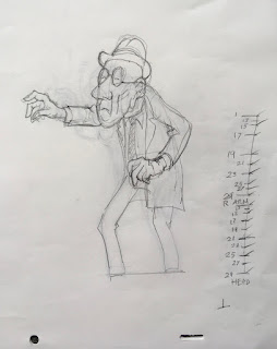
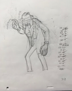
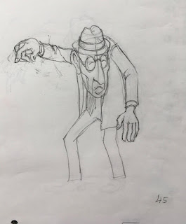
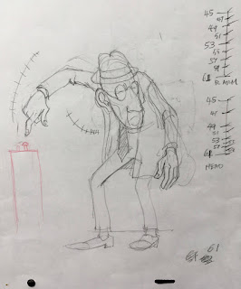
Let's look now at the four extreme drawings for this scene, numbers 1, 29, 45 and 61.
 |
| DRAWING 1 |
This is the beginning drawing, a 12-frame hold as he hovers over the button he intends to press.
 |
| DRAWING 29 |
For the right hand, this is clearly the anticipation extreme. The head, meanwhile, has just eased out of the hold at 1 and is starting its turn.
 |
| DRAWING 45 |
Number 45 is perhaps more a breakdown type drawing than an extreme. It merely defines where the head and right hand are at this point in their forward arcs. Yet it is important because it helps to control that timing that we are talking about.
 |
| DRAWING 61 |
Number 61, here, is not typical, either, even though it is the last drawing in the scene, because it is not a hold. But there
is an ease-in going on with the head and left arm.
So, if you visualize a timing like this, with things moving at different rates and perhaps stopping at different times, how does an animator go about organizing it on paper, so that an assistant could make sense of it? (Or so that you, yourself, can remember what it was you wanted to do?)
Easier Said than Done
First, you make your spacing guides. You begin that by drawing a line representing the duration of the scene between two adjacent extremes, as for example 1 and 29 here.
As you see, we have two guides here: one for the Right Arm, the other for the Head. Just examine the lower one, marked "HEAD" for now. This scene is all on two's (i.e., two exposures per drawing), so all the drawing numbers are odd numbers--1,3,5, etc. If you see even numbers, probably something is being animated on one's.
These are the actual guides I drew on my extreme drawing no. 1. They were done for my own use, and I see at this moment that on the HEAD chart, I never did write in the number 1 at the top, but pretend that it is there. The opening hold is 12 frames, so the first frame of movement is frame 13: the drawing is given the same number. If you have already numbered your extremes (and you should have by now, working with a stop watch or metronome), then you know that you must place exactly eight drawings somewhere along this chart.
But just how do you go about it?
Making a Spacing Guide
The following exercise should be informative if you are not used to doing spacing charts like these.
You begin by drawing a vertical line about two inches [5cm] long in the margin of your extreme drawing. Each horizontal mark that you make along this line represents one drawing (think
drawings not
frames here). Your top and bottom marks will have the numbers of the beginning and ending extreme drawings that you are timing. Thus, here you have 1 at the top and 29 at the bottom.
At this point, your total timing between these two extremes should already have been worked out: it is 29 frames, or a little more than 1 1/4 seconds. A glance at your exposure sheet tells you that you need to place 8 drawings between drawings 1 and 29. It also tells you what the numbers on those 8 drawings will be: 13, 15, 17, 19, 21, 23, 25 and 27.
 |
The exposure sheet shows the number of drawings and the number of frames exposed.
It does not contain information about the timing of the movements within the drawings. |
What you have yet to work out is how those 8 drawings will be spaced out. This information is not in your exposure sheet; it is only shown in the spacing guide which you are now creating.
What you know here is that the head eases out of its hold beginning with no. 13 and then it maintains a steady rate all the way to 29. In your spacing guides, you will want to divide by half wherever possible, and so you begin by dividing the entire distance by half.
Now lets divide each half into half by making two more horizontal marks.
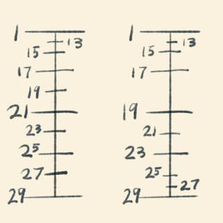
Note that you are not yet applying numbers to the marks, because you are not yet sure where the numbers will fall. But now that you have added three marks, you know that you have 5 more to add. If you divide each of these four spaces in half, that will use up 4 more of your allotment of 8, for a total of 7. Thus with only one mark still to do, you know that you must subdivide the first remaining space to create a small but satisfactory ease out. Now apply the drawing numbers to the appropriate marks.
But you know that the right arm--the one that is going to press the button--has a different timing.
Between the same two extremes as above, you will want different timing: an ease or cushion at each end of the batch of extremes. The number of inbetweens is still the same--8, but the spacing is different. Here is that chart on the right, compared with the chart for the head.
 |
| Head is at left, Hand is at right. |
Now notice that the halfway point on each chart is a
different drawing. For
Head, it is 21, but for
Hand it is 19. This means a bit of extra trouble for the inbetweener or assistant.
When you are doing your inbetweens, you have to start with drawing 21 as halfway for the head and body, but you don't draw in the right arm and hand because the halfway drawing for that is going to be 19, not 21. To correctly follow both timing guides, you must make partial drawings. One way to proceed is to do all the Head drawings without adding any right Hands. Then you can go back and add the right arm and hand according to the Hand guide, starting with drawing 19.
* * * * * *
I am sure this is complicated to grasp just by reading about it. The thing to do is to try animating something with at least two different timing guides using the same drawings, and you will soon get it. Then when you go back and look at this description, it should all make sense.
I suggest that you now go back to post No. 169 and play the video a few times, watching how the right hand and arm are timed so much differently than the head and body.
Timing different body parts at varying rates is a process that certainly takes more work than timing everything the same (and is no doubt easier in CGI than in hand-drawn animation!) but the resulting movement can give your animation the kind of depth and richness that is hard to beat.


