Pages

For People Crazy About 2D Animation!

Acme Punched! is for people crazy about 2D animation. It may be enjoyed by beginners and others, but it is aimed at animators who know already something about the process of animation and the basics of character animation. In large part, it will attempt to provide a deep look into the problem solving that goes on in my head as I work out a scene, often in step-by-step posts that I will sometimes enter in "real time", without knowing in advance what the outcome will be. Mistakes and false starts will not only be included but emphasized, so that the creative process of animation will be portrayed realistically. And, while my own bias is for 2D drawn animation, many of the effects and principles discussed here can apply to CGI 3D animation as well. I hope the blog will prove useful and instructive for all.

-Jim Bradrick

Thursday, December 27, 2018

No. 177, A Wish for the New Year

At Year's End...


A wish for Peace on Earth, at second thought, is not enough right now. An equally important hope is is for An End to Tyranny, which is on the rise, even in the United States where the man now in the White House wants to be our tyrant.

Sorry.  I try to keep this blog non-political, and yet...

...and yet,

HAPPY NEW YEAR, EVERYONE!


Sunday, December 16, 2018

No. 176, Staging with Perspective

Using Extreme Perspective in Staging, with Notes on Matching Consecutive Shots


Creating a layout with unusual perspective
Just now I am working on a scene that has to match the previous scene closely; the difference between the two is just a matter of "camera" angle on the two characters.

The first scene, 5-24, looked like this in storyboard:

(The female officer is about to draw her service pistol, but the male officer  quickly blocks her move with his hand. She then looks up at him to see his face.)

Then after animation, it looked like this:


The following scene, 5-25, was drawn this way in the storyboard...

(The male officer shakes his head, as if to say: You don't need that here.)

...but this drawing no longer matched the animated version of 5-24, so my problem was to make a layout of 5-25 that looked like a natural change of angle.

I had to imagine and draw a rotation of the crouching woman officer and a corresponding view of the man.  It took me a couple of tries before I got what I was looking for. Note that the perspective is quite close to the storyboard panel above.


The version on the right was what I felt I needed. Though the final layout was to be a closeup, this long shot showing the characters' full poses was important for understanding how the heads and shoulders should be positioned. Note the faint perspective lines behind the two figures.

From here it was a simple job to do the closeup layout. In the end what is important is the eye contact between the two characters, but getting the poses right helps to make a convincing and dramatic shot.

The final layout for scene 5-25.


Wednesday, December 5, 2018

No. 175, Going To and Fro

In animation, sometimes a character moves, then returns to her original pose. Most obviously it happened all the time in games animation a few years ago, where a character always had what was called a root position. With the increased complexity of computer gaming animation nowadays, it probably isn't so important, but back then whether a character took just one step or ran and chopped with her sword, the animator always had to add the frames that got his character back to the root.

And when you have to animate something like that, you will always ask yourself what it would look like if you just ran the to drawings in reverse, so you wouldn't have to do any fro drawings.  Because you are always looking for ways to economize on drawings, right? Unfortunately, the answer is usually no; it won't look good.

When it comes to animating the whole figure, this just about goes without saying. Running the drawings backwards will just look like running the drawings backwards, and not like anything natural at all.

What about a head turn?  Yes, it can work, if certain conditions are right.

Here is an example that just came off my disc this week:


This man is looking off to the left of the screen.  For a moment, he turns his head to look to screen right, holds, and then returns to his original position exactly. I filmed it with two repeats in this pencil test so that you can observe it carefully.

It works because there is nothing in the head that is subject to drag or follow-through. (If the man had long hair, you would have both drag and follow-through.)

It works because what he sees when he looks to the right does not cause a change in expression or demeanor. (If he saw something that startled him, it is doubtful that he would return to his original pose afterwards.)

It works because the blink in the middle of the move works in either direction.

Yes, and yet I did do something to make the return different from the original move: I added three more inbetweens to the return move, six frames that were just enough to show a slower rate of speed.


*    *    *
And did you notice a drawing error in this pencil test?  I did; the hair on the side plane of his head should look narrower after he turns to screen right, but it doesn't. My bad! as they used to say.  But I have now fixed the drawings.


Friday, November 30, 2018

No. 174, Designing on the Fly

In feature animation production, the storyboard artists are not required to stay too much on model with the characters. As long as one can tell what character it is, and if expressions and body language are conveyed, a character may be drawn roughly and loosely.  For them, the important things are staging and camera viewpoint and clarity of action.

The independent animation film maker who is doing everything himself will sometimes design a character during the storyboarding process. In such a case, it is equally okay to be a bit careless about details and accuracy, because the character design is still fluid.

By the time real animation begins, however, it is well to have a model sheet made up.  I have a good example of that here.

I have a number of short scenes featuring these two characters, and I intend to animate all the scenes  as a group. This is a good way to minimize a tendency to keep on designing as the work goes along; if I were to do one scene in the group now and another six months later, there would be a likelihood that I might have trouble getting the character to look the same.

Figure 1


Figure 1 shows a collage of storyboard images of the two characters I am calling Ben and Bev.  They are male and female security personnel at the airport, in charge of moving people through the luggage X-ray process.  Here, Ben's images are more consistent than those of Bev, whose hair style keeps changing through the sequence's storyboard.

Figure 2


In Figure 2, I have retraced all the images from Figure 1, plus many more from a second sheet, working to make consistent all the details and proportions as I drew. The result is a model sheet that will definitely help me to keep these characters in line for all of their scenes.

Friday, November 23, 2018

No. 173, Making It Bigger

Working Too Small


We all know by now that CGI character animation has the ability to be far more subtle in movement than hand-drawn work could ever be. The limit of hand-drawn subtlety is easily defined: it is basically down to the width of a pencil line. That's why in our hand-drawn medium, we look for other ways to distinguish our craft than by competing with CGI in this area where they are clearly the champs.

That said, we still need to express some subtlety and slow movement in our work, sometimes getting down to that pencil-line thickness between drawings in order to put across our ideas in animation.

Why, then, would anyone work at a smaller scale than they have to?  The bigger your image, the more subtle you can be.  A character drawn 9 inches high can be much more subtle than a character drawn only 4 1/2 inches high, because the width of that pencil line stays the same. Right?


Yet scaling my characters smaller on the page than they have to be is a mistake I have repeatedly committed in my own work. I just caught myself doing it again, struggling with miniature hands and fingers and other details until I realized my mistake.

Animators who do their hand-drawn work paperless, drawing digitally with a stylus directly into the computer, do not really have this problem because they can zoom their view in and out at will. It is to those of us who still animate on paper that I am talking to here.

In the days of filmed animation, the animator was usually forced to work at the scale dictated by the action within the layout. A character might have to run off into the distance until it was quite small on the paper, losing detail and integrity, going off-model along the way. There were examples at Disney where tiny onscreen characters had been animated large, then reduced to the correct relative size with photostats before inking, but that was expensive to do and rare.

But if, like me, you do a hybrid sort of animation, working first on paper and then scanning the drawings into ToonBoom, TV Paint, or other such software, you can take advantage of the software's scaling capability in reverse.  For example, if you have a situation where your field to photograph is 11 inches wide, and your character in that scene is two inches high, you can animate that character on paper at 6 or 8 inches high and then, after scanning, bring that layer down to the correct scale relative to the background.

One limitation to this is a character who must be animated showing her whole height; in that case you would not want to scale it up so much that it would crop off any of the limbs.

The point is to always think about this when approaching a scene.  Could you be drawing larger? If you could, then probably you should.


Thursday, November 15, 2018

No. 172, Indiegogo Campaign for "Hand Drawn" Feature Film

"Hand Drawn"


As an enthusiastic supporter of anything promoting 2D animation in this CGI age, I am happy to make known to you an Indiegogo project called Hand Drawn.  This will be a feature-length film of commentary and interviews with many well-known and lesser-known animators from across North America and perhaps also Europe and Asia.

Indiegogo is a crowdfunding website where you pledge what you can, from one dollar to several hundred, with perks increasing according to how much you put in.  I just learned of the campaign today (15 November, 2018), only eleven days before the deadline.  So if you want to help, go now to this direct link.

You can also go to the project homepage, here, to see all the details.

If you love 2D animation as I do, and you want to preserve and promote it, this is an opportunity to contribute to that cause. They are asking only $15,000 dollars, and as of now they are a little more than halfway there, so your effort, even if it is but a few dollars, can really make a difference.

Don't  wait!


Wednesday, October 31, 2018

No. 171, The Actor Who Might Have Been an Animator: Scott Wilson

Scott Wilson


Most fans of The Walking Dead probably know that actor Scott Wilson died at age 76 on October 6 of this year.  As a character actor he was also well known for movie roles in such films as  In the Heat of the Night and In Cold Blood, both from 1967, and in The Great Gatsby and many others over the years.


What is not well known is that he was always interested in animation, and that he had wanted to be an animator at one time.  Looking through online obituaries, I have not found a single mention of this obscure fact.

Years ago--I don't know where--I read of this interest of his, and I just filed it away in my trivia filled mind. Then, not long ago, when reading or listening to a Richard Williams piece on You Tube, I was fascinated to learn that Wilson as an older man had attended one of Williams' four-day animation class seminars. Richard Williams quoted Wilson as having made a remark in class about a similarity between live acting and acting in animation, and in Williams' book, Scott Wilson and his wife, Heavenly, are mentioned on his acknowledgements page.

To me it was a validation of my previous knowledge of Scott Wilson's interest, and it showed that his fascination with the art of animation still burned somewhere in his heart, despite success in his acting career.

I don't know any more than this simple fact, but with me it earns him this respectful obituary not only as a fine actor, but as an animator who might have been.

Monday, October 29, 2018

No. 170, Planning and Executing a Complex Scene Timing

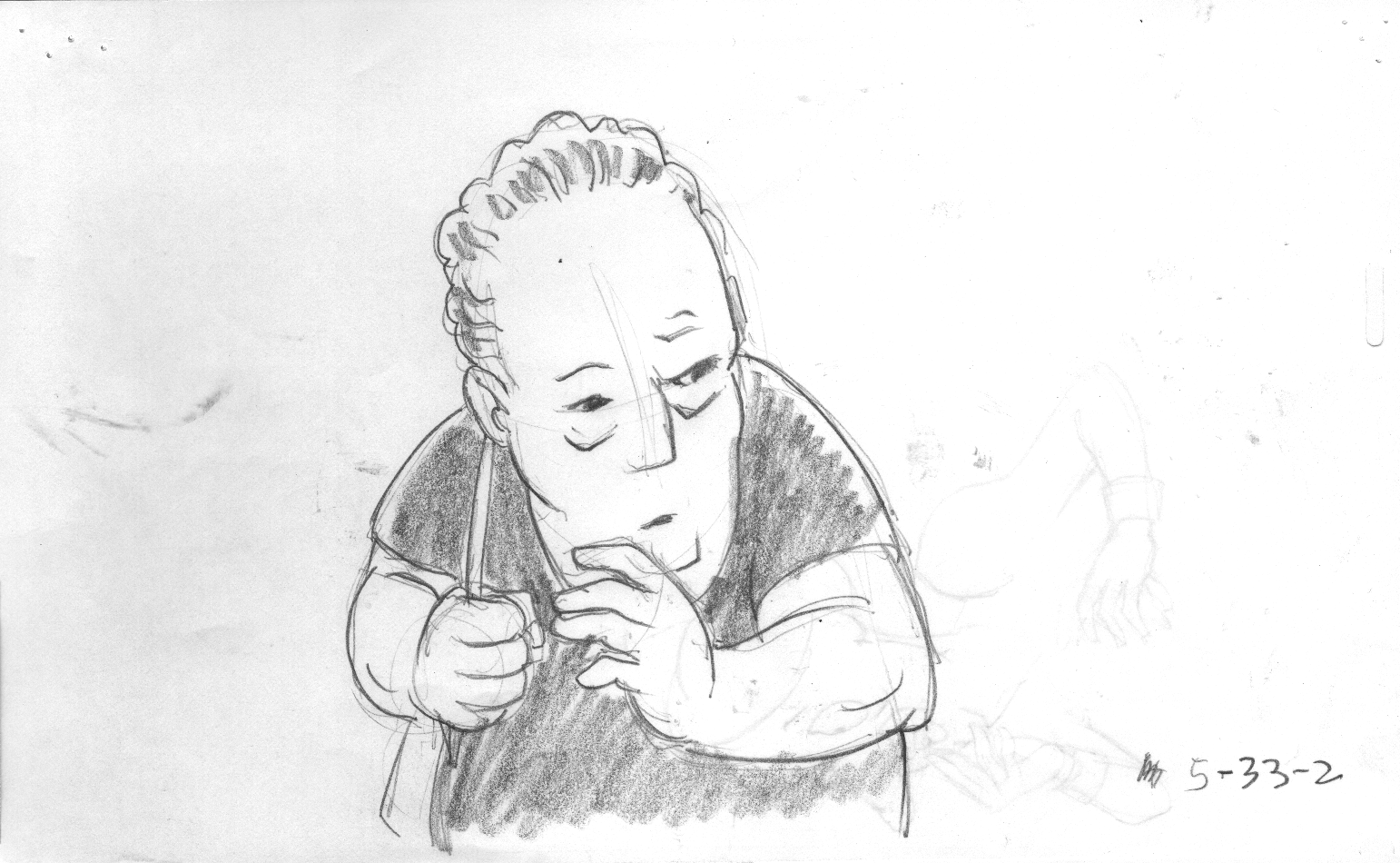
This continues my discussion of the scenes shown in  blog post No. 169.

How to Plan the Timing

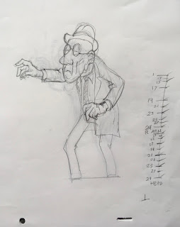
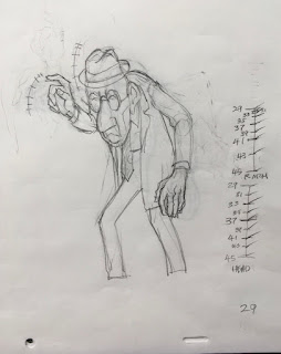
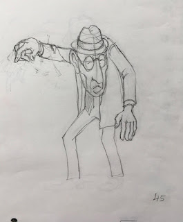
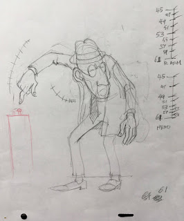
Let's look now at the four extreme drawings for this scene, numbers 1, 29, 45 and 61.

DRAWING 1
This is the beginning drawing, a 12-frame hold as he hovers over the button he intends to press.


DRAWING 29
For the right hand, this is clearly the anticipation extreme.  The head, meanwhile,  has just eased out of the hold at 1 and is starting its turn.


DRAWING 45
Number 45 is perhaps more a breakdown type drawing than an extreme.  It merely defines where the head and right hand are at this point in their forward arcs. Yet it is important because it helps to control that timing that we are talking about.


DRAWING 61
Number 61, here, is not typical, either, even though it is the last drawing in the scene, because it is not a hold. But there is an ease-in going on with the head and left arm.

So, if you visualize a timing like this, with things moving at different rates and perhaps stopping at different times, how does an animator go about organizing it on paper, so that an assistant could make sense of it? (Or so that you, yourself, can remember what it was you wanted to do?)

Easier Said than Done

First, you make your spacing guides. You begin that by drawing a line representing the duration of the scene between two adjacent extremes, as for example 1 and 29 here.

As you see, we have two guides here: one for the Right Arm, the other for the Head. Just examine the lower one, marked "HEAD" for now. This scene is all on two's (i.e., two exposures per drawing), so all the drawing numbers are odd numbers--1,3,5, etc. If you see even numbers, probably something is being animated on one's.

These are the actual guides I drew on my extreme drawing no. 1. They were done for my own use, and I see at this moment that on the HEAD chart, I never did write in the number 1 at the top, but pretend that it is there. The opening hold is 12 frames, so the first frame of movement is frame 13: the drawing is given the same number. If you have already numbered your extremes (and you should have by now, working with a stop watch or metronome), then you know that you must place exactly eight drawings somewhere along this chart.

But just how do you go about it?

Making a Spacing Guide


The following exercise should be informative if you are not used to doing spacing charts like these.

You begin by drawing a vertical line about two inches [5cm] long in the margin of your extreme drawing. Each horizontal mark that you make along this line represents one drawing (think drawings not frames here). Your top and bottom marks will have the numbers of the beginning and ending  extreme drawings that you are timing. Thus, here you have 1 at the top and 29 at the bottom.

At this point, your total timing between these two extremes should already have been worked out: it is 29 frames, or a little more than 1 1/4 seconds. A glance at your exposure sheet tells you that you need to place 8 drawings between drawings 1 and 29.  It also tells you what the numbers on those 8 drawings will be: 13, 15, 17, 19, 21, 23, 25 and 27.
The exposure sheet shows the number of drawings and the number of frames exposed.
It does not contain information about the timing of the movements within the drawings.


What you have yet to work out is how those 8 drawings will be spaced out. This information is not in your exposure sheet; it is only shown in the spacing guide which you are now creating.

 What you know here is that the head eases out of its hold beginning with no. 13 and then it maintains a steady rate all the way to 29. In your spacing guides, you will want to divide by half wherever possible, and so you begin by dividing the entire distance by half.


Now lets divide each half into half by making two more horizontal marks. 


Note that you are not yet applying numbers to the marks, because you are not yet sure where the numbers will fall. But now that you have added three marks, you know that you have 5 more to add. If you divide each of these four spaces in half, that will use up 4 more of your allotment of 8, for a total of 7. Thus with only one mark still to do, you know that you must subdivide the first remaining space to create a small but satisfactory ease out.  Now apply the drawing numbers to the appropriate marks.


But you know that the right arm--the one that is going to press the button--has a different timing.
Between the same two extremes as above, you will want different timing: an ease or cushion at each end of the batch of extremes. The number of inbetweens is still the same--8, but the spacing is different.  Here is that chart on the right, compared with the chart for the head.
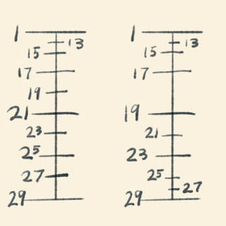
Head is at left, Hand is at right.


Now notice that the halfway point on each chart is a different drawing.  For Head, it is 21, but for Hand it is 19. This means a bit of extra trouble for the inbetweener or assistant.

When you are doing your inbetweens, you have to start with drawing 21 as halfway for the head and body, but you don't draw in the right arm and hand because the halfway drawing for that is going to be 19, not 21. To correctly follow both timing guides, you must make partial drawings.  One way to proceed is to do all the Head drawings without adding any right Hands. Then you can go back and add the right arm and hand according to the Hand guide, starting with drawing 19.

*   *    *    *    *    *

I am sure this is complicated to grasp just by reading about it.  The thing to do is to try animating something with at least two different timing guides using the same drawings, and you will soon get it. Then when you go back and look at this description, it should all make sense.

I suggest that you now go back to post No. 169 and play the video a few times, watching how the right hand and arm are timed so much differently than the head and body.

Timing different body parts at varying rates is a process that certainly takes more work than timing everything the same (and is no doubt easier in CGI than in hand-drawn animation!) but the resulting movement can give your animation the kind of depth and richness that is hard to beat.


Sunday, October 7, 2018

No. 169, Two in a Row

Often, a single short scene viewed alone will not be as effective as it is when seen within the flow of the scenes before and after. Here I had an instance where it made sense to me to present two consecutive scenes together, so I delayed posting the first one until I could also show the second. As it happens, September was a busy month for me in several other ways, so I find myself now in October without having done a blog post at all in the previous month. I try not to let that happen, but I am now looking forward to making up for it.

These two scenes show our Old Man pressing a button on a mysterious device he brought with him into the airport. The guards and the other passengers are nervous; I have already shown you a few of their reactions. Is it possibly a bomb?  No one knows, so I build suspense by showing the Old Man's
deliberate action as he looks back toward the guards.

Timing and Spacing

Richard Williams in his book The Animator's Survival Kit quotes Grim Natwick as saying that animation is all in the spacing and the timing.

Dick Williams drawing of Grim Natwick. Copyright Richard Williams.
Largely, this refers to the many ways it is possible to get satisfying results in the simplest scene by varying the speed of the elements of that scene relative to one another. This gives interest and complexity, whereas timing all elements together can be obvious and resultantly boring. As in the first scene here, one could even stop all movement on the end frame without that fact being obvious to the typical viewer.

Here is the two-scene pencil test.


In the first scene, the medium shot, the right hand is raised and cocks in anticipation before moving steadily down toward the button. Meanwhile, the head lowers and moves toward the right of the screen, easing in so slowly that it does not distract from the more important movement of the hand.

In the second scene, a closeup of the hand pressing the button, I knew exactly what I wanted to do. You may notice that the finger flattens out on the button for 6 frames, showing resistance, before the button clicks down. At this point I intend to have the button light up to show its activation.

Obviously you have to visualize in advance how this will all work. The spacing guides or ladders, as they are sometimes called, are all-important for this. Next time I will talk about those and about how to plan the timing in a shot like this.


Thursday, August 30, 2018

No. 168, The Simple Things

The Simple Things


In animation production, as I have mentioned, it is wise to organize the scene "handouts" in their order of importance or complexity, the idea being to get the best work from the animators on the most critical scenes. If any sort of creative fatigue or ennui sets in, it is hoped, it will be at such a time when the scenes being worked on are simple and less likely to affect the quality of the production.

Although I am working alone on my project, I have just about arrived at that point. There are many scenes still to be done but they are mostly uncomplicated.

Here is such a scene: the Old Man in line at the carry-on X-ray station has hesitated to comply with the requirement that he get his own bag up onto the table. Cut to the guard, who then leans forward and (cut to reverse closeup) taps the steel table three times with his hand. So, I will deal with two scenes at once here since they are so closely related.

The Storyboard Drawings


The guard is aware that the Old Man is hesitant.


To make it clear that the Old Man must get his own bag onto the
table, the guard reaches out a hand and...


...taps three times on the table.
While I was entirely faithful to the first two panels as drawn, I did redraw the third panel. In the original, the trunk seemed too tall relative to the table, and the Old Man needed to be facing in a different direction. Here is my layout showing those changes.

Also, I added the angry man to the right.

Now I will show you the two scenes together, but without backgrounds or anything but the moving character.


Note that the hand animation at the end is all still in very rough drawings, yet the animation comes across just as well as if it were in cleanups.


Wednesday, August 22, 2018

No. 167, Work-around for a YouTube Quirk

Where's My Hold?!!


To my annoyance, I have noticed that my YouTube uploads have often been shortened at the end.  The problem arises when I have a hold at the end of my pencil test.  If it is 6 or 10 or 20 frames long--no matter--if there is not any change in the image, YouTube will clip off all but one or two of the frames.

This is serious because a hold at the end is an important timing feature of any animation.

My solution now is to add a couple of blank frames at the end.  Then all the frames of my ending hold get published.  Here is a test of that solution.


It works, and now that I know what to do, I am happy with the results.  (Compare with the videos in post No. 166.}

No. 166, Beware of Re-writing Unintentionally


Beware...


It is one thing to enhance a scene with character movement and acting; it is another to change the meaning of the scene by what you add. A storyboarded scene may be fairly interpreted in many different ways, but it should not be re-interpreted in such a way that it no longer tells the story properly.

That is a problem I ran into with this scene. Of course I am my own storyboard artist as well as the animator, but in this case I went too far in my interpretation.

The scene is a sequel to the one we looked at in post No. 163, in which the character I call Nelson has reacted to a perceived bomb threat by cringing down into a fearful posture.

The "bomb" has turned out to be a harmless, non-explosive mechanical device. Nelson now rises up from his trembling crouch to see what is really happening.

Here are the storyboard panels with which I was working.

Panel 1
Panel 2
Pretty simple, huh? But, I decided to make it more complicated. I thought, what if he then shows his anger at being frightened, and at publicly showing his fear? And I came up with a final pose drawing for this that I really liked:

The "extra" pose I added.

Not bad, huh? He looks mad as hell, doesn't he? So, I went ahead and animated it as part of the scene, and it came out like this.


I thought the animation came out pretty good too, so I showed it to my director, who practically threw it back in my face. "If I want the damn story changed, I'll change it, or I'll have the storyboard department change it", he said.  He was clearly frustrated with me. "As animator," he went on, lowering his voice as he got hold of himself, "it's not your job. Having him get mad like that at this point does not work with his other scenes.  What were you thinking?"  

Have I mentioned that the director is me? As I am also the animator and storyboard department,  this was an intimate conversation. But the director is boss, so the animator must back down, and I did. Then I had to think how to fix it.  It was actually easy; I just removed the last eight drawings, and it was back in line with the storyboard.

The real regret, of course, is the wasted work.  If not for this blog, no one would ever have seen the version above.

Now, here is the scene as it was written and storyboarded.


Yes, it is fun to think up cool things to add to your scene; just don't try to change the storyline in the process!

Monday, July 30, 2018

No. 165, Gesture Drawing at the Old Ball Game

Baseball Drawing Fun


Yesterday I went with my wife and some friends to a local baseball game. The team is a collegiate woodbat team, a member of the West Coast League.  It was a beautiful baseball day, sunny and warm with a nice breeze.  I thought to take along my sketchbook to do some action gesture drawing.

Regular gesture drawing is usually done with a short pose of from one to three minutes.  I enjoy that, too, but what I call Action Gesture Drawing is not from any held poses at all. Your subjects are moving about all the time and unaware that they are being drawn.  This can be very difficult in activities where no one holds still at all, or hardly ever.  You see someone in conversation at a park, they actually are holding still, so you start a drawing and suddenly they shift their weight or otherwise change their pose.

Turns out, baseball is ideal for this. In baseball, as perhaps in cricket and a few other sports, the players repeat their poses many times: the batter takes his or her stance, the catcher squats down to give signals or receive the pitch, and the pitcher has a number of standard moves and poses in his repertoire.

Just as batters and pitchers and fielders have to warm up before they are ready to play, so does the gesture artist need a few moments to get warmed up for a good session.  Here is my whole warmup page, so that you can see that there are bad drawings among the good.

My warmup page, showing some unsuccessful sketches.
Here are some of the better ones...

This right handed batter is ready for the pitch.  First I drew the angles of the forearms and the bat; the rest I filled in from repeated pitches.

I believe this was another right handed batter. he has swung at the ball and at this point has already let go of the bat with his right hand. His whole right arm is hidden behind his body.

Our seats were along the first base line, so we had good views of the pitcher and batter, as well as the catcher. This pose of a left handed pitcher is not one that is held at all, so I had to watch him pitch several balls to get the drawing done. After this the left leg swings forward; in a quarter of a second, the pose changes dramatically.

Here is a complementary pose, the delivery by a right handed pitcher. Again, the leg that is behind will swing forward rapidly.

Here, the pitcher waits for  s signal from the catcher.

Last, here is a young man who probably imagines himself behind the plate or on the mound someday.

Every so often, I will encourage you to do life drawing to improve your observation, an important tool for the animator. So try to always have a sketchbook at hand. These drawings were all done directly with a fine line waterproof marker, but whether you use pencil or pen, keep drawing!

Saturday, July 28, 2018

No. 164, Smear Drawings and How to Use Them

If you look back at the video in post No. 162, you will see the character, Nelson, glancing quickly right and left before going into his cringe. This was done with the use of smear drawings, which I have mentioned before. Chuck Jones The Dover Boys  makes use of this technique extensively for quick transitions, so if you have this cartoon on DVD or can find it on You Tube, take a look.

Here is how they are supposed to work, based on a supposition that the frame speed is 24 frames per second.

You create your starting pose, A...

... and your ending pose, B.


Then you do this weird inbetween drawing that will appear on one frame only; this is very important.

If the movement is left to right, you trace the left contour of drawing A, then the right contour of drawing B.
Contour A shown in Red.

Contour B shown in Blue.


Between those contours you handle the shape like a piece of taffy stretched across between the starting and ending contours.

As appropriate, include an arc of movement in this drawing.

The result will be a smear or blur that can be a quite effective transition. The viewer will not be able to focus on the inbetween but the effect will be of a smooth, although lightning fast, movement, rather like that of a bird suddenly moving its head.
Here is the smear tween laid over the two key drawings.
This is the smear tween alone.
This will work fine in black and white, but it works even better in full color.
Above, the three images in color.
Colors actually track better than lines. Here I have limited myself to just two colors, but more could also work. But more than 3 or 4 colors will not make the effect any better, and it is a lot of unnecessary work. They say that light colors track better than dark ones.

Let's now look at a video of this effect, created in Flipbook through Autodesk Sketchbook.

Note: For the best effect, try looping this video. See instructions at the top right of this page if you don't already know how.

When you loop the video, you will see that this effect--having no anticipation nor drag nor follow-through--works just as well backwards as forwards.  I hope you enjoy using this fun effect!

Friday, July 13, 2018

No. 163, My Next Assignment...and Yours!, part 3

"Take" Two


This scene posed some problems I had not anticipated. But I finally got it sorted out. Here is the result, with discussion following.


If you compare it to the video in the previous post, No. 162, you will see that I have taken out the quick head movements at the beginning and added a classic Hollywood cartoon "take"--a sudden movement indicating surprise or shock.

Sometimes a move in animation that isn't working quite right is best handled by coming at it with something altogether different, rather than continuing to fuss with the original drawings.  I was slowed down in my posting to this blog by summer weather, yard work and fun with some house guests who came up to stay with us during Independence Day week.

But I have also taken the time to clean up all the drawings, so you are seeing this much as it will appear when inked and painted.

The next scene I do will show you what this same character does when he comes out of his cringing pose to find that his fears were unwarranted. Is he relieved? Yes, but he is also angry!

Thursday, June 21, 2018

No. 162, My Next Assignment...and Yours!, part 2

The Inbetweens and Key Drawings


I have now done my animation of this scene, and there were some surprises. More about that later, but first let's look at the main poses.  We began with the two storyboard poses last time; here is how those translated into animation drawings.

This...

Storyboard panel 1.

...became this. Simple enough.


But then the second storyboard panel...

Storyboard panel 2.
Ended up converting to two drawings: this one (which pretty much resembles story panel 2)...

Drawing 57


 ...and also this one, an even more extreme compression of Nelson's body.

Drawing 71


This last drawing and the six inbetweens leading to it comprise a moving hold, in Disney parlance, ending in a trembling vibration on ones between drawing 71 and drawing 72 (which is drawing 71 re-traced with some minimal displacement of forms; that's how you get an effect of vibration or trembling).

Thus, the sequence for the end is 57, 59, 61, 63, 65, 67, 69 (all on twos) and 71, 72, 71, 72, 71, 72, etc. (all on ones.)

 At the beginning of the scene, before Nelson goes into his cringe, you will see that I also have him quickly looking one way and then the other.

Here is the first pass pencil test of this whole thing:


What do you think? My own opinion: the cringe part is good but the beginning where he glances back and forth does not read very well.


Next: We'll add a couple of holds, and also talk about those quick transitions.