Pages

For People Crazy About 2D Animation!

Acme Punched! is for people crazy about 2D animation. It may be enjoyed by beginners and others, but it is aimed at animators who know already something about the process of animation and the basics of character animation. In large part, it will attempt to provide a deep look into the problem solving that goes on in my head as I work out a scene, often in step-by-step posts that I will sometimes enter in "real time", without knowing in advance what the outcome will be. Mistakes and false starts will not only be included but emphasized, so that the creative process of animation will be portrayed realistically. And, while my own bias is for 2D drawn animation, many of the effects and principles discussed here can apply to CGI 3D animation as well. I hope the blog will prove useful and instructive for all.

-Jim Bradrick

Saturday, April 30, 2016

No. 96, A Poster for "Carry On"

Drawtastic


Today I spent my time promoting this blog and my feelings about 2D animation at an event in Seattle called Drawtastic. This is the brainchild of my friend and fellow 2D animation enthusiast Tony White, whose first book, The Animator's Workbook, has been a valued volume in my animation library for 30 years. Originally from England, Tony for the past several years has lived and taught and written about animation in the Seattle, Washington, area near where I reside.  It was a great pleasure to finally meet him face to face a couple of years ago, especially as we share that passion for preserving and nurturing the art of hand drawn animation.

The event was the first of what we hope to be many annual editions.  It was designed to encompass not just animation drawing but all drawing, and so it included the professional caricaturist Nolan Harris and several other comics artists and graphic novelists among the presenters and vendors. Organized along the lines of a comicon, the vendors like me occupied tables in a hall where visitors could talk to us freely as they moved about, and some of us made drawings during this time. I set up a portable animation board and worked on cleaning up the rough drawings of the Old Man's walk cycle. (The roughs are what I presented in my last post before this one, No. 95.)


The Poster

Also, stimulated by thought about what would make a good visual presentation at my table at the Drawtastic event and despite the fact that I had only about three weeks to get it ready, I decided to create a poster for my film Carry On.And because of the intense work I have been doing on my storyboards for the film, I knew at once exactly what imagery I wanted to show.

My movie poster for Carry On.

In my next post I will talk more about Drawtastic and some of the people I met there, and I will tell about the stages of development the poster went through.

Thursday, April 21, 2016

No. 95, A Most Unusual Walk Cycle

Note: This post is currently under edit in an attempt to improve the quality of the videos. Some links may not function from time to time.

Back to Animation

Well I certainly had some fun this past week. Having gotten the animatic for Sequence 3 of my film in pretty good shape, I decided it was time to do some actual animation.

And the choice for that animation was obvious: the all-important action of the Old Man dragging his ponderous suitcase through the airport, which was destined to be seen from several angles throughout the film. It would be onscreen repeatedly, and if it did not work well, it could spoil the entire production.

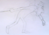
Based on a drawing I worked out some time ago, the cycle would need to show 1) the weight of the object being dragged and 2) the continuous effort required to keep the weight moving along.

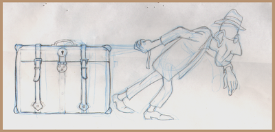
The character pose that was the inspiration for this walk cycle.
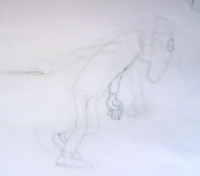
To help me to understand the forces involved, I took the largest suitcase I have, which is perhaps but a quarter of the size of the Old Man's bag, and I loaded it with two 12-pound hand weights and two 15-pound weights, for a total of 54 pounds [24.5 kg]. (I had at first added 20 more pounds, but 74 pounds [33.5 kg] turned out to be too heavy to drag effectively.) I then had someone take movies of me dragging this thing along a concrete walkway, a surface that provided a lot of friction that contributed to the resistance of the movement.

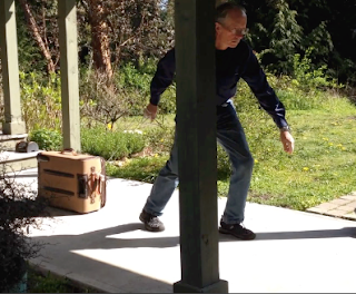
Dragging my 54 pound suitcase for live-action reference.
Taking caution from Nancy Beiman's advice in her invaluable book Animated Performance, I no longer am tempted to any literal interpretation of live-action reference footage, and so the filming was perhaps more interesting in what it felt like to drag that suitcase than in what it looked like on the screen.

I also had live action taken front a frontal viewpoint and from a 3/4 rear viewpoint, which should be useful when I adapt the cycle for these other angles.

At last I sat down at my animation desk and knocked out this rough animation of the walk in profile.
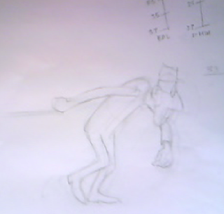
Pencil Test 1

Link here.
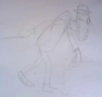
A frame from Pencil Test 1
First, I failed to check the settings on Toki Line Test, the pencil test application that I use.  It was set on 30fps, the standard video setting, whereas I am timing this film at the standard film frame rate of 24fps. So, this test plays slightly faster than it should.

The upper body is a mess of uncoordinated and lurching movement--not a success.  But if you mask off the upper part and just watch the legs and feet, you can see that this part works quite well.

Back to the drawing board!

Pencil Test 2

Link here.
A frame from Pencil Test 2
Now we have the proper speed of 24fps, and you can clearly see by its jerkiness that the test was shot on 4's.  With a stopwatch I had determined that the whole stride (two complete steps) ought to take a little under 2 seconds, so I settled on 40 frames.  Shot on 2's, that would be 20 drawings, but in this rough version I am working with just 10 drawings which, because the movement is slow, will be enough for me to be able to evaluate the action. Later, the 10 missing inbetweens will have to be added.

The action now looks a lot better, with the straining of the upper body evident as he throws out his left leg. I have omitted the left arm for now so that I can focus on the torso. Note how the right arm straightens out completely at the most extreme point of the effort.
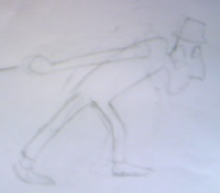
Pencil Test 3

Link here.
A frame from Pencil Test 3
Walking up and down a hallway in imitation of the Old Man's walk, I began to get an idea of the proper left arm movement. Because the right arm is constantly restrained behind him by the burden of the suitcase, the customary counterpoint--right arm moving with left leg, left arm moving with right leg--is disrupted.  The left arm now moves in direct support of the left leg, adding its own weight and momentum to the effort on that side.

But while the arm looks correct at the forward part of the movement, the backswing and turnaround are unconvincing. I go back to my drawing board--and my eraser!--once more.

Pencil Test 4

Link here.
A frame from Pencil Test 4
Here we have a much better movement. The arm comes back far enough and the drag and follow-through on the arm and hand work pretty well.  It is time to put in those remaining 10 drawings.

Pencil Test 5

Link here.
A frame from Pencil Test 5
Of course we have a much smoother movement overall now that all 20 of the drawings are present and it is playing on 2's.  Also I was able to do a lot with ease-in and ease-out spacing while adding the last 10 drawings, as you can see by the flurry of spacing charts around the character's head. Further, I darkened some lines, drew in the hat on all drawings and made some adjustments to the scale of the left hand which made it more convincing as it approached or retreated from the camera.

The next step will be the addition of detail and cleanup, but at this stage I feel I have validated the walk cycle and that all the principal questions have been answered.


Saturday, April 9, 2016

No. 94, Using Storyboard Pro with Scanned Images, Part 3: Timing an Arbitrary Scene

How Long Is the Scene?

The screen duration of many scenes is easy to determine. If your character is doing a certain bit of business before the camera, then the time it takes to perform the action may give you your answer.  If it is based on dialog, then you have another easy guidepost to determine the length of your scene or shot.

But what about a scene with no clear beginning or ending? What then determines how long it should last? Such a problem is confronting me in Scene 7 of the sequence of my film Carry On. This is where Miss Hopegood first crosses paths with the Old Man and his Suitcase.  The camera is facing across a long corridor in which the Old Man drags his case to the right, while Miss Hopegood passes in the opposite direction, moving to the left.  In the next scene, she realizes what she has just seen, and she goes back to try to help him (whether or not he wants her help.)

I originally boarded this scene in three panels, with the camera traveling along with Miss Hopegood, keeping her centered in the frame, while behind her we see that she is moving past the Old Man. The background of the corridor, of course, is also slipping along toward the right.

Here are the 3 panels:


I timed this out to last three seconds or so.  In SBP I originally gave it 3 seconds, 20 frames, or 92 frames and just under 4 seconds for the three panels.

It seemed to play well enough in this form, but I realized that I could get a better idea of it by making the three panels into one and animating both the Old Man layer and the Background layer in motion to the right.

This involved separating the character elements from each other and from the background, each on a separate layer. With all the negative space being white, it was impossible to clearly see what was opaque and what was transparent, so I added an extra layer at the bottom of the stack which was colored a solid blue.
The Layers window showing the opaque layer included at the bottom.
With this blue layer, I was able to clearly see what opaque parts needed to be removed from each layer.
Next I created a new background layer on which to create a moving vector background.
The New Background layer added.
Showing the simple background I created with the line and fill tools.
All layers showing as translucent with Auto Light Table turned on.
The final composite as it looks in the movie.

I did all this but then found that it worked better if the scene lasted about 6 seconds.  Here is the result, with a few scenes included before and after to show the context.


Revised Animatic


I have made many other changes to my animatic of Sequence 3, adding refinements and effects to better approximate the final vision, which in turn allow me to make more assured judgments in the timing of all the shots. Changes include:

--Simple animation of layers from left to right (or in the X axis), such as a character moving across the screen or a background.

--Layer animation of characters/vehicles, including scaling, to show these things moving in perspective

--Transitions such as cross dissolves

--Camera moves that clarify the action

There are many other refinements that could be added, but I am trying to limit the embellishments to only those things that would help put across the story more clearly; if a single still panel is effective, then to animate their elements in the animatic is not worth my time and trouble.

Here is a link to the revised animatic.