Pages

For People Crazy About 2D Animation!

Acme Punched! is for people crazy about 2D animation. It may be enjoyed by beginners and others, but it is aimed at animators who know already something about the process of animation and the basics of character animation. In large part, it will attempt to provide a deep look into the problem solving that goes on in my head as I work out a scene, often in step-by-step posts that I will sometimes enter in "real time", without knowing in advance what the outcome will be. Mistakes and false starts will not only be included but emphasized, so that the creative process of animation will be portrayed realistically. And, while my own bias is for 2D drawn animation, many of the effects and principles discussed here can apply to CGI 3D animation as well. I hope the blog will prove useful and instructive for all.

-Jim Bradrick

Saturday, March 29, 2014

No. 59, A Walk Cycle for Albert, Part Two: Point of View

A Different Point of View


In thinking about this walk for Albert, I have most often pictured it from one side, the standard view for getting the most out of your drawing cycle.  In 3D terms he is walking along the X axis, but the camera stays with him and matches his speed so that he stays centered on the screen, while the background can be seen slipping past.

But even though I want to show this profile angle, there is a problem in designing it in this way because of the sack of grain he is carrying; its great weight forces him to walk assymetrically, and from the side this is very hard to visualize.  Here are a few sketches showing my struggles with this problem.


I seem to remember reading of an animator (Frank Thomas?) advising that if you are having trouble drawing a character from the camera angle, to first draw it from a more obvious angle, then extrapolate back to the original angle.  In other words, draw it first at an angle  from which you can understand the proportions and mechanics, and then rotate it in your mind to whatever it must be.  This is difficult but it is a skill most long-time pencil animators have developed.

So in this case, I decided to try looking at the walk from the front:
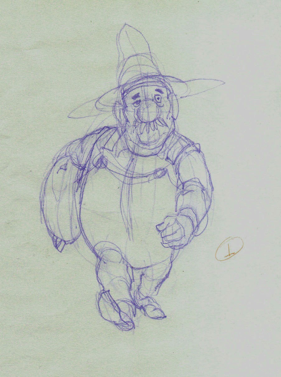

Right contact position.
Immediately I could see that this was the way to go.  Here are the other three key drawings for the cycle.

Passing position.
Left contact position.
Passing position.
And now I have a first pencil test made with just these 4 drawings:
The cycle is designed to last 28 frames at 24fps, a bit longer than usual.  Also I am putting the emphasis on the contact positions, so in the test, instead of exposing the 4 drawings equally, seven exposures for each, I gave the contact drawings 8 exposures and the passing positions only 6 each.  It still adds up to 28 frames, but the rhythm more nearly matches what I want the final result to be.


Next: The Test from the front, with all drawings filled in.

No comments:

Post a Comment