Pages

For People Crazy About 2D Animation!

Acme Punched! is for people crazy about 2D animation. It may be enjoyed by beginners and others, but it is aimed at animators who know already something about the process of animation and the basics of character animation. In large part, it will attempt to provide a deep look into the problem solving that goes on in my head as I work out a scene, often in step-by-step posts that I will sometimes enter in "real time", without knowing in advance what the outcome will be. Mistakes and false starts will not only be included but emphasized, so that the creative process of animation will be portrayed realistically. And, while my own bias is for 2D drawn animation, many of the effects and principles discussed here can apply to CGI 3D animation as well. I hope the blog will prove useful and instructive for all.

-Jim Bradrick

Sunday, February 22, 2015

No. 77, Blurring the Pencil Lines: 2D Animation in Today's Independent Films

As digital animation technology matures and disseminates down even to one-person studios like my own, the distinction between 2D and 3D animation becomes less clear--less easy to sort into just two piles and often less easy to identify in viewing.

A film may be animated on paper, then scanned in and completed digitally.  A very similar looking film may be animated directly into digital form, by using an electronic stylus and a Wacom or other tablet, but still adhering to the traditional process of superimposition of images for registration and then either animating straight ahead or by the more controlled method of extremes, breakdowns and inbetweens.

A traditional 2D film can be processed and enhanced digitally to the point that it greatly resembles something done with 3D models in Maya or another similar 3D program. Conversely, a film animated with CGI models can now be rendered to look like it was animated on paper. Then there is the increasingly dominant TV production method of 2D digital puppetry. And there are now numerous examples of hybrid productions, where some elements are singled out to be created as CGI models while others are still done in 2D, the output of both being blended in the production.

But just for fun, let's see what traditional 2D elements we can discern in the nine Oscar contender films I listed last week.

The Plainly 2D

Bus Story

Duet

Footprints

Me and my Moulton

The most obviously and directly 2D are Bus Story, Duet, Me and my Moulton and Footprints. They all show signs of having been animated on paper.  In Bus Story, Duet and Footprints, one can even see the character of pencil lines in the final render, although I wouldn't be too surprised to learn than someone has developed some automatic and logarithmic way to convincingly duplicate even that look.


Me and my Moulton looks inked in the same way that hand-traced cels used to look inked, but I would bet that this was all done in a computer.

The 2D, 3D Hybrids
The Dam Keeper
An interesting crossover is The Dam Keeper, with a final render style that looks like impasto paints applied with a large chiseled brush. And I rather thought that the characters were CGI modeled. According to online information, however, the drawings were on paper and the painting was digital.  I do think I saw some CGI images here and there, as with the tramcar and the mill interior.

Even with the Disney funded Feast,  I am not sure there is anything done on paper beyond the concept stage. But I have not found anyway production details about this film.  Anyone out there know?
The Unabashedly 3D
Of the three remaining, I feel certain that two are straightforward CGI model productions: A SingleLife and Sweet Cocoon, though the former has opted for a look that is somewhat in the clay animation style of a Nick Park.
A Single Life

Sweet Cocoon


And a Big Hand for Stop Motion
Last, and in many ways most interesting of the whole group, is the extraordinary stop motion film The Bigger Picture.  It is extraordinary in its intended audience, which is emphatically adult; it its scale, which is actual size (a character who is intended to represent a six foot man is actually six feet tall in from of the camera); in its variety of media, including wet, opaque paint on a wall and other flat surfaces, papier maché and real furniture and rooms as props and settings.
The Bigger Picture


So there you are.  But just now, as I type this, it is 5:06pm, Pacific Time, and that's time to go watch the Oscars presentations and see who wins!

Tuesday, February 3, 2015

No. 76, Animated Short Subjects Oscar Contenders 2015

Today I got a chance to go and see all 5 nominees that made the final cut for Oscar contention in the Animated Short Subject category, plus 4 runners-up.  Let's take a look at what we have here.

The Five Nominees


Me and my Moulton.  14 minutes. Director: Toril Kove. Canada.

2D animation with possible computer assist.  Simple and charming line art about 3 daughters of eccentric Norwegian parents, narrated by the middle girl.

Feast. 6 minutes. USA.

From Disney, a digital film directed by Patrick Osborne about a foodie dog and his foodie owner.  Clever and full of life, with an unusual lighting treatment that is high contrast and sharp edged. Typical Disney character design and movement.

A Single Life. 2 minutes. Netherlands. Directors: Marieke Blaauw, Joris Oprins, Job Roggeveen.

The shortest by far of these short films, this is a succinct and quite funny digital film with a character design based on stop motion clay animation.  My pick to win.

The Dam Keeper. 18 minutes.  USA. Directors: Robert Kondo and Dice Tsutsumi.

A perplexing digital film with a flawed storyline about an orphan pig who is both a bullied child in school and an adult burdened with an onerous responsibility for his whole town. The rendering style is painterly and ragged with some quite beautiful color design.

The Bigger Picture. 17 minutes. UK. Director: Daisy Jacobs.


An unusual stop motion film in a combination of kinetic painting and papier maché animation, about two grown men and their elderly mother.  Touching and funny and strange.

The Four Also-Rans

No explanation is given for the selection of these four films which have been included to be distributed with the five nominees.  Whether they were jury favorites or just easily available is not mentioned. Nevertheless, here they are.

Sweet Cocoon. 6 minutes. France.

Hilarious and well-animated digital film about an overweight caterpillar who gets help in getting into her ready-made coccoon  from two elderly beetles.

Footprints. 4 minutes. USA.

2D animation in the unique and highly personal style of Bill Plympton, whom I applaud for making a go of 2D animation while personally not liking his work very much.

Bus Story. 11 minutes. Canada.

2D animation in a primitive style reminiscent of Richard Condie, this film sponsored by the National Film Board of Canada tells the story of a woman whose modest dream is to drive a school bus.

Duet. 4 minutes. USA.

A film by the Disney-trained virtuoso 2D animator Glen Keane, about a boy and girl growing up from babyhood and finally and inevitably coming together as a couple.


Next: Blurring the Pencil Lines: Traditional 2D Animation in 2015 Oscar Entries

Monday, January 26, 2015

No. 75, Me vs Toonboom StoryBoard Pro, Part Four

A Note to My Readers:

The internet is littered with the corpses of abandoned blogs, their authors having lost interest, become burnt-out or otherwise permanently diverted.  This is not one of them.  I have taken a long hiatus caused by a combination of things: a trip to Italy, some paid work that has kept me busy, and a couple of hangups with StoryBoard Pro that I will mention below, but I have not lost my enthusiasm for my little cause of learning and writing about animation.

I realize the value of posting regularly, and am back with the determination to regain your attention and interest.  I thank you for your past allegiance and intend to carry on now as before. Let us continue.

-Jim Bradrick


Trouble in StoryBoard Pro


Digital vs Paper

I made a valiant effort to do my storyboards digitally, but this has not proved easy for me.  This is perhaps the most significant thing that got me stalled last August.  I can do it, and if you took away all my paper and pencils, I would do it, just as I would certainly learn to draw again with my left hand if I lost my right.  Nevertheless, it still feels more comfortable to me to draw on paper, and so, for now, I have gone back to doing first-draft sketches on paper and scanning them into the computer. As I am the animator as well as the storyboard man on my own projects, these sketches often double as my animator's thumbnails, and when I have just a pencil in my hand I am not distracted by having to deal with such issues as layers, toolbars and keyboard shortcuts that cut into my creative line of thought.

Written down, these things seem less like good reasons than mere excuses, and I am sure I will get over my discomfort eventually, but my decision to return to paper and pencil allows me to move forward again, and that is the important thing.

Sound

Then there is the issue of sound.  My script for The Two Washingtons contains dialog, and as I approached the dialog sequences I found that I was having trouble with visualizing the complex character interplay that was to go on.  There are four character voices planned, with possibly a fifth, and I realized finally that I ought to go ahead and record a scratch track so that I could work out dialog timing. Other dynamics between the characters would also become apparent.

If you have ever priced professional sound recording equipment, you know that this can be expensive.  But my friend Don Wallace of Wallace Creative in Portland, Oregon, put me onto a solution that gives me high sound recording quality at an amazingly modest price.  This solution is the Zoom H1 Handy Recorder. Powered by just one AA battery, it gives you digital sound recording you may find hard to believe.

The ZOOM H1 recorder on its mini tripod and with a foam wind baffle covering the mic.

Armed with my script and a fondness for ham acting, I soon had the soundtrack I needed.  In Adobe Soundbooth I edited the track into clips, changed the pitch on the voice of one character, and imported the sound into SBP.  As expected, having the dialog sound on the SBP timeline helped greatly in timing the remainder of the storyboard.

In the timeline at bottom, note the sound clip showing in waveform mode.


Thursday, September 11, 2014

No. 74, Rare Animation Books: The Animated Film

The Animated Film, by Roger Manvell, pub. 1954 by Sylvan Press. 63 pages.


This book, subtitled "with pictures from the film 'Animal Farm' by Halas and Barchelor", was remarkable in its day for not being about the Walt Disney studio.  Indeed, it was about a British studio and their production of the first British feature-length animated film.  Across the pond at Disney, work was going forth on Lady and the Tramp, another sentimental adventure with songs that had become a Disney mainstay.  Animal Farm was nothing of the sort.

The film was based on a popular book of the same name by George Orwell, who was a journalist and, later on, author of the  more famous dystopian novel 1984. The book was a satire of the communist form of government and, more specifically, of the Soviet version of communism, which in its heavy handed way had become in many ways indistinguishable from fascism.  It told the story of farm animals who rise up and overthrow their human master and then attempt to govern themselves, with the more cunning and ruthless among them eventually rising to the top.  "All animals are equal," goes the famous quote, "but some are more equal than others."

Expressive animation of the pig who decided he was "more equal than others."


Two still frames in black and white from the color film Animal Farm.


Today it is known that the CIA, interested in any kind of anti-Soviet propaganda, obtained the film rights to Animal Farm, and that under the direction of Howard Hunt (of Watergate infamy) the producer Louis De Rochement was chosen as front man.  De Rochemont then selected the Halas and Batchelor studio to create the film. It is not generally believed that the studio had knowledge of the source of their funding at the time.

The Halas and Batchelor workflow chart of animation production.


The film was remarkable for being of adult interest rather than that of children.  John Halas, a Hungarian immigrant to England, and his wife and partner, Joy Batchelor, expanded their studio to a staff of 70 for the production. Three years, from 1951 to 1954, were spent in the making of the film. The technique and style chosen were not unlike the Disney model, with drawn animation traced and painted onto cels, and with care taken to achieve a certain amount of realism in the movement and design, again in the mode of Disney.  It was, after all, intended to be released as a commercial product, so it needed to be able to compete.

A page showing development of the design for one of the human characters in the film.

Model sheets of some of the animal characters.


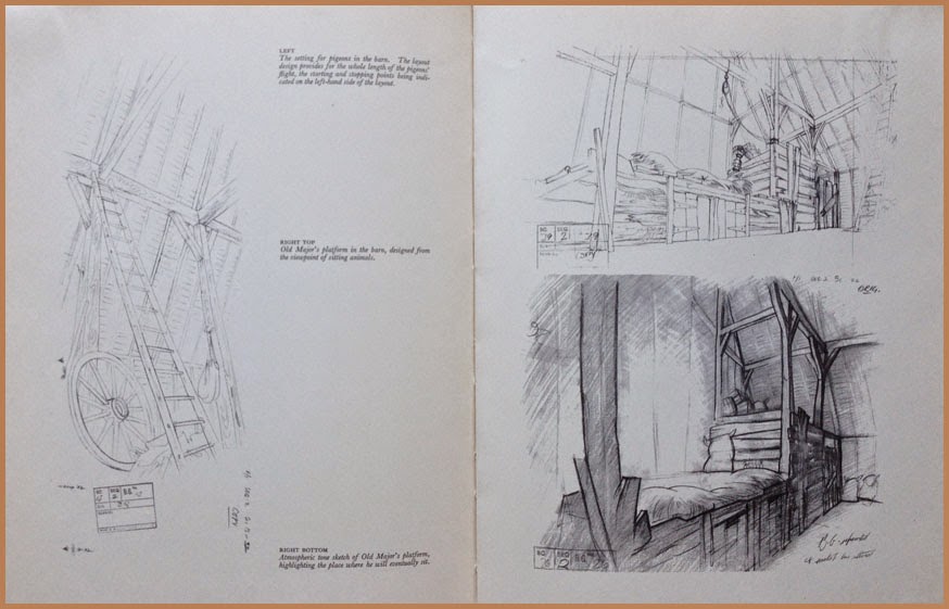
The book includes expressive model sheets of the characters, sections of storyboard, layouts and animation drawings.

A detail of the Tension Chart.


An interesting insert is a foldout "Tension Chart" showing the flow of tension or excitement from beginning to end, including notes on mood, music and color.

Background layouts.


But although the film was in color, the books illustrations are all in black and white.  Altogether it is a fascinating look through a parallax lens of feature animation production in a country other than the US.

Views of production work around the Halas and Batchelor studios.


Roger Manvell, the author, was a writer who had worked for years with Halas and Batchelor "as a researcher, author and screenwriter", according to the 2006 book Halas and Batchelor Cartoons, An Animated History, by Vivien Halas and others.  In addition to The Animated Film, he also wrote in association with John Halas three other books on animation.

The Animated Film is out of print and likely to be very difficult to obtain.

Wednesday, September 3, 2014

No. 73, Rare Animation Books: The Art of Animation

The Art of Animation, by Bob Thomas, 187 pages. Pub. 1958 by Simon and Schuster.

 This colorful book was conceived around the Disney studio's production of Sleeping Beauty (1959) and showcases its art in particular. And unlike the Robert D. Feild Art of Walt Disney, published in 1940 and reviewed in my post no. 72, it gives due credit to the names and personalities of the many great Disney artists throughout the history of the studio. Surprisingly, there is even a Compilation of Animation Credits section at the end. On the other hand,  it is also like the previous book in that it has the taint of a corporate production, a Disney promotion that makes no mention of any other studio or of anything negative such as the labor union battles of the 1940s or the diminished interest of Walt Disney himself in his animated productions.

A double-page spread using a still from the film of Sleeping Beauty.


The Disney story was presented in an entertaining and beautifully laid out book.  There was plenty of production art to look at, though it was often juxtaposed with non-production art that had the look of Little Golden Books art--flattened, not quite on model.  Even as a boy I recognized and resented this insertion by an art director of what I considered second generation interpretations of the real thing.

Another spread showing stills from three cartoons, two illustrations featuring production art, and at lower right a Golden Books-style illustration.


Nevertheless, there was information here that had never before reached such a wide audience, much of it in archival photographs and their captions.

Shot of a story conference in the old Hyperion studio, mid 1930's.  That's inspiration artist Albert Hurter at extreme right.

First photo and first mention of which I am aware of Disney's Nine Old Men of animation. The term was not used by Walt endearingly.


Pictures of the animators at work intrigued me particularly, as they showed the artists with pencils actually in hand, actualy animating, the stacks of drawings and pinned-up model sheets all around them. To me, already in love with the idea of animating as a career, it was thrilling.

Animator Ollie Johnston at his board, mugging into his mirror while animating a fairy.


Looking back from 2014, with all the wealth of critical writing about Walt that we now have, with all the interviews and research accomplished by animation historians like Jim Korkis and Mike Barrier, the Bob Thomas book seems without depth, but it marked the beginning of a time of greater interest in the people of animation who made Walt Disney look good and in the art of animation itself.

A spread showing the work of background stylist Eyvind Earle, whose angular and geometric designs influenced even the character design in Sleeping Beauty.


My copy is a first edition that I have owned for more than fifty years, as evidenced by its worn appearance.  An internet search through rare booksellers or ebay might turn up a copy for you.

Tuesday, August 26, 2014

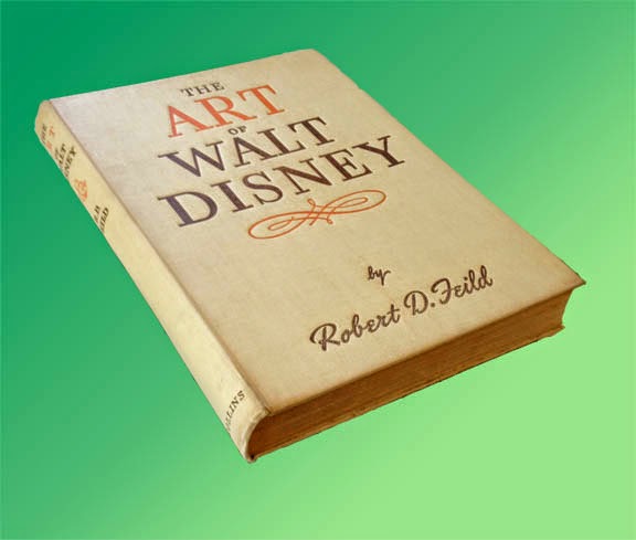
No. 72, Rare Animation Books: The Art of Walt Disney, by Feild

The Art of Walt Disney, by Robert D. Feild, 290 pages, pub. 1942 by Macmillan and Co.


First, you should understand that there are  two completely different books called The Art of Walt Disney. The better known of these is the most recent, a massive coffee table book by Christopher Finch first published in 1974.  In fact, when I went to Amazon just now to look at reviews of the earlier Art of Walt Disney, I found that all the reviews seemed to be of the 1974 book; all these people had no knowledge of the one published in the 1940s.  But the Finch version, rich in color artwork but short on real information about the animation studio, was for me a vast disappointment.

The other book known as The Art of Walt Disney was published in 1942 and written by a professor of art who was given a year of access to the Disney studio in Burbank between 1939 and 1940.  An interesting year it was, too, for Snow White and the Seven Dwarfs had premiered successfully in 1937, proving the viability of feature-length animation and spurring the studio to initiate production on not one but several new features.  The book therefore contains details on the production of Pinocchio, Fantasia, Bambi and Dumbo, all of which were in various stages of development, as well as many animated short subjects which were still a major division of production at Disney.

Early concepts of the 7 dwarfs. Some of these are by Albert Hurter.


As an art historian Feild admitted to a quandary about what the animated productions of the Disney studio actually meant as art, but he knew he was onto something big and exciting.  Disney the producer had thrown far more money back into raising the standards of animation than he had kept for himself, and the result was a clear lead in production quality and standards over every other Hollywood studio.  Efforts by other countries, from the Disney point of view, did not even exist.

Layout sketches, possibly by Tyrus Wong.


The book itself was the first serious literary survey of Disney or of any animation, and its publication was a tribute to the new recognition and respect accorded to Walt Disney after his sensational breakout from shorts starring Mickey Mouse, Donald Duck and Goofy into the world of feature films.  For an exhilerating two years or so after the release of Snow White, anything seemed possible and the continued success of the studio seemed assured.

World war beginning in  1939 with Hitler's invasion of Poland ended all that, closing lucrative distribution markets in Europe and, after 1941, diverting much of the studio's energy into jingoist war propaganda.  According to a 1942 review in Saturday Review, however, the book went to press before the December, 1941, bombing of Pearl Harbor, and so Feild's writing was not influenced by the direct involvement of America--and Hollywood--in World War II.

These may be examples of Shamus Culhane's "fast animation" technique.


There is an oft-told story of Walt Disney confronting one of his ambitious young artists back in the '30's, telling him not to get any ideas about making a name for himself at the studio; the only name the public was to see was that of Walt Disney. The story is true, though of course the features from Snow White on had artist credits just like any other feature films.  But Feild in his book maintained Disney's attitude about keeping the artists anonymous, and so there is not a single animator or designer mentioned by name in the entire book. From the point of view of historical interest, this is an unfortunate omission, although subsequent writing over the ensuing decades has illuminated some of this darkness. One can easily recognize the work of Marc Davis, of Milt Kahl, of Rico LeBrun and others.

Some of Preston Blair's dancing hippo drawings, made famous in his animation book.


The text  is written in a somewhat verbose style typical of the day, but the book does a good job of detailing the Disney production process and even makes an attempt to describe the intricacies of animating. Much is made of the expansive new Burbank production plant. Yet the refusal to name names continues to be an irritant throughout.  Besides Walt, only Roy Disney is mentioned by name.  How can you tell the story of Walt Disney without mention of Ub Iwerks?  Of Ham Luske and Norm Ferguson and Bill Tytla and Freddie Moore?  Yet Feild manages to keep them all behind the curtain, to the point that I suspect this anonymity was a precondition imposed on him by Walt.

Uncredited like all the others, here are some structural guides for deer animation by Rico LeBrun.


Nevertheless there are many full-page plates or illustrations, some in color, that make the book a worthwhile document of the Disney studio in the early 1940s.

Animation drawings of Ali the alligator, very possibly by John Lounsberry.


Feild's The Art of Walt Disney is considered a collector's item.  My copy is a British reprint (1944) published in London by Collins.  Copies available on the internet are few and  not inexpensive, but it is still possible to get one if you want it badly enough.


Sunday, August 3, 2014

No. 71, Me vs Toon Boom StoryBoard Pro, Part Three


The Moving Storyboard


Now we get to the point where StoryBoard Pro is not just a storyboard platform but also a tool for creating an animatic. Like the storyboard itself, the animatic is a planning tool for discovering the best way to tell a story and for discovering problems before all the expense of creating animation and full production art.  Where a live-action film maker might shoot footage at a ratio of ten feet for every foot used in the final edit, the goal of the animation studio with its highly expensive and labor intensive production cost, was a ratio of one to one.  The storyboard and especially the animatic could make that happen.

Originally called a Leica reel, the animatic is a filmed (or videoed) storyboard, with the duration of each panel timed to play as nearly as possible to the calculated length of the same action in the final animation.  Thus an accurate animatic lasting ten minutes and twenty-two seconds onscreen will represent the final production lasting the same amount of time.

One thing that SBP can do is help the animator to accurately time transitions and certain types of movement upon the screen.  Here is my first example from the developing storyboard for my new film The Two Washingtons.


This is the establishing shot for the whole film.  Looking through the grid of a window, we see a huge jet taking off.  An appropriate sound effect will be added.  Then we dissolve to the interior of the airline terminal building, immediately pulling away from the window and widening out to reveal the large gate area crowded with people waiting for their flight to be called.  The background sound will change to the ambience of an airport building, with murmurring voices, footfalls, and the occasional PA announcement.

To accomplish this little sequence I used three of SBP's effects: 1) an animated layer (the airplane), 2) the cross-dissolve from the airplane shot to the interior shot, and 3) a long camera truck-out from the window to a wide shot of the whole room.

Let's think about it piece-by-piece.  The airplane shot might have taken from two to four frames of a conventional storyboard.  Limited to that, I think I would have done it like this:

How this shot might look in a conventional storyboard.


But SBP allows me to do it with just two drawings, the airplane and the window grid, and the result is about as good as I could hope to make it in the final film!

The Animated Layer


The animated layer is about as simple to do as can be.  You select your panel, then the layer you want to animate.  (Of course you will have to have planned this as you constructed your storyboard, so that anything moving will be on its own layer.  If you think something in a scene might move, or of course if the background is to be used in more than one panel, then you should be thinking and working in separate layers.) Next, you use the First Frame Transform tool and manipulate the image to its beginning position.  All the basic transform functions are available, so you can not only reposition but scale, skew, rotate, and so on.  In the case of the airliner, I slid it down out of the camera frame at lower left and also scaled it proportionally down.

The green rectangle is the camera field.


Then I clicked Last Frame Transform and pushed the airplane image off the screen at upper right.  Done!  The plane appears to be taking off outside the window, growing larger as it rises.


This is not actually the last frame position, because that happens near the end of the cross dissolve and is therefore nearly transparent, but it is near the end.


Camera Move

The second panel is done not as a layer move but as a camera move.  With the chosen panel selected, click on the Camera symbol in the toolbar, then open Tool Properties.

Tool Properties panel for Camera
As I am still learning this program, I do not yet fully understand the sections of this panel called Selected Keyframes and Static Attributes.  Here we will be concerned only with the top section, Camera Transform.

From left to right, the first three symbols are: 1) Set Keyframe at Beginning of Panel, 2) Set Keyframe at Current Frame of Panel, and 3) Set Keyframe at Last Frame of Panel. In my shot of the airport interior, I have used just 1 and 3, because the camera is to move throughout the shot. It is important to set both these keyframes, first and last, before moving your camera.  When you do this, the camera fields start out the same for both frames, so they are superimposed.  But at the bottom of the field, there is a green square for the first frame and a red square for the last.  Click and drag on each of these squares to adjust your opening and ending positions.  Here is what mine looked like after making those moves.

The panel in Camera View, clearly showing the move from start (green) to finish (red).

Note: a change in rotation is also possible here, as for example I could have rotated the green window so that the horizontal window bars started out parallel with the match shot in the previous panel.  I decided this was unnecessary however.

I am not quite finished here.  Rather than have the camera move at a constant rate, I decided to add ease in and ease out on both ends, but at different rates.  To do that, go to the Ease In, Ease Out lines in the Camera Transform box and just enter values for the durations of those eases.  In this case I chose 10 frames for the ease in (less than half a second at 24fps) and a full two seconds for the ease out.  These are easy to keep adjusting until they feel right.


The Transition

The last thing I have to do in this little two-panel scene is to add a smooth transition between panels. Find the New Transition icon in the toolbar and click on that.  I want to do a simple cross dissolve, which is the default option. There are also some wipe options.  Select the transition you want by double-clicking on the transition symbol on the timeline, or use the panel view.  The duration of the transition can be changed by pulling the edges of the transition symbol to left or right in the timeline.

Again, I applaud the ease of use of these functions.  I figured all this out and set it up in far less time than it took to write about it.


Next time I will show you another example of camera work in SBP, and I will also talk about some drawing options that are not available in Animate or Animate Pro.